
When you are ignoring layout and image dimensions and load a 3500px wide image on a phone with a slow connection, no image format in the world will save all the wasted data and computation.
To solve this problem, we can use the Contentful Images API. The beauty of using an Image API is that you can upload an image and request different formats using query parameters (fm=webp automatically converts the image to webp).
<picture>
  <!-- load webp images if supported -->
  <source type="image/webp"
    srcset="
      https://images.ctfassets.net/.../paris.jpg?w=100&fm=webp 100w,
      https://images.ctfassets.net/.../paris.jpg?w=200&fm=webp 200w,
      ..."
    sizes="
      (max-width: 768px) calc(100vw - 3em),
      (max-width: 1376px) calc(50vw - 8em),
      550px">
  <!-- load traditional supported image format -->
  <img
    srcset="
      https://images.ctfassets.net/.../paris.jpg?w=100&fm=jpg&fl=progressive 100w,
      https://images.ctfassets.net/.../paris.jpg?w=200&fm=jpg&fl=progressive 200w,
      ..."
    sizes="
      (max-width: 768px) calc(100vw - 3em),
      (max-width: 1376px) calc(50vw - 8em),
      550px"
    src="https://images.ctfassets.net/.../paris.jpg"
    alt="Buildings of Paris"
    loading="lazy"
    decoding="async"
    width="1243"
    height="1500">
</picture>
The source elements include not only a type attribute but also srcset and sizes. These two attributes are core parts of responsive images and can be applied to the source element, too.
srcset and sizes give additional layout and source URL information so that the browser can load properly sized images depending on screen size and other factors. This picture element loads not only the best format but also images in the best sizes.
Additionally, the img element includes more attributes. Be aware that the included img is not only the picture’s fallback solution. The source elements’ job is to augment and provide additional source information about this one included image.
Even though there is a picture element around the image, you still have to consider image best practices to provide the best user experience:
alt– define alternative text for assistive technology or in case the image doesn’t loadloading– define an image lazy loading strategydecoding– define an image decoding strategywidth/height– provide an aspect ratio to avoid layout shifts
For avif image format kindly read this article.
17. Utilize schema markup
Google Images supports structured data for product images, videos, and recipes. For example, if you have recipes on your site and you add structured data to your images, Google can add a badge to your image showing that it belongs to a recipe.
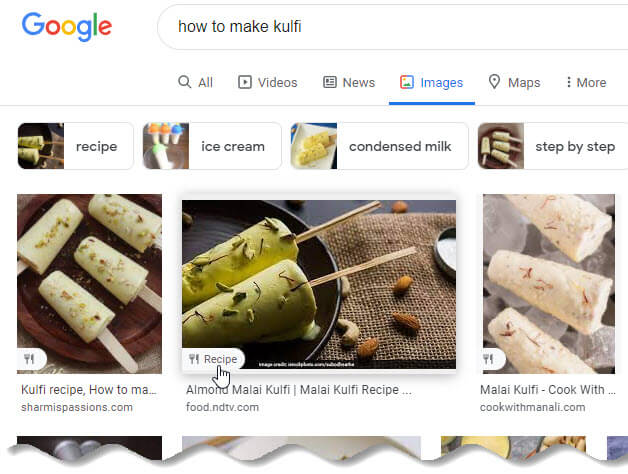
What Google says about these badges:
If you have images on your site, you can help users identify the type of content associated with the image by using appropriate structured data on your pages. This helps users find relevant content quickly, and sends better targeted traffic to your site.
Use Google’s Structured Data General Guidelines to learn how to add structured data to your pages within the search engine’s parameters.
18. Add Images to your Sitemap
According to Google, a site map is “a file where you can list the web pages of your site to tell Google and other search engines about the organization of your site content.”
In other words, it’s a file that contains a map of your site’s content.
Having your images in a sitemap greatly increases the chances of search engines crawling and indexing your images. Thus, results in more site traffic.
Basically you need to include the title, description, URL location, caption, and license information for the images. Follow these guidelines that Google suggests when creating a sitemap with image information.
There is one key difference when creating an image sitemap than creating one that includes your web pages.
As Google says, “Image sitemaps can contain URLs from other domains, unlike regular sitemaps, which enforce cross-domain restrictions. This allows you to use CDNs (content delivery networks) to host images.”
If you are using WordPress, Yoast offers a sitemap solution in their plugin. One more alternative for WordPress is Sitemap Generator plugin from Marco Beierer.
19. Use vector graphics where appropriate
Here’s what Google says about vector graphics:
Vector graphics use lines, points, and polygons to represent an image. [They are] ideally suited for images that consist of simple geometric shapes (for example, logos, text, icons, and so on), and deliver sharp results at every resolution and zoom setting, which makes them an ideal format for high-resolution screens and assets that need to be displayed at varying sizes.
SVGs are perhaps the most popular vector format on the web. No matter what browser, device or screen resolution you have, SVGs will look crystal clear because they don’t pixelate.


Add comment