
CSS positioning can be a bit tricky to grasp, but don’t worry, we’ll break it down step by step.
In this article, we’ll explore the key differences between position: relative and position: absolute in CSS with plenty of examples and live demos to make things crystal clear.
What Is Relative Positioning
When you set an element’s position to relative in CSS, it won’t move by itself. It’s like saying, “Stay where you are, but get ready to move if I tell you to.”
Now, if you add something like left: 20px along with position: relative, you’re telling the element to move 20 pixels to the right from where it would usually be. It’s like giving it a little nudge to the side.
So, remember, “relative” alone won’t make things move. But if you add specific positioning like “left“, “right“, “top“, or “bottom“, that’s when the magic happens!
What Is Absolute Positioning
When you set an element’s position to absolute in CSS, it’s like giving it its own little world on the webpage. It completely ignores where it would normally sit in the flow of the page.
Imagine you’re placing a sticker on a wall. If you say position: absolute to the sticker, it doesn’t care about other stickers nearby. It just sticks exactly where you tell it to.
So, “absolute” positioning is like saying, “You go wherever I tell you, no matter what else is happening on the page!” But remember, they might not stay where you expect if the page layout changes.
But here’s the trick: it’s positioned relative to its closest ancestor element that has a position other than “static”. If no such ancestor exists, it’s positioned relative to the document itself.
Absolute positioning is handy for creating overlays, tooltips, or pop-up menus that need to appear in specific locations.
Let’s dive into some examples to see these concepts in action:
Example and Live Demo
To start with, create a parent container with 4 boxes side by side.
<!DOCTYPE html>
<html lang="en">

<head>
	<meta charset="UTF-8">
	<meta name="viewport" content="width=device-width, initial-scale=1.0">
	<title>Position Absolute and Relative Example</title>
	<link rel="stylesheet" href="style.css">
</head>

<body>
	<div class="parent">
		<div class="box" id="one">One</div>
		<div class="box" id="two">Two</div>
		<div class="box" id="three">Three</div>
		<div class="box" id="four">Four</div>
	</div>
</body>

</html>
.parent {
	display: flex;
	gap: 8px;
}

.box {
	background: #41C9E2;
	width: 100px;
	height: 100px;
	color: #fff;
	justify-content: center;
	display: flex;
	align-items: center;
	border: 2px #008DDA solid;
}

#two {
	background: #008DDA;
	color: #fff;
}
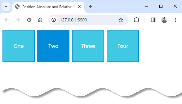
By default, elements on a webpage are positioned statically (static), which means they stay where they are in the layout. But what if we want to move an element, like the Dark blue box, without messing up the layout around it?
That’s where relative positioning comes in. With relative positioning, we can move the Dark blue box a certain distance from where it would normally be, without affecting other elements around it.
So, if we want to move the Dark blue box 20 pixels to the right and down from where it would usually sit, we can do that with relative positioning.
#two {
	background: #008DDA;
	color: #fff;
	position: relative;
	top: 20px;
	left: 20px;
}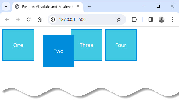
This way, we create a gap for the Dark blue box in its original spot, but it won’t disrupt anything else on the page.
Interestingly position: absolute is the opposite.
By applying position: absolute to the Dark blue box, it will not leave any gap where it would have been. The position of the Dark blue box is based on its parent position (the dotted border). Thus, moving 20px to the left and bottom from the top-left origin of the dotted border.
When we use position: absolute on the Dark blue box, it means the box won’t leave any empty space where it was before. Instead, its position is determined by its closest parent element that has a specific position set (like the dotted border in this case).
So, we can move the Dark blue box precisely based on where its parent element is located.
.parent {
	display: flex;
	gap: 8px;
	position: relative;
	border: 2px #008DDA dotted;

}

.box {
	background: #41C9E2;
	width: 100px;
	height: 100px;
	color: #fff;
	justify-content: center;
	display: flex;
	align-items: center;
	border: 2px #008DDA solid;
}

#two {
	background: #008DDA;
	color: #fff;
	position: absolute;
	top: 20px;
	left: 20px;
}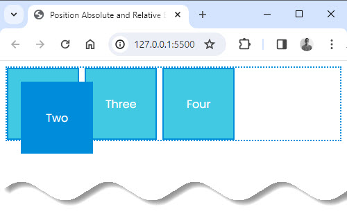
For example, if we move the Dark blue box 20 pixels to the left and 20 pixels from the bottom-left corner of the dotted border, it will move exactly there without affecting anything else on the page.
So, in a nutshell …
When we use position: relative, we can move an element from where it currently sits without messing up other nearby elements. But with position: absolute, the element moves based on its parent’s position, and it might cause other elements to shift around.
Conclusion
By experimenting with these examples and playing around with different values, you’ll gain a better understanding of how relative and absolute positioning work in CSS.
It might seem a bit tricky at first, but with practice, you’ll master it in no time! So, keep coding, keep experimenting, and don’t hesitate to reach out if you have any questions. Happy coding!
Reference
- CSS Position – MDN Documents


Add comment