
CSS flexbox is a one-dimensional layout pattern that makes it easy to design flexible and effective layouts. With flexbox, we can organize items from left to right, top to bottom, and at the same time control the spacing and order of the items in the container.
Flexbox can replace floats, positioning tricks, inline-block layouts and even table display layouts. If you have ever pulled your hair out wondering why some seemingly simple layouts were difficult or even impossible in CSS, you are going to love Flexbox.
The main reason why you would use flexbox today instead of floats is to satisfy the demands of responsive design.
In this article, we will get you up and running with the fundamental concepts behind flexbox. Understanding these core concepts will open up a whole world of extremely flexible, easy to create layouts (especially for responsive web design).
Let’s dive into flexbox and become a master of it in a very short time.
What is FlexBox?
The Flexbox Layout officially called CSS Flexible Box Layout Module. It is a new layout module in CSS3 which consists of the flexbox container (the parent element) and the flexbox items (the children elements).

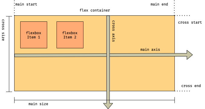
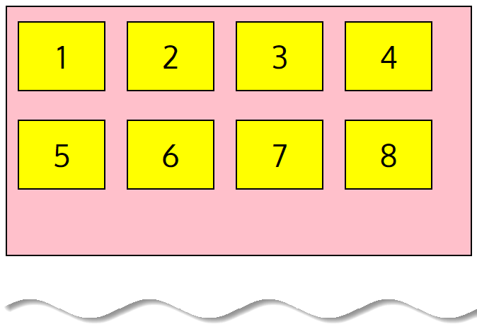
You can get an idea about flexbox container and flexbox items from the above image. The flexbox container is used to group a bunch of flexbox items.
And any HTML element that is a direct child of the flexbox container is a flexbox item. We use flexbox container to determine the layout. However, the flexbox items can be manipulated individually.
Flexbox is a way to describe how elements should be displayed inside another element. The outer element is called the flexbox container (the parent element – responsible for styling of full box), and the inner elements are known as flexbox items (the child elements – responsible for individual item in a box).
When we describe flexbox as being one dimensional we are describing the fact that flexbox deals with layout in one dimension at a time — either as a row or as a column.
This can be contrasted with the two-dimensional model of CSS Grid Layout, which controls columns and rows together.
The CSS flexbox layout is a one-dimensional layout system, meaning that it handles either rows or columns, not both.
💡 Note
In CSS 2.1, four layout modes were defined which determine the size and position of boxes based on their relationships with their sibling and ancestor boxes.
The block layout designed for laying out documents, and that lays elements on a page vertically; the inline layout designed for laying out text horizontally inside block-level containers; the table layout designed for laying out two-dimensional data in a tabular format; and the positioned layout designed for very explicit positioning without much regard for other elements in the document.
Flexbox layout algorithm is direction based unlike the block or inline layout which are vertically and horizontally based. Hence, flexbox layout should be used for small application components, while CSS Grid Layout is emerging to handle the large scale layouts.
👍 Advantages of using Flexbox
➊ Automatically scale elements so that they fill the available space
➋ Solve the problem of horizontal and vertical centering
➌ Change the order of the items
➍ Easily reverse the structure of items
➎ Automatically shrink or grow elements to make them fit into the container and prevent overflow
➏ Flexbox is a great way to get more flexibility in your layouts and to simplify responsive layout design
The basic idea of flexbox layout is to let the container to change the width/height (and order) of its elements to optimize the available space filling (mainly for placement on all screens types and sizes), depending on some rules you set or compresses them to avoid overflow.
Since flexbox is a whole module and not a single property, it involves a lot of things including its whole set of properties. Some of them are meant to be set on the container (parent element, known as “flexbox container”) whereas the others are meant to be set on the children (said “flexbox items”).
Flexbox is ideal for times where you need to re-order elements on certain circumstances, or if you want to scale your elements vertically, horizontally or if you want to align your elements.
FlexBox Architecture (How does it work?)
As we mentioned earlier, in flexbox, there are mainly two entities: a parent container (the flexbox container) and the immediate children elements (flexbox items).
Flexbox container properties
These are some of the properties that can be applied to a flexbox parent container:
display | align-content | align-items |
flex-direction | flex-flow | flex-wrap |
justify-content |
Flexbox items properties
And following are some of the properties of the flexbox items.
flex | align-self | flex-basis |
flex-grow | flex-shrink | order |
Before going through the flexbox properties that control and customize flexbox layout, there are two concepts and terms that you should get familiar with first: flexbox axes and flexbox lines.
Flexbox Axes
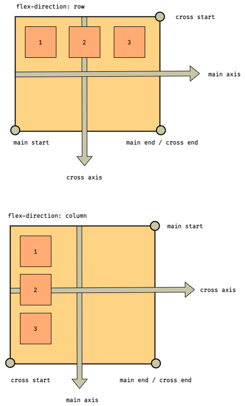
In flexbox we have two axes: the main axis and the cross axis. By default, the main axis runs left to right, whereas the cross axis is perpendicular to the main axis and runs top to bottom.
Unlike block and inline layout, whose layout is based on block and inline flow directions, flexbox layout is based on flex directions.
The concept of flex directions is based on the concept of axes that determine the directions along which flexbox items are laid. The following illustration shows the axes defined on a flexbox container:
Depending on the values of the flexbox properties, flexbox items will be laid out inside a flexbox container following either the main axis or the cross axis.
To control the behavior of content’s width and gaps between that stretch horizontally across the main axis you will use justify properties. To control vertical behavior of items you will use align properties.
Main Axis
By default, the main axis runs from left to right and the cross axis is perpendicular to the main axis and runs top to bottom.
This is the default axis where items are laid out by default. It’s not necessarily horizontal always; it can be vertical depending upon
flex-directionproperties.
The start point of the man axis is termed as the main start and the endpoint is termed as the main end and the length between them is termed as the main size.
So we can say that the flexbox item flows from the main start to the main end and take up the main size as a length.
Cross Axis
Similarly, with cross axis, we have a cross start, cross end, and cross size. we can also change the direction of main and cross axis but we will discuss it further.
It is necessary that you familiarize yourself with these concepts before starting to use the flexbox layout. Because everything in flexbox layout is relative to these two axes.
💡 Note
When using flexbox we work with two axes: the main and cross axes. As their names suggest, these axes form a hierarchical relationship, the main axis being superior to the cross axis.
This hierarchical relationship constitutes the main difference between flexbox and CSS Grid Layout. By design, CSS grid has two non-hierarchical axes: the row and column axes. This is because the creators of web standards intended CSS grid to be used as a two-dimensional layout model.
Flexbox, on the other hand, has one primary and one secondary axis, as its purpose is to be a one-dimensional layout model. The cool part about flexbox is that you can define the direction of that one dimension by setting the position of the main axis, therefore you can create both row-based and column-based layouts.
Flexbox Lines
Flexbox items are positioned inside a flexbox container along a flexbox line. It is a hypothetical line used for grouping and alignment of flexbox items inside their container.
Flexbox uses the concepts of the main axis and the cross axis. Flexbox lines follow the main axis. The cross axis is perpendicular to the main axis.
Flexbox lines follow the main axis and by default there is only one flexbox line per flexbox container.
A flexbox container can be either single-line or multi-line, depending on the flex-wrap property:
- A single-line flexbox container lays out all of its children in a single line, even if that would cause its contents to overflow.
- A multi-line flexbox container breaks its flexbox items across multiple lines, similar to how text is broken onto a new line when it gets too wide to fit on the existing line.
When additional lines are created, they are stacked in the flexbox container along the cross axis according to theflex-wrapproperty. Every line contains at least one flexbox item, unless the flexbox container itself is completely empty.
Writing Modes
An important part of customizing a flexbox is changing the direction of the flexbox line. By default, the flexbox line goes in the direction of text: left to right, top to bottom.
However, if you change the direction of the text using the direction property, the direction of the flexbox line will also change. That means, writing modes are a new way to write text right to left, or even vertically, as you might see in certain languages such as Japanese.
Also, if the writing mode changes, the directions of both the main axis and cross axis will also change. For example, in a Japanese language layout, the main axis is vertical and the cross axis is horizontal.

Source: W3C
For more information about the possible writing modes and directions, see the CSS Writing Modes Module entry from W3C.
In all of our examples the writing mode will be left to right, top to bottom, but you must keep in mind that this will not always be the case.
Now, let’s start to learn about the syntax of flexbox.
How to create the flexbox container
The first step to start using flexbox is to create a flexbox container. As we mentioned earlier, children of a flexbox container are called the flexbox items, and are laid out inside the flexbox container using the flexbox properties.
A flexbox container is created by setting the display property on the parent HTML element to either flex or inline-flex.
With display: flex the container is rendered as a block. With display: inline-flex the container is rendered inline.
Therefore, the CSS flexbox container defines the size, alignment, and position for its children.
Here is an example declaring a flexbox container.
.flex-container {
  display: flex;
}
Or if you want to display it like an inline element use:
.flex-container {
  display: inline-flex;
}
This is the only property you need to set on the parent container and all its immediate children will become automatically flexbox items.
💡 Note
Some properties do not work when applied to the flexbox items, namely clear, float, and vertical-align. And pseudo elements such as ::first-letter and ::first-line has no effect on a flexbox container. Also, an absolutely-positioned flexbox item does not participate in flexbox layout.
Now, let’s start experiencing the awesomeness of flexbox.
To start, we will need an HTML file and a CSS file for styles. Let’s say we have an HTML file called flexbox.html and a CSS file called flexbox.css.
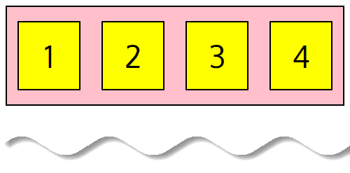
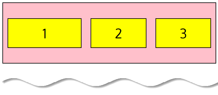
We will have a div called flex-container, and all the direct child elements of the flex-container will have a div separately. So, our HTML and CSS file will look like this.
<body>
    <div class="flex-container">
      <div>1</div>
      <div>2</div>
      <div>3</div>
      <div>4</div>
    </div>
</body>
* {
font-family: Oxygen;
text-align: center;
font-size: 44px;
}
.flex-container {
display: flex;
flex-wrap: nowrap;
background-color: pink;
border: 2px solid #000;
}
.flex-container > div {
width: 100px;
margin: 20px 15px;
padding: 10px;
line-height: 75px;
background-color: yellow;
border: 2px solid #000;
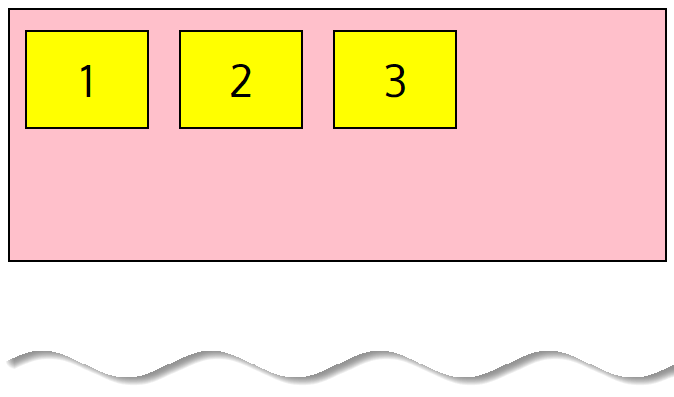
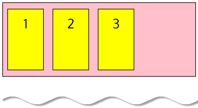
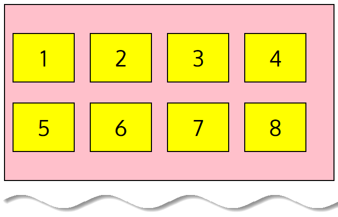
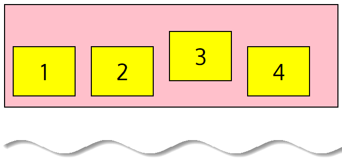
}Here we have a flexbox container (in pink), containing four flexbox items (in yellow boxes):
Make Sure the display property is always set or none of the other property is going to work on the flexbox container.
💡 Note
Children of a flexbox container, the flexbox items, are laid out using the flexbox layout. Any element outside a flexbox container is not affected by the flexbox layout defined on it, and will be rendered as it normally would in the page.
As you can see the flexbox items are laid out from left to right also you can see the container is having a 100% width as it behaves as a block level element.
💡 Note
Every flexbox container initially has these default values:
• flex-direction: row
• justify-content: flex-start
• align-items: stretch
• align-content: stretch
• flex-basis: auto
• flex-wrap: nowrap
Other properties don’t have default values. If you do not set them, CSS won’t apply them to your flexbox container.
This is the code we will be working with throughout this guide. Let’s now break it down by examining the key properties!
📚 Cheatsheet – display
🤔 Do you want the flexbox container to behave like a block on inline element?flex : makes the container act display blockinline-flex : makes the container act display inline
How to create a Row or Column
If you want to arrange the flexbox items to look like a row or a column, apply the flex-direction property to the flexbox container.
This property specifies how flexbox items are laid out in the flexbox container. For example, if you set the flex-direction to the column. The main axis is vertical and the cross axis is horizontal. If you set the flex-direction to row, the main axis is horizontal and the cross axis is vertical.
The flex-direction property
Default value: flex-direction: row
With row direction the flexbox items are stacked in a row from left-to-right in ltr context.
The
flex-direction: row;property will make a horizontal row. The row is the default value.
.flex-container {
  display: flex;
  flex-direction: row;
  background-color: pink;
  border: 2px solid #000;
}
The order can be reversed with row-reverse where flexbox items will be from right-to-left in ltr context.
.flex-container {
  display: flex;
  flex-direction: row-reverse;
  background-color: pink;
  border: 2px solid #000;
}
❗ Caution
row and row-reverse are dependent of the writing mode so in rtl context they will be reversed respectively.
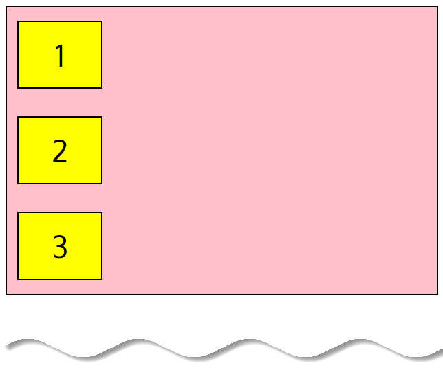
To place flexbox items vertically from top-to-bottom in flexbox container, we can use the column value.
The
flex-direction: column;property will make a vertical column.
.flex-container {
  display: flex;
  flex-direction: column;
  background-color: pink;
  border: 2px solid #000;
}
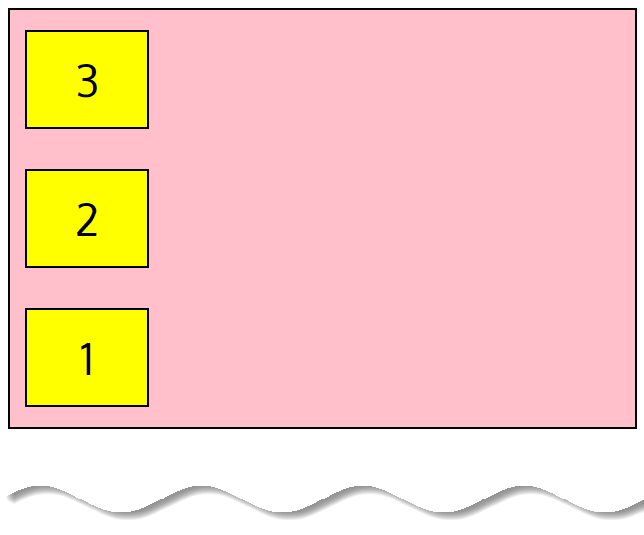
With column-reverse direction the flexbox items are stacked in a column from bottom-to-top.
.flex-container {
  display: flex;
  flex-direction: column-reverse;
  background-color: pink;
  border: 2px solid #000;
}
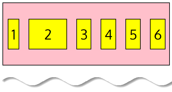
The flex-wrap property
Default value: flex-wrap: nowrap
The initial flexbox concept is the flexbox container to set its flexbox items in one single line. However, the flex-wrap property controls if the flexbox container lay out its items in single or multiple lines, and the direction the new lines are stacked in.
The
flex-wrapproperty allow us to choose whether our flexbox items should wrap or not.
By default, flexbox items will always try to fit on one line, that means they are shrunk to fit the flexbox container’s width. Hence nowrap value specifies that the flexbox items will not wrap (this is default).
  <body>
    <div class="flex-container">
      <div>1</div>
      <div>2</div>
      <div>3</div>
      <div>4</div>
      <div>5</div>
      <div>6</div>
      <div>7</div>
    </div>
  </body>
.flex-container {
display: flex;
flex-wrap: nowrap;
background-color: pink;
border: 2px solid #000;
}
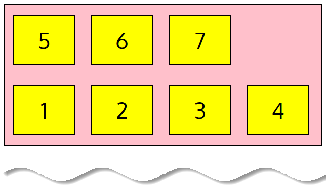
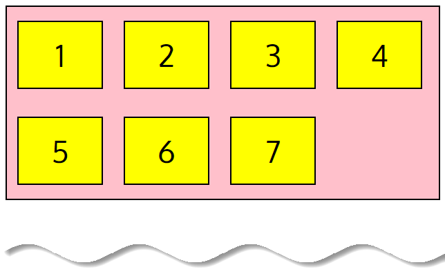
Note that as it’s the default value, nowrap doesn’t need to be set on flexbox container. Our flexbox items will not wrap.
When we set the wrap value, our flexbox items will wrap if necessary:
💡 Note
If you have more flexbox items that can fit in one row and you still want a horizontal layout, the flex-wrap: wrap; property will come in handy. This way, the flexbox items will wrap onto multiple lines inside the flexbox container.
The default value is flex-wrap: nowrap;.
.flex-container {
  display: flex;
  flex-wrap: wrap;
  background-color: pink;
  border: 2px solid #000;
}
By using
flex-wrap: wrap;our flexbox items are displayed in multiple rows if needed from left-to-right and top-to-bottom

We can also use wrap-reverse to reverse the order:
.flex-container {
  display: flex;
  flex-wrap: wrap-reverse;
  background-color: pink;
  border: 2px solid #000;
}
❗ Caution
These properties are dependent of the writing mode so in rtl context they will be reversed respectively.
The flex-flow property
Default value: flex-flow: row nowrap
This property is a shorthand for setting the flex-direction and flex-wrap properties. The default value is flex-flow: row nowrap;.
.flex-container {
  display: flex;
  flex-flow: row wrap; /*flex-direction + flex-wrap*/
  background-color: pink;
  border: 2px solid #000;
}
📚 Cheatsheet – flex-direction
🤔 Do you want your main axis to be vertical or horizontal?row (default) : left to rightrow-reverse : right to leftcolumn : top to bottomcolumn-reverse : bottom to top
How to align elements horizontally
To define the horizontal alignment of flexbox items, we can use the justify-content property. The available values for this property are flex-start, flex-end, center, space-between, space-around and space-evenly.
The
justify-contentproperty defines the alignment of flexbox items on the main axis.
The justify-content property
The flexbox examples below show how each property works.
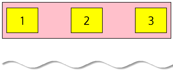
Default value: justify-content: flex-start
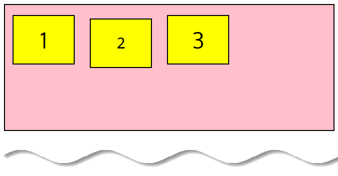
justify-content: center
The center value aligns the flexbox items at the center of the flexbox container.
<div class="flex-container">
      <div>1</div>
      <div>2</div>
      <div>3</div>
</div>
.flex-container {
display: flex;
justify-content: center;
background-color: pink;
border: 2px solid #000;
}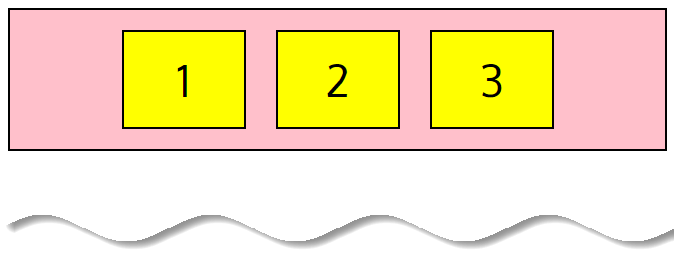
That’s how simple it is to center our flexbox items!
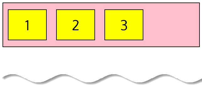
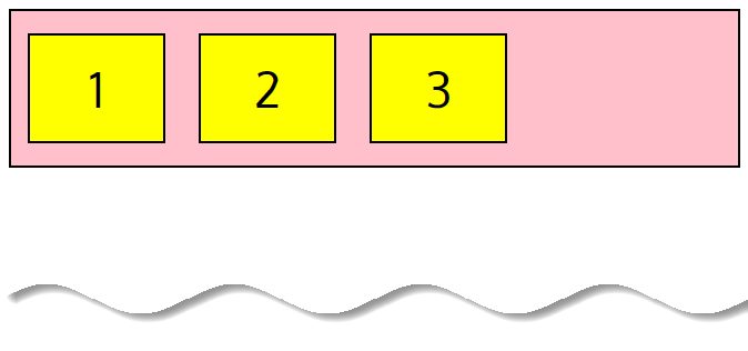
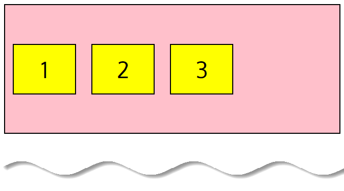
justify-content: flex-start
We can also use flex-start to place our flexbox items at the beginning of the container (this is the default):
.flex-container {
  display: flex;
  justify-content: flex-start;
  background-color: pink;
  border: 2px solid #000;
}
flex-start– items are packed toward the flexbox container’s left side (it’s the default value).
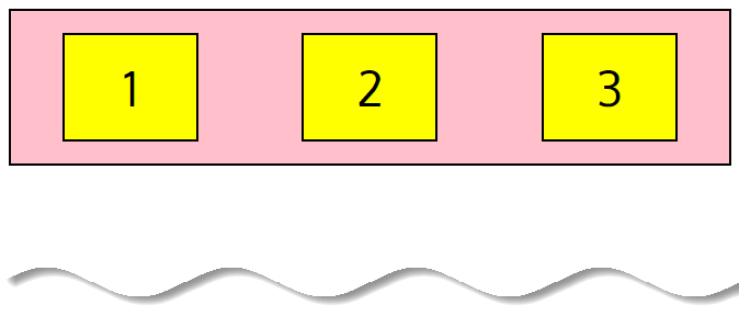
justify-content: flex-end
To place our flexbox items at the end, use flex-end:
.flex-container {
  display: flex;
  justify-content: flex-end;
  background-color: pink;
  border: 2px solid #000;
}
flex-end– flexbox items are packed toward the flexbox container’s right side.

justify-content: space-around
We can use space-around to display flexbox items with space before, between, and after:
.flex-container {
  display: flex;
  justify-content: space-around;
  background-color: pink;
  border: 2px solid #000;
}
justify-content: space-between
With space-between flexbox items are displayed with equal spacing between them, first and last flexbox items are aligned to the edges of the flexbox container.
.flex-container {
  display: flex;
  justify-content: space-between;
  background-color: pink;
  border: 2px solid #000;
}
space-between– flexbox items are evenly distributed in the line (the first item is on the left, the last item on the right).
justify-content: space-evenly
With space-evenly flexbox items are distributed so that the spacing between any two flexbox items (and the space to the edges) is equal.
.flex-container {
  display: flex;
  justify-content: space-evenly;
  background-color: pink;
  border: 2px solid #000;
}
📚 Cheatsheet – justify-content
🤔 How do you want the extra space to be distributed along the main axis?flex-start (default): flexbox items anchored to the startflex-end : flexbox items anchored to the endcenter : flexbox items centeredspace-around: start and end items are not to the edge but have 1 unit of space on each sidespace-between : flexbox items evenly distributed in the line. First item in on the start and last item is at the endspace-evenly : similar to space-around, except all space is the same
How to align elements vertically
To align flexbox items vertically, we can use the align-items, align-content or align-self properties.
The align-items property
To define the vertical alignment of several flexbox items, we can apply the align-items property to the flexbox container. The available values for this property are stretch, flex-start, flex-end, center and baseline.
The
align-itemsproperty defines how items are laid out along the cross axis.
Default value: align-items: stretch
The flexbox examples below show how each property works.
align-items: center
To align items in the middle of the flexbox container, we use center:
.flex-container {
  display: flex;
  align-items: center;
  background-color: pink;
  border: 2px solid #000;
  height: 250px;
}
Here we have increased the height of the flexbox container in our demo code to 250px, to better show the effects.
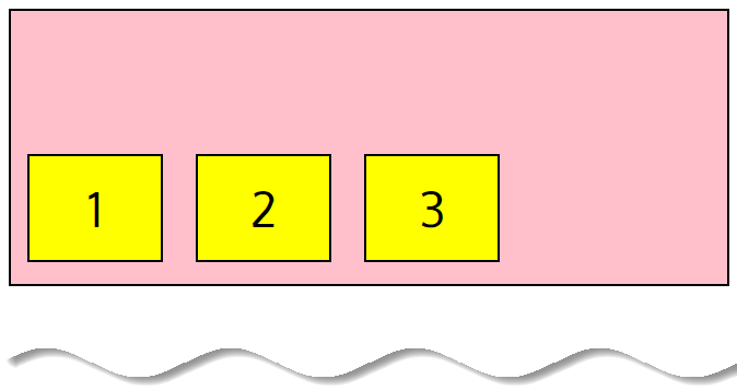
align-items: flex-start
To place at the top, we can use flex-start:
.flex-container {
  display: flex;
  align-items: flex-start;
  background-color: pink;
  border: 2px solid #000;
  height: 250px;
}
align-items: flex-end
Or we can use flex-end to place at bottom of the flexbox container:
align-items: stretch
The default value of stretch will stretch our flexbox items to fill the flexbox container:
.flex-container {
  display: flex;
  align-items: stretch;
  background-color: pink;
  border: 2px solid #000;
  height: 250px;
}
align-items: baseline
The baseline will align the flexbox items to the baseline of the content. If you are confused about what actually baseline is, Wikipedia describes it as, “The line upon which most letters “sit” and below which descenders extend.”
The below image from Wikipedia will clear about it more.

So to illustrates this concept we have used alternating font-size values.
  <body>
    <div class="flex-container">
      <div>1</div>
      <div style="font-family: monospace; font-size: 34px">2</div>
      <div>3</div>
    </div>
 </body>
.flex-container {
display: flex;
align-items: baseline;
background-color: pink;
border: 2px solid #000;
height: 250px;
}
📚 Cheatsheet – align-items
🤔 How do you want the extra space between flexbox items to be distributed along the cross axis?flex-start : flexbox items are placed in the top part of the flexbox containerflex-end : flexbox items are placed in the end part of the flexbox containercenter : flexbox items are centered in the middle of the flexbox containerbaseline : flexbox items are aligned such as their baselines alignstretch (default) : flexbox items are stretched to fill the container, still respecting min-width and max-width properties
The align-content property
To define the vertical alignment of several lines of flexbox items, we can use the align-content property. This property has no effect when there is only one line of flexbox items.
This property only works if two conditions are met:
- The
wrapvalue should be applied to the flexbox container - The flexbox container should be higher than the lines of the flexbox items
In other words, there must be additional vertical space inside the flexbox container, which should be larger than the sum of all the heights of the rows of elements.
The available values for this property are stretch, flex-start, flex-end, center, space-between and space-around.
Default value: align-content: stretch
The flexbox examples below show how each property works.
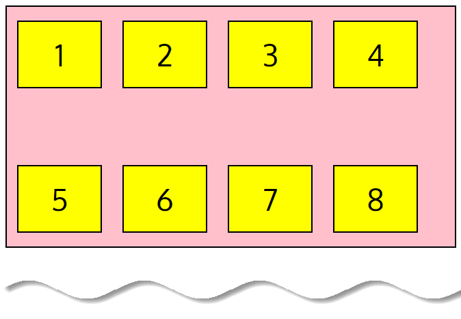
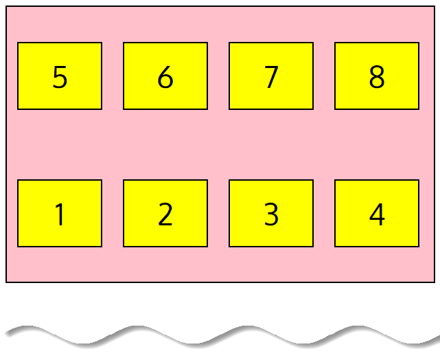
align-content: space-between
In these examples, the demo container height has been increased to 350px and the flex-wrap property to is set to wrap, to better illustrate how align-content works.
By setting space-between will display each flexbox line with equal space between them:
<body>
    <div class="flex-container">
      <div>1</div>
      <div>2</div>
      <div>3</div>
      <div>4</div>
      <div>5</div>
      <div>6</div>
      <div>7</div>
      <div>8</div>
    </div>
</body>
.flex-container {
display: flex;
flex-wrap: wrap;
align-content: space-between;
background-color: pink;
border: 2px solid #000;
height: 350px;
}
align-content: space-around
The space-around value will distribute space before, between, and after each flexbox line:
.flex-container {
  display: flex;
  flex-wrap: wrap;
  align-content: space-around;
  background-color: pink;
  border: 2px solid #000;
  height: 350px;
}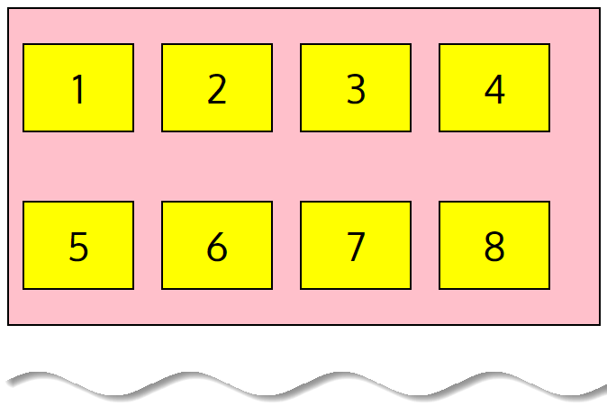
align-content: stretch
The default stretch value stretches the flexbox lines to fill any remaining space:
.flex-container {
  display: flex;
  flex-wrap: wrap;
  align-content: stretch;
  background-color: pink;
  border: 2px solid #000;
  height: 350px;
}
align-content: center
We can also use center to display the flexbox lines in the middle of the flexbox container:
.flex-container {
  display: flex;
  flex-wrap: wrap;
  align-content: center;
  background-color: pink;
  border: 2px solid #000;
  height: 350px;
}
align-content: flex-start
Or we can use flex-start to position at the start of the flexbox container:
.flex-container {
  display: flex;
  flex-wrap: wrap;
  align-content: flex-start;
  background-color: pink;
  border: 2px solid #000;
  height: 350px;
}
align-content: flex-end
And finally flex-end to position our flexbox lines at the end of the flexbox container:
.flex-container {
  display: flex;
  flex-wrap: wrap;
  align-content: flex-end;
  background-color: pink;
  border: 2px solid #000;
  height: 350px;
}
📚 Cheatsheet – align-content
🤔 How do you want the extra space of LINES of flexbox items to be distributed along the cross axis?flex-start : flexbox items anchored to the startflex-end : flexbox items anchored to the endcenter : flexbox items centeredspace-between : first line at the start of the flexbox container and the last one is at the endspace-around : lines are evenly distributed with equal space around each linestretch (default) : lines stretch to take up the space that is left
The align-self property
To vertically align individual flexbox items, we can use the align-self property. It applies to the flexbox items, not to the flexbox container. Also, it is useful to override the alignment specified for the flexbox container with the help of the align-items property.
The
align-selfproperty allows the default alignment (the one specified byalign-items) to be overridden for individual flexbox items.
The available values for this property are auto, stretch, flex-start, flex-end, center and baseline.
Default value: align-self: auto
The flexbox examples below show how each property works.
align-self: center & align-self: stretch
In these examples we will use a 200px height of the flexbox container, to better illustrate the align-self property.
Let’s align the third flexbox item in the middle of the flexbox container to center (the others are defaulting to stretch):
.flex-container {
  display: flex;
  align-items: stretch;
  background-color: pink;
  border: 2px solid #000;
  height: 200px;
}
<body>
<div class="flex-container">
<div>1</div>
<div>2</div>
<div style="align-self: center">3</div>
<div>4</div>
</div>
</body>
align-self: flex-start & align-self: flex-end
And now let’s align the second flexbox item with the bottom, and the third flexbox item with the top:
.flex-container {
  display: flex;
  align-items: stretch;
  background-color: pink;
  border: 2px solid #000;
  height: 200px;
}
<body>
<div class="flex-container">
<div>1</div>
<div style="align-self: flex-end">2</div>
<div style="align-self: flex-start">3</div>
<div>4</div>
</div>
</body>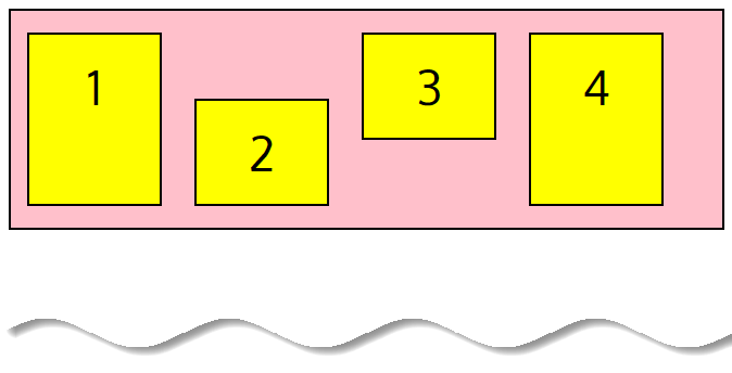
align-self: baseline
When we set baseline flexbox items are aligned such as their baselines align.
.flex-container {
  display: flex;
  align-items: stretch;
  background-color: pink;
  border: 2px solid #000;
  height: 200px;
}
<body>
<div class="flex-container">
<div>1</div>
<div>2</div>
<div>3</div>
<div style="font-family: monospace; font-size: 54px; align-self: baseline">4</div>
</div>
</body>
align-self: auto
The auto is equals to the value specified in the align-items property for the flexbox container (it’s the default value)
Here we have set align-items: flex-end for all of our flexbox items on the stylesheet.
.flex-container {
  display: flex;
  align-items: flex-end;
  background-color: pink;
  border: 2px solid #000;
  height: 200px;
}
To override align-items property, we used align-self: center and align-self: auto on HTML.
<body>
    <div class="flex-container">
      <div>1</div>
      <div>2</div>
      <div style="align-self: center">3</div>
      <div style="align-self: auto">4</div>
    </div>
</body>
❗ Caution
The value of auto for align-self computes to the value of align-items on the element’s parent, or stretch if the element has no parent.
📚 Cheatsheet – align-self
🤔 Do you want to override the align-items value for the specific flexbox item?auto (default) : equals to the value specified in the align-items property for the flexbox containerflex-start : flexbox items anchored to the startflex-end : flexbox items anchored to the endcenter : flexbox items centeredbaseline : baselines are alignedstretch : fill the container
How to achieve perfect centering in flexbox
It’s quite simple in Flexbox! Just ensure both justify-content and align-items are set to center, and then flexbox items will be perfectly centered:
<body>
    <div class="flex-container">
      <div>Ola!</div>
    </div>
</body>
.flex-container {
display: flex;
justify-content: center;
align-items: center;
background-color: pink;
border: 2px solid #000;
height: 200px;
}
💡 Note
You can use auto-margins to divide flexbox items in the same container. Auto-margins eat up all the extra space in a flexbox container.
For example, to move an flexbox item to the right side of the flexbox container, apply to it the margin-left: auto; property. However, if free space is distributed to auto-margins, the alignment properties will have no effect
How to change the order of the elements
Several properties allow determining the order of the flexbox items and they are order, row-reverse, column-reverse and wrap-reverse.
The order property
Default value: order: 0
To customize the order of individual flexbox items, we can use the order property. It applies to the flexbox items only.
The
orderproperty controls the order in which flexbox items appear in the flexbox container.
Lets taken an example:
The default order:
<body>
    <div class="flex-container">
      <div>1</div>
      <div>2</div>
      <div>3</div>
      <div>4</div>
    </div>
</body>
.flex-container {
display: flex;
align-items: center;
background-color: pink;
border: 2px solid #000;
height: 200px;
}
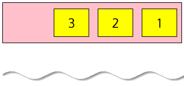
To change the order of individual items:
  <body>
    <div class="flex-container">
      <div style="order: 4">1</div>
      <div style="order: 3">2</div>
      <div style="order: 2">3</div>
      <div style="order: 1">4</div>
    </div>
 </body>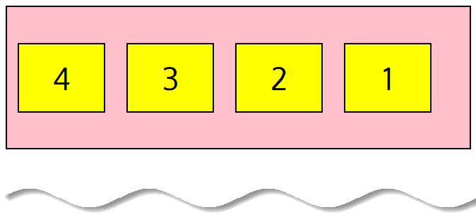
To make the last item first:
<body>
    <div class="flex-container">
      <div>1</div>
      <div>2</div>
      <div>3</div>
      <div style="order: -1">4</div>
    </div>
</body>
By default, all flexbox items have the order: 0; value. If you specify the value -1 for an element, it moves toward the start of the line, and the value 1 places it in the end.
If multiple flexbox items have the same order value, they will be displayed according to the original order.
The row-reverse and column-reverse property
We can reverse the flexbox items order. To arrange flexbox items in a row right-to-left, apply the flex-direction: row-reverse; property to the flexbox container.
  <body>
    <div class="flex-container">
      <div>1</div>
      <div>2</div>
      <div>3</div>
      <div>4</div>
    </div>
  </body>
.flex-container {
display: flex;
align-items: center;
flex-direction: row-reverse;
background-color: pink;
border: 2px solid #000;
height: 200px;
}
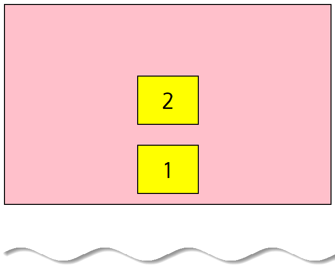
To arrange flexbox items in a column bottom-to-top, we can use the flex-direction: column-reverse; property.
  <body>
    <div class="flex-container">
      <div>1</div>
      <div>2</div>
    </div>
  </body>
.flex-container {
display: flex;
align-items: center;
flex-direction: column-reverse;
background-color: pink;
border: 2px solid #000;
height: 400px;
}
Instead of flex-direction, we can choose the shorter flex-flow property to apply those values:
.flex-container {
  flex-flow: row-reverse wrap;
}
.flex-container {
flex-flow: column-reverse nowrap;
}The wrap-reverse property
There is also the flex-wrap: wrap-reverse; property that allows wrapping flexbox items onto multiple lines from bottom-to-top.
<body>
    <div class="flex-container">
      <div>1</div>
      <div>2</div>
      <div>3</div>
      <div>4</div>
      <div>5</div>
      <div>6</div>
      <div>7</div>
      <div>8</div>
    </div>
</body>
.flex-container {
display: flex;
align-items: center;
flex-wrap: wrap-reverse;
background-color: pink;
border: 2px solid #000;
height: 400px;
}
How to make the elements Grow or Shrink
The flexibility of flexbox items is determined by the flex-basis, flex-grow, and flex-shrink properties.
The flex-grow property
Default value: flex-grow: 0
The flex-grow property applies to individual flexbox items and defines the ability of a flexbox item to grow. It dictates what amount of the available space inside the flexbox container the item should take up.
The
flex-growproperty gives a flexbox item the ability to grow relative to the rest of the flexbox items in the flexbox container.
It accepts a unitless value that serves as a proportion. The default value is 0. Negative numbers are invalid.
For example, if all flexbox items have flex-grow set to 1, the remaining space in the flexbox container will be distributed equally to each flexbox item.
If one of the children has a value of 2, the remaining space would (attempt to) take up double the space of the others.
<body>
    <div class="flex-container">
      <div style="flex-grow: 2">1</div>
      <div style="flex-grow: 1">2</div>
      <div style="flex-grow: 1">3</div>
    </div>
</body>
.flex-container {
display: flex;
align-items: center;
background-color: pink;
border: 2px solid #000;
height: 200px;
}
The flex-shrink property
Default value: flex-shrink: 1
The flex-shrink property applies to the flexbox items and indicates how much each element will be reduced if there is not enough available space.
It accepts a unitless value that serves as a proportion. The default value is 1. The value 0 allows keeping the item’s original size. Negative numbers are invalid.
For example, we might not want the second flexbox item to shrink as much as the others:
<body>
    <div class="flex-container">
      <div>1</div>
      <div style="flex-shrink: 0">2</div>
      <div>3</div>
      <div>4</div>
      <div>5</div>
      <div>6</div>
    </div>
</body>
.flex-container {
display: flex;
align-items: center;
background-color: pink;
border: 2px solid #000;
height: 200px;
}
💡 Note
The flex-shrink property won’t work if the flexbox container has the flex-wrap: wrap; property.
The flex-basis property
Default value: flex-basis: auto
The flex-basis property defines the default size of the flexbox item before the available space is distributed. You can set an absolute/relative value (e. g. 200px or 10em), a percentage value (e. g. 50%) or a keyword (auto, content).
The flex-basis property can be interpreted as the minimum width of the flexbox item. If you specify a flex-basis value, it will set the width for the specific flexbox item, but depending on other flexbox parameters the flexbox item may become wider (or narrower) than the flex-basis value.
The default value is auto. It retrieves the value of the width property. And the content value is based on the flexbox item’s content.
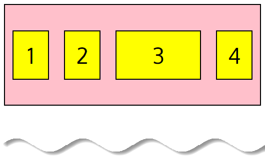
For example, let’s set the initial length of the third item to 300px:
 <body>
    <div class="flex-container">
      <div>1</div>
      <div>2</div>
      <div style="flex-basis: 300px">3</div>
      <div>4</div>
    </div>
</body>
.flex-container {
display: flex;
align-items: center;
background-color: pink;
border: 2px solid #000;
height: 200px;
}
💡 Note
If you do not set a flex-basis value and set the flex-grow value to 0, the element will be compressed to its minimum size.
flex (shorthand)
The flex property is shorthand for flex-grow, flex-shrink, and flex-basis combined. The second and third parameters (flex-shrink and flex-basis) are optional, with the default being 0 1 auto.
The
flexproperty is the shorthand forflex-grow,flex-shrink, andflex-basiscombined.
It may have several values:
flex-growflex-shrinkflex-basis: values of the three properties combinednone: same as0 0 auto(makes the flexbox items fully inflexible)initial: same as0 1 auto(the default value; it is based on the width and height properties)auto: same as1 1 auto(it is based on the width and height properties, but makes the flexbox items fully flexible)<positive number>: same as<positive number> 1 0(makes the flexbox item flexible and sets the flex basis to zero)
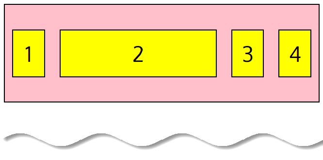
For example, let’s make the second flexbox item not growable (0), not shrinkable (0), and give it an initial length of 300px:
 <body>
    <div class="flex-container">
      <div>1</div>
      <div style="flex: 0 0 300px">2</div>
      <div>3</div>
      <div>4</div>
    </div>
 </body>
.flex-container {
display: flex;
align-items: center;
background-color: pink;
border: 2px solid #000;
height: 200px;
}
💡 Note
You can make one flexbox item flexible by applying the flex: 1; property and make other ones static by applying flex: initial; width: 300px; (or another value for the fixed width).
For example, flex: 1 1 300px; is identical to the code below:
flex-grow: 1;
flex-shrink: 1;
flex-basis: 300px;
And flex: 1; is identical to the code below:
flex-grow: 1;
flex-shrink: 1;
flex-basis: 0%;
In the example above, the width of a flexbox item will not be defined by its content but by the flex-grow property.
You can use this trick from flexbox layout to make the footer stick to the bottom of the page, see the code below.
body {
  display: flex;
  flex-direction: column;
  min-height: 100vh;
}

main {
  flex: 1;
}
Flexbox layout Checklist
- Create a flexbox container (e. g.
div.container) and put flexbox items inside (e. g.div.item). - Apply
display: flex;to the container. - Set
flex-flow: row wrap;orflex-flow: column nowrap;for the.container. - To determine the horizontal alignment, use the
justify-contentproperty (flex-start,center,flex-end,space-around,space-between). - To determine the vertical alignment, use the
align-itemsproperty (flex-start,center,flex-end,stretch,baseline). To align individual items vertically, usealign-self(flex-start,center,flex-end,stretch,baseline). - To change the order of the flexbox items, apply the
orderproperty orflex-direction: row-reverse;orflex-direction: column-reverse;. - To make one element wider than the other one inside the container (for example, to make it twice as wide), apply
flex: 2;to one element andflex: 1;to the others.
Flexbox playground
Here’s are few flexbox playground where you can play with the different flexbox properties and explore the power of the flexbox layout.
- Flexbox cheatsheet by Yoksel
- Flexbox cheatsheet by Malven.co
- Flexbox cheatsheet by Joy Shaheb
- Flexplorer lets you create complicated layouts using a very simple interface
- Test CSS Flexbox Rules will demonstrate the effects that each property can have on a given layout
- Flexbox Tester lets you play with settings for each item in a layout and displays the pixel width of items as you make changes
- Flexbox Cheatsheet – A neat PDF cheatsheet for download, with grapes, pears, and oranges
- Flexbox30 – Learn Flexbox with 30 Code Tidbits
- Flexbox Playground is a colorful way to learn about the power of Flexbox layout properties
Resource & Further Reading
- MDN – Basic concepts of flexbox
- Codrops – Flexbox CSS Reference
- CSS Tricks – Guide to Flexbox
Zoe Mickley Gillenwater has also given a great talk at the SmashingConf, called Leveling Up With Flexbox. Her presentation features a lot of practical use cases for flexbox. The examples shown and explained in her slides are definitely worth checking out.
Conclusion
Flexbox is a powerful new layout mode that will revolutionize layout for websites. As you can also see, it requires a whole new way of thinking.
Hence, flexbox is a great tool for making a robust layout. It can be best used with:
- Scalling horizontally.
- Scalling vertically.
- Re-ordering elements.
- Flexible designs.
and at last but not least, the problem of vertical positioning is completely solved by flexbox layout.
Hopefully this article has prepared you to start making websites with flexbox. Please feel free to ask questions in the comments.


Add comment