
“Everything in CSS is a Box“, you have probably heard this multiple times before, but this is an important concept that every front-end developer should be aware of. Understanding these boxes is key to being able to create layouts with css, or to align items with other items.
CSS Box model is the primary means of layout for everything on the web.
In this article, we will take a proper look at the css box model so that you can build more complex layout tasks with an understanding of how it works and the terminology that relates to it.
Then, let’s see what the mysterious css box model is all about!
What is Box model?
Every element that can be displayed on a web page is comprised of one or more rectangular boxes. CSS box model typically describes how these rectangular boxes are laid out on a web page.
💡 Note
CSS box model is essentially a box that wraps around every HTML element and CSS determines the position, size and properties (color, border size, background, etc.) of these boxes.
These boxes can have different properties and can interact with each other in different ways, but every box has a content area and optional surrounding padding, border, and margin areas.
Box model is the basic building block of CSS.
In a nutshell, when we say box it means that it has content, padding, border and margin. So, a box is made up of four properties. The image below illustrates it all:
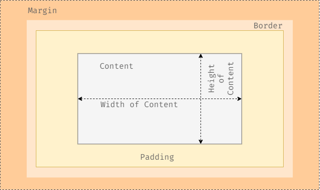
The image above shows a graphical representation of the box model. The part in the center, labeled ‘Content’, is where the text will be displayed that is put inside the HTML tag.
The next layer shows the padding, this is spacing between the content and the border. Outside the border of the element is the margin, this is an additional spacing between other elements in the HTML document.
Using the padding or the margin depends on where you want the spacing to be, inside or outside the border. You can also use both the padding and margin in one element, they can be used in conjunction or independently.
✨ Interesting facts
Now that you know everything is a box, you might think of a box as something that comes from Amazon and arrives on your door step. Inside the box is a cool gadget (the content), likely surrounded by some protective padding (the padding). Perhaps two boxes were delivered and they are side by side with a little space in between them. This is the margin. This is kind of like the CSS Box model, isn’t it?
Now we are going to cover each element of the box model in details.
The structure of the Box model
As mentioned above, the structure of the box model consists of:
- Content
- Padding
- Border
- Margin
These are all the elements the browser needs in order to render a box model and with CSS you can control each of them individually. Let’s see how.
Content
The content is pretty clear. It represents the content of your element that has a specific width and height. Of course this may be simple text, images, or other types of media.
The content box is where you will see your content. This is what gets affected when you set an element’s width and height.
A fixed height and width can be set using the height and width of CSS properties, or they can be determined by the content itself.
Example:
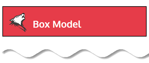
  <body>
    <h1>Box Model</h1>
  </body>
h1 {
background-color: #e63c49;
color: #ffffff;
}
In the above example, we have text, background color and text color attached to our content area through CSS.
Padding
Now it’s time for the padding.
Padding is the second area around the content area. It defines the space between the border and content of an element. Padding is an important concept in box model because it helps make content more visible and readable.
Padding is transparent so it will allow background colors to be visible if there are any.
The padding property is used to provide spacing directly outside the content. Let’s see it in action.
Example:
  <body>
    <h1>Box Model</h1>
  </body>
h1 {
background-color: #e63c49;
color: #ffffff;
padding: 20px;
}
If you are using a background css property for the element, the background will extend into the padding area.
As demonstrated, you can see how padding affects the overall look of the box. There is space of 20px between the content and edge of the box on all four sides. You can also add padding to every side individually, using padding-top, padding-bottom, padding-left, padding-right or the shorthand property padding only.
✨ Interesting facts
The padding box is essentially an extension of the content box but the content itself leak onto the padding box. The thickness of the padding is added to the width and height of the content.
But remember, you can’t use negative values for padding. Padding properties can be defined with one of three value types:
- length — A numeric value expressed as an absolute or relative length unit such as
px,em, orrem - % — A value expressed in terms of the percentage of the containing element
- inherit — The padding will be inherited from the parent element
Padding is ideal for cases where you want to extend the border away from the element or if you want to give space between the background color of an element and the content inside.
Border
Border is the third area around the padding box. This creates a border around the element and its padding. You can set thickness, color and style of the border.
The border requires three values for this: width, style, and color. Shorthand values for the border property are stated in that order—width, style, color. In longhand, these three values can be broken up into the border-width, border-style, and border-color properties.
💡 Border Properties
border-width : It controls the thickness of the borderborder-style : It controls the line style – dashed, solid etc. border-color : It controls the color of the border
Border can have different appearances. The common styles are solid, double, dashed, dotted, and none. However, there are several other styling choices you can choose from.
Here is an example code for a 2px wide, solid, black border that wraps around all four sides.
<body>
    <h1>Box Model</h1>
</body>
h1 {
background-color: #e63c49;
color: #ffffff;
padding: 20px;
border: 2px solid #000000;
}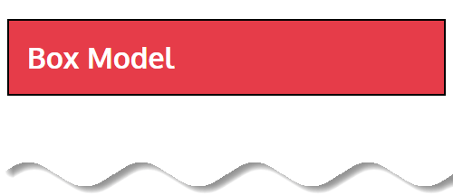
The border surrounds the content and padding. It may be set to dotted, dashed, solid, double, groove, ridge, inset, outset, none, or hidden. It may also have rounded corners if you like. The key thing to remember is that the border is between the element’s padding and margin and is typically opaque to cover any background color that may be present.
Border properties in CSS
As we mentioned earlier borders draw a line between the margin and padding of each sides of the box. There are three properties of a border which we can change. They are border-width, border-style, and border-color.
The following sections examine how each of the respective css properties can be used to affect borders.
Border Width (border-width)
The border-width property allows you to specify the width of the border area surrounded by the padding area of the box. You can specify the width in absolutes or relative units.
There are also several pre-defined values that define the border width: thin, medium, and thick. For example, border-width: thick; makes a thicker border.
You can also individually control the border width in each sides of the box using the following properties:
border-top-widthborder-right-widthborder-bottom-widthborder-left-width
Border Style (border-style)
The border style property is used to specify the line style of the border. There are 12 different types of predefined border styles and they are: none, hidden, dotted, dashed, solid, double, groove, ridge, inset, outset, initial and inherit.
The following table shows the different types of border style:
| Value | Description | Output |
none | Default value. Specifies no border |  |
hidden | The same as “none“, except in border conflict resolution for table elements |  |
dotted | Specifies a dotted border |  |
dashed | Specifies a dashed border |  |
solid | Specifies a solid border |  |
double | Specifies a double border |  |
groove | Specifies a 3D grooved border. The effect depends on the border-color value |  |
ridge | Specifies a 3D ridged border. The effect depends on the border-color value |  |
inset | Specifies a 3D inset border. The effect depends on the border-color value |  |
outset | Specifies a 3D outset border. The effect depends on the border-color value |  |
initial | Sets this property to its default value. i.e. The initial keyword is used to set a CSS property to its default value. | -NA- |
inherit | Inherits this property from its parent element. i.e. The inherit keyword specifies that a property should inherit its value from its parent element. | -NA- |
No other border properties will take effect unless the border-style property has been set
You can also individually control the top, right, bottom, and left borders style of a box using the following properties:
border-top-styleborder-right-styleborder-bottom-styleborder-left-style
If you prefer go by shorthand then try using – border-top, border-right, border-bottom, and border-left.
Border Color ( border-color)
The border color property indicate which color a border should be. You can specify Color keywords(eg: blue, red) , Color hexadecimal(eg: #ff0000) values and Color decimal (RGB or RGBA) or percentage (HSL or HSLA) values to specify colors in the border color properties.
Additionally, you can use border-colour: transparent; if you want to use a transparent border (sounds weird, but it can come in handy if you want the space for a border but don’t want an actual line showing).
You can also individually control the border color in each sides of the box using the following properties:
border-top-colorborder-right-colorborder-bottom-colorborder-left-color
Border Radius
While we are looking at borders and their different properties, we need to examine the border-radius property, which allows you to create cool effects and rounded corners on your boxes.
💡 Note
When considering the order in which multiple values are applied to the border-radius property (as well as the margin and padding properties), remember that they move in a clockwise fashion starting at the top left of an element.
Lets see few examples:
border-radius (with four values):
<div class="border-box">border-radius</div>
.border-box {
  width: 20%;
  padding: 30px;
  font-size: 30px;
  background-color: #4caf50;
  color: #ffffff;
  border-radius: 15px 30px 30px 15px;
}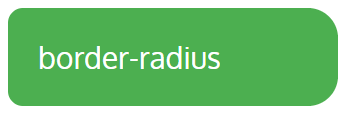
Here, first value applies to top-left corner, second value applies to top-right corner, third value applies to bottom-right corner, and fourth value applies to bottom-left corner.
border-radius (with three values):
<div class="border-box">border-radius</div>
.border-box {
  width: 20%;
  padding: 30px;
  font-size: 30px;
  background-color: #4caf50;
  color: #ffffff;
  border-radius: 15px 50px 30px;
}
Here, first value applies to top-left corner, second value applies to top-right and bottom-left corners, and third value applies to bottom-right corner.
border-radius (with two values):
<div class="border-box">border-radius</div>
.border-box {
  width: 20%;
  padding: 30px;
  font-size: 30px;
  background-color: #4caf50;
  color: #ffffff;
  border-radius: 15px 50px;
}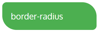
Here, first value applies to top-left and bottom-right corners, and the second value applies to top-right and bottom-left corners.
border-radius (with one value):
<div class="border-box">border-radius</div>
.border-box {
  width: 20%;
  padding: 30px;
  font-size: 30px;
  background-color: #4caf50;
  color: #ffffff;
  border-radius: 15px;
}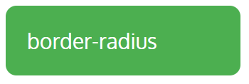
Here, the value applies to all four corners, which are rounded equally.
You can also use the individual border-top-left-radius, border-top-right-radius, border-bottom-right-radius, and border-bottom-left-radius properties.
Margin
Now we are ready to talk about the margin property. Margin is the fourth area around the border area. Where padding defines the space inside an element, between its content and the border, margins define the space around the outside of an element.
In other words, margins are the spaces outside of the element’s border and provides some space between elements on the page.
The CSS margin properties are used to create space around elements, outside of any defined borders.
Interestingly margin is completely invisible. Margin has no background color, and will not obstruct elements behind it. You will only see margin if you apply color to it.
We can also individually control the top, right, bottom, and left margin of a box using the following properties:
margin-topmargin-rightmargin-bottommargin-left
The CSS margin property can be given a negative value for interesting placement techniques or be set to
autofor automatic margins.
💡 Note
❶ There is no margin color property.
❷ By default, when parent element has background color then the same color applies to child element margin also else no background color applies.
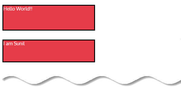
Here’s an example of the margin property in action:
  <body>
    <h1><img src="https://i.ibb.co/zQnL1sB/logo-25-01-2021.png" />Box Model</h1>
  </body>
h1 {
background-color: #e63c49;
color: #ffffff;
padding: 20px;
border: 2px solid #000000;
}
img {
margin-right: 20px;
margin-bottom: -15px;
}
In the above example, we have applied margin-right: 20px and margin-bottom: -15px to the image.
It is important to reiterate, Everything in CSS is a Box. Here we have total two elements <h1> and <img> so that we have two boxes.

The best way to demonstrate this in a practical example is to show you how two elements are positioned with and without margins.
<body>
    <div class="box">Box 1</div>
    <div class="box">Box 2</div>
</body>
.box {
height: 100px;
width: 100px;
background-color: #e63c49;
color: #fff;
padding: 10px;
border: solid 3px black;
margin: 0;
}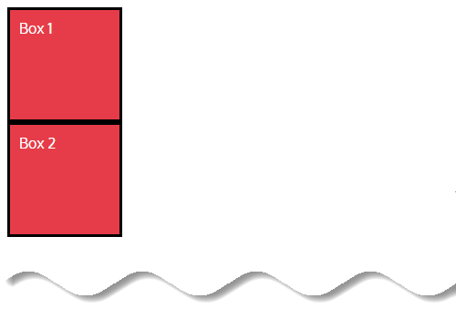
In this example, you can see how, without margin, two elements stick together and there is no space between them.
Now, let’s add some margin.
Margin is perfect for “pushing” your element away from other elements. For example when you got a
<p>element that you need to move a bit away from other<p>elements, just a bit whitespace to make our paragraph visually pleasing.
.box {
  height: 100px;
  width: 100px;
  background-color: #e63c49;
  color: #fff;
  padding: 10px;
  border: solid 3px black;
  margin: 20px;
}
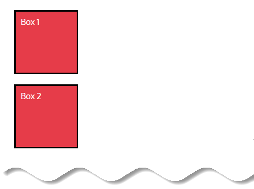
Now, this looks better. We added some space between the boxes.
💡 Note
Margin properties work exactly like padding properties. You have the individual properties and the shorthand property, and they work in the exact same way:margin-top: the top marginmargin-bottom: the bottom marginmargin-left: the left marginmargin-right: the right marginmargin: shorthand property for all four margins. Can take one, two, three, or four values.
If the shorthand property is used, and only one value is defined, then it applies to all sides of the element. If two values are defined, then the first value represents the top and bottom margins and the second represents the right and left margins.
If three values are defined, the first value represents the top margin, the second represents the left and right, and the third represents the bottom margin. If four values are defined, they represent the top, right, bottom, and left, respectively.
Now you might realize that margins and padding seem similar. In case you get confused what the right option is for a certain element or layout, consider the following key differences between CSS margin and padding:
- Margin is the space outside of the border area, whereas padding is the space inside the border area.
- Margin backgrounds are always transparent, whereas the background of the padding area of a box is specified by the background property of the element.
- When increased, margins increase the gap between an element and any adjacent elements. When increased, padding increases the size of the element.
- In CSS, adjoining margins of two or more boxes can combine to form a single “collapsed” margin. While margin areas can collapse vertically, padding areas cannot.
🤔 Padding Vs Margin
It can be easy to confuse padding and margin as they both give the effect of adding space. But where are these properties adding space?
One tip to help remember which is, if you find yourself saying “I need more background”, then likely you need some padding. Padding allows the background color through. If you feel you need space between boxes, then that is when margin comes into play.
Margin is outside of the border, while padding is inside of the border.
One oddity with the margin property is that, under certain circumstances margin collapsing occurs and the margins between adjacent elements may be shared. Lets discuss it next.
CSS Collapsing margins (Auto collapse)
As we have discussed, a big difference between padding and margin is that margins will auto collapse.
In other words the top and bottom margins of blocks can overlap into a single margin area where the size is the largest of the individual margins. If they are the same margin value on each element, then that value is used: they are not added together.
Top and bottom margins of elements are sometimes collapsed into a single margin that is equal to the largest of the two margins. This is called margins collapse or auto collapse of margins.
Let’s get one thing clear here. Only one type of margin can collapse: Vertical (top and bottom). Margin collapse never applies to horizontal (left and right) margins.
Now look at a visual example how CSS margins collapse occurs before jump into real coding example:
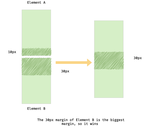
Element A has a bottom margin of 10px. Element B has a top margin of 30px. 30px is the bigger margin, so the resulting margin between the two elements is 30px. (Note: If the margins of Element A and Element B were the same, say 30px each, the resulting margin would be 30px).
Lets understand this concept more with an example:
  <body>
    <p>Line one</p>
    <div>Line Two</div>
  </body>
p {
height: 80px;
margin-bottom: 20px;
border: solid 3px black;
background-color: #e63c49;
color: #ffffff;
width: 300px;
}
div {
height: 70px;
margin-top: 30px;
border: solid 3px black;
background-color: #e63c49;
color: #ffffff;
width: 300px;
}
In the above example, bottom margin 20px is applied to <p> element and top margin 30px is applied to <div> element. Since margin collapse happened, only margin 30px is applied in between <p> and <div> elements not 50px is applied.
CSS auto margin
We often set margin property with value auto to block level element which helps to horizontally center the block level element (not text inside the element). That means;
When you have specified a width on the object that you have applied margin:0 auto to, the object will sit centrally within it’s parent container.
You can use
margin: 0 autoto horizontally center an element’s content. Be aware that the element needs to have awidthspecified for this to work.
Specifying auto as the second parameter basically tells the browser to automatically determine the left and right margins itself, which it does by setting them equally.
It guarantees that the left and right margins will be set to the same size. The first parameter 0 indicates that the top and bottom margins will both be set to 0.
margin-top:0;
margin-bottom:0;
margin-left:auto;
margin-right:auto;
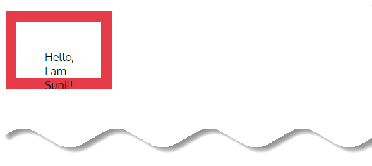
Let’s understand this concept through an example;
<body>
    <p>Hello Sunil!</p>
</body>
p {
width: 600px;
margin: 0 auto;
background-color: #e63c49;
color: #ffffff;
}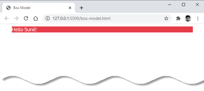
In the above example,
Here, margin top (margin-top:0;) and margin bottom (margin-bottom:0;) values set to 0. Margin right (margin-right:auto) and margin left (margin-left:auto) values set to auto.
And finally, <p> element width is set to 600px. So that <p> element is centered based on remaining available space.
All is good but the only problem occurs when the browser window is narrower than the width of our element. The browser resolves this by creating a horizontal scrollbar on the page.
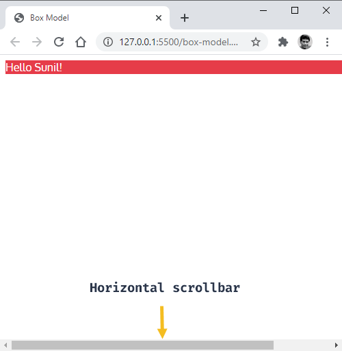
Let’s improve the situation by adding max-width of 600px.
p {
  max-width: 600px;
  margin: 0 auto;
  background-color: #e63c49;
  color: #ffffff;
}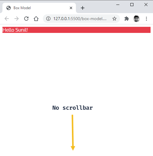
Using max-width instead of width in this situation will improve the browser’s handling of small windows. This is important when making a site usable on mobile devices.
💡 Margin & Padding Colors
The margin and padding properties are completely transparent and do not accept any color values. Being transparent, though, they show the background colors of relative elements.
For margins, we see the background color of the parent element, and for padding, we see the background color of the element the padding is applied to.
Few things to remember when using auto margin:
- Auto margin can be applied only to block-level elements
- Using
margin:0 autoproperty, element can horizontally only centered - Auto margin property can not be applied to inline elements
- Auto margin property can not be applied to absolutely positioned block-level elements (ex:
position:absolute;) - Auto margin property can not be applied to float property with value left/right (ex:
float:left;) applied block-level elements
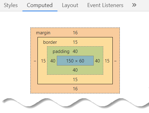
How to calculate the element total width and height
Usually when you set the width and height of an element using the CSS width and height properties, in reality you are only setting the width and height of the content area of that element. The actual width and height of the element’s box depends on the several factors.
Using below example, let us see how to calculate an element height and width.
<body>
    <p>Hello, I am Sunil!</p>
</body>
p {
width: 150px;
height: 60px;
padding: 40px;
border: 15px solid #e63c49;
margin: 20px;
}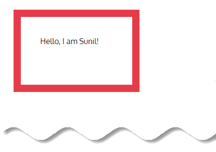
The actual space that an element’s box might take on a web page is calculated like this:
Total Width = width + padding-left + padding-right + border-left + border-right + margin-left + margin-right
According to our example:
Total width = 150px (content width) + 40px (padding left) + 40px (padding right) + 15px (border left) + 15px (border right) + 20px (margin left) + 20px (margin right) = 300px.
Total Height = height + padding-top + padding-bottom + border-top + border-bottom + margin-top + margin-bottom
According to our example:
Total height = 60px (content height) + 40px (padding top) + 40px (padding bottom) + 15px (border top) + 15px (border bottom) + 20px (margin top) + 20px (margin bottom) = 210px.
The alternative box model – box-sizing
We mentioned that the padding adds to the width and height of the content area. But what if you want to set the height and width of the element while taking padding and border width into account?
The answer is – box-sizing
The box-sizing property defines how to calculate the total width and height of an element. We can adjust box-sizing property using these two values :
box-sizing: content-box;
box-sizing: border-box;
content-box
The way the content-box property works is, you specify the width and height for an element, any further additions to the box of any element will be added to its width and height. For example,
The content-box is the model that browsers use by default, and it is the less desirable one.
<body>
    <p>Hello, I am Sunil!</p>
</body>
p {
box-sizing: content-box;
width: 150px;
height: 60px;
padding: 40px;
border: 15px solid #e63c49;
}
We have specified the width of the <p> element to take up 150px but with the content box property, <p> element will take up a width of 260px instead.
That is, any further additions via padding or border will be added to the element’s width to make up the actual space it would take up on the users screen.
Notice that with content-box the element ends up taller and wider than the specified dimensions because the border and padding fall outside of those dimensions.
border-box
The border-box property on the other hand, takes the specified width and height as the total space an element will take up on the users screen, regardless of how much padding or border is added to the element.
border-box: The padding and border are included in the width and height.
In other words, when you set box-sizing: border-box; on an element, the padding and border of that element no longer increase its width, which is just opposite of content-box property.
For example,
<body>
    <p>Hello, I am Sunil!</p>
</body>
p {
box-sizing: border-box;
width: 150px;
height: 60px;
padding: 40px;
border: 15px solid #e63c49;
}
Here we have set an element’s width to 150px, that 150px will include any border or padding we added, and the content area will shrink to absorb that extra width.
🤔 What now? – content-box or border-box
Should you use content-box or border-box?
We recommends to use border-box, because it removes the uncertainties when sizing. It makes sure that if you set your element to have certain dimensions, it’ll stay as such.
But interestingly, the margin in both properties(content-box or border-box) doesn’t get subtracted from the specified width or height. So for example, if we write,
div {
  box-sizing: border-box;
  width: 200px;
  margin: 50px;
}
div {
  box-sizing: content-box;
  width: 200px;
  margin: 50px;
}
Both do the same thing, there is no difference in what is translated to the screen.
The content-box property can get confusing and requires you to always keep paddings and border values applied to elements. With the border-box property you are guaranteed that whatever width you specify would remain the same regardless of the padding and border, which is easier to remember.
Rather than specifying the box-sizing property for every element, you would usually find this snippet in most CSS projects.
*, *::before, *::after {
  box-sizing: border-box;
}
This effectively causes every element on the page to use the border-box property and also applies it to the before and after pseudo-elements.
If the
box-sizingproperty is set toborder-box, you can also define the border size withmin-width,max-width,min-height, andmax-height.
Beyond the box model
In addition to margin, padding, and border, there are a couple of CSS properties that, in our opinion, should be included when talking about the box model: box-shadow and outline.
Neither of them occupies space within the box, but they are visible, they are boxes, and their positioning/size highly depend on the specific areas from the box-model.
CSS Box model tips
Tip #1: If no padding is declared, then browser specific default padding is applied to an element. Default padding is mostly 0 or very negligible amount.
p {
    /*padding:10px;*/
    border:1px solid red;
    margin:20px;
   }
Tip #2: If no margin is declared, then browser specific default margin is applied to an element. Default margin is mostly 0 or very negligible amount.
p {
    padding:10px;
    border:1px solid red;
    /*margin:20px;*/
   }
Tip #3: If no border style is specified, then no border style (border-style:none) is applied to an element by default.
p {
    padding:10px;
    /*border:1px solid red;*/
    margin:20px;
   }
Tip #4: If no width is specified to block-level element, then block-level element takes 100% width by default.
p {
border:1px solid red;
/*width:150px;*/
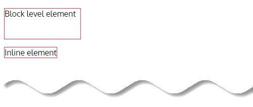
}Tip #5: Block-level element and inline element take only required height space based on content size by default.
Tip #6: Inline element takes only required width based on content size.
Tip #7: width and height properties are not applicable to inline elements but applicable to block-level elements.
  <body>
    <p>Block level element</p>
    <span>Inline element</span>
  </body>
p {
border: 1px solid #e63c49;
width: 150px;
height: 60px;
}
span {
border: 1px solid #e63c49;
width: 150px; /*Not applicable*/
height: 60px; /*Not applicable*/
}
Tip #8: There is no direct way to apply color to element’s margin space.
Tip #9: Parent element background color is applied to child element margin space by default.
Tip #10: When apply a background color to a parent element then by default the same background color applies to child element’s content, padding and margin also.
<body>
    <div>
      DIV element
      <p>P element</p>
    </div>
</body>
div {
background-color: #FFA500;
height: 100px;
width: 250px;
border: 1px solid red;
margin: 20px;
}
p {
height: 50px;
width: 100px;
border: 1px solid green;
margin: 20px;
}
Tip #11: When apply a background color to an element, the same color also applies to padding space but not to margin space.
<body>
    <div>DIV element</div>
</body>
div {
background-color:orange;
height:50px;
width:250px;
border:1px solid red;
margin:30px;
}Here margin is still transparent.

Resources & Further reading
Conclusion
The CSS box model is one of the fundamentals of website development. Understanding this model will enable you to better align elements with other elements and create more complex layouts.
You have made it to the end of this article, congrats!
So, what did you learn?
- Every element on a web page is basically a box.
- The aspects of the box model are content, padding, border and margin.
- When using an inline element you can’t set a fixed width or height for that element, while it is possible with a block and inline-block element.
Hopefully, this helped you learn something new or refreshed your memory.
If you have questions, comments or suggestions, please drop them in the comment section.
Thanks for reading!


Add comment