
Naming things are always difficult in the programming world, and CSS is not far from it. Some developers don’t pay that much attention to naming. They claim that there isn’t enough time on thinking about which name to give each class in CSS.
That may be right, but in the long run low quality code consumes much more time.
So there are different approaches to solve the naming problem in CSS, and one of them is BEM (Block-Element-Modifier).
In this article, we will have a closer look at what BEM is and how to structure your CSS code with BEM. Then, without further a due, let’s start learning BEM.
What is BEM?
When you are building smaller websites, how you organize your styles is usually not a big problem. You create your usual files, write all the needed CSS, and that’s all.
However, when it comes to larger, more complex projects, how you organize your code becomes crucial. How the code is structured is even more important if you are working in a team consisting of multiple front-end and back-end developers.
Today, there are plenty of methodologies with the aim of reducing CSS code and one of them is BEM. BEM stands for Block-Element-Modifier.
💡 Quick Fact
The best practice is to use BEM only with classes, and not IDs because classes allow you to repeat names if necessary and create more consistent coding structure.
The main idea behind it is to speed up the development process, and ease the teamwork of developers by arranging CSS classes into independent modules or components.
A class name in BEM follows the following syntax:
.block__element--modifier
Lets understand BEM concept with an easy example.
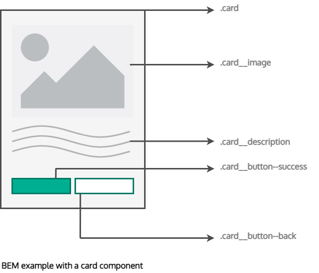
Let’s say we want to build a card component. The block would be .card. Then any sections within card would be elements. So in this example, we have image, description, button.
BEM naming convention connects block and element with two underscores, example- card__image. Finally, we have two different types of buttons, success and back.
We call these modifiers and we connect them with our element with two dashes, for example .card__button--success.
.card {}
.card__image {}
.card__description {}
.card__button--success{}
.card__button--back {}
Also, if you want to break your website into organized modules as shown above, it should consist of the same structure: Block, Element, and Modifier.
Where each block can have multiple elements, and both block and elements can have multiple modifiers.
💡 BEM helps to solve the following tasks:
➊ Reuse the layout
➋ Create stable, predictable and clear code
➌ Reduce the project debugging time
However, let’s first start with the basic BEM structure and explain it with an examples.
What is a Block in BEM?
Blocks are independent, reusable and usually bigger components of a webpage. They can have modifiers and contain elements.
When naming your blocks, focus on describing its purpose (i.e. what it is) rather than its state (i.e. what it looks like).
For example, .btn or .nav follows the correct naming convention for a block.
.big or .bright-pink describes how it looks, so it doesn’t scale well when you want to change the design later on.
BEM methodology encourages front-end developers to think of a website as a collection of reusable component blocks, or perhaps confusingly, “block” here refers to the segments of HTML that make up a page or application.
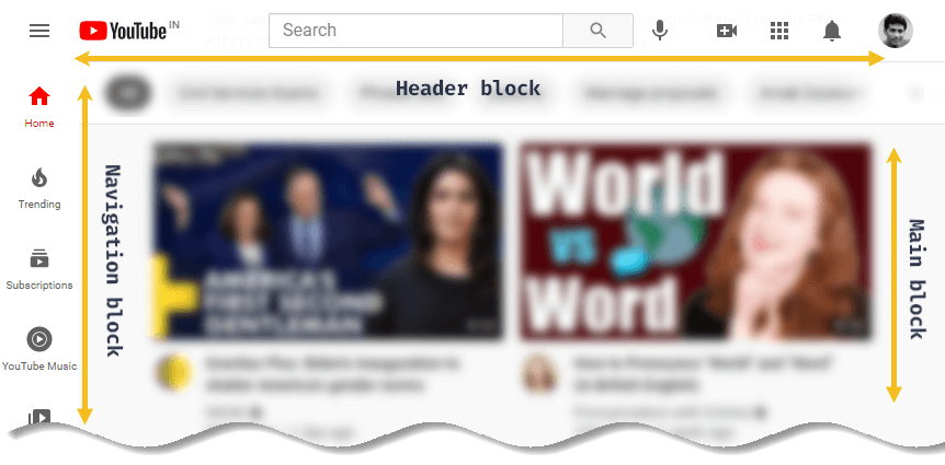
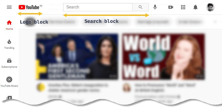
Blocks can also contain other blocks. For example, a header block might also contain logo, and search form blocks, as seen in below.
To see the full power of BEM naming, consider this example with a form. According to the BEM methodology, the form is implemented using the form block. In HTML, the block name is included in the class attribute:
<form class="form" action="/">
The block name is always unique. It sets the namespace for elements and provides a visible connection between the block parts.
and the CSS of this form will be:
.form { /* styles */ }
The reason BEM uses a .form class instead of the <form> element is because classes allow for infinite reusability, even if the fundamental element should change in style.
What is an Element in BEM?
Elements are children of blocks. An element can only have one parent block, and can’t exist independently which means if we remove the block then there will be no meaning left of the element.
An element is a component within the block that performs a particular function. It should only make sense in the context of its block.
The element name is connected with the block using two underscores like :
.block__element { /* styles */ }For example, using the .card component, an element inside the card component (like an image) would have a class name like .card__image.
Lets stretch the card component example further.
Here, __image, __title , __description and __button are all elements connected with the .card block.
 <body>
    <div class="card">
      <img class="card__image" src="…" />
      <h2 class="card__title">…</h2>
      <p class="card__description">…</p>
      <a class="card__button">…</a>
    </div>
</body>
.card { /* styles */ }
.card__image { /* styles */ }
.card__title { /* styles */ }
.card__description { /* styles */ }It’s also considered a best practice to use a BEM element class and use that directly in your CSS (e.g. .card__image {}) as this has a lower specificity. Still confused? Let’s take one more example to understand it more better way.
Must Read: What is CSS Specificity and How Does it Work?
Buttons are good examples of blocks that can contain different possible styles. If you set the background color of a <button> element to be red, all <buttons> are forced to inherit the red background. Following which, you have to fix your code by overwriting your <button> elements.
button {
  background-color: red;
}

.something button {
  background-color: blue;
}
If styled a button with a .button class instead, you can choose whether to use the .button class on any <button> elements.
Then, if you need a different background color, all you do is to change to a new class, say .button--secondary, and you are good to go!
.button {
  background-color: red;
}

.button--secondary {
  background-color: blue;
}
💡 Note
Using blocks and elements for class names solves an important problem: It helps you to get rid of nested selectors. All selectors in a BEM project have the same weight (lower specificity). That means it is much easier to redefine styles written according to BEM.
Now, to use the same component (in our case – card component) in another project, you can just copy its layout and styles.
This brings us to the next part of BEM — modifiers.
What is a Modifier in BEM?
Modifiers represent different states or styles of classes. They can be used both for blocks or elements.
A modifier acts like a flag that we can use on our blocks or elements to create a different version of them or to differentiate them with their regular version.
The modifier name is connected with the block or element like :
.block--modifier { /* styles */ }
.block__element--modifier { /* styles */ }
Let’s take a closer look at this.
For example, in our .card block, we might have a light or dark version. Or you might have primary and secondary buttons.
<div class="card card--dark">
    <img src="…">
    <h2 class="card__title card__title--large">…</h2>
    <p>…</p>
    <a>…</a>
</div>
.card { /* styles */ }
.card--dark { /* styles */ }
.card__title { /* styles */ }
.card__title--large { /* styles */ }❗ Important
A modifier defines the look, state and behavior of a block or an element. Adding modifiers is optional. However, modifiers let you combine different block features, as you can use any number of modifiers.
Again, a block or an element can’t be assigned different values of the same modifier.
One more important point to know, A modifier contains only additional styles that change the original block implementation in some way.
This allows you to set the appearance of a universal block only once, and add only those features that differ from the original block code into the modifier styles.
Lets see this example:
<form class="form form__type--original" action="/">
  <input class="form__search" name="s">
  <input class="form__submit" type="submit">
</form>
The line <form class="form form__type--original">....</form> indicates that the block is assigned a type modifier with the original value.
Now the form can have a unique color, size, type, or design theme. All these parameters can be set with a modifier:
<form class="form form__type--original form__size--m form__theme--forest"></form>
<form class="form form__type--original form__size--m form__theme--sun"></form>
But interestingly all the selectors for each modifier will still have the same weight:
.form__type--original { /* styles */ }
.form__size--m { /* styles */ }
.form__theme--forest { /* styles */ }
❗ Important
● Block names must be unique within a project
● Element names must be unique within a block
● Variations of a block—say, a search box with a dark background—should add a modifier to the class name
Summary of BEM naming conventions
The primary purpose of BEM methodology is to make names of CSS selectors as informative and transparent as possible. Original BEM style is defined in this way:
Block name is usually a single word like .header, but if you have longer block definition then it is divided with a single hyphen -:
.lang-switcher {/* Styles */}Element name starts with double underscore __:
.lang-switcher__flag {/* Styles */}Modifier name starts with double hyphen --:
.lang-switcher__flag--basic {/* Styles */}There is only one very critical rule in BEM methodology – a modifier cannot be used outside of the context of its owner.
A naming convention tells us how classes within a component relate to one another.
Beside these original BEM styles, there are alternative naming schemes available and they are as follows:
By Harry Roberts:
.block-name__element-name--modifier-name {/* Styles */}Rules:
- Names are written in lowercase
- Words within the names of BEM entities are separated by a hyphen (
-) - An element name is separated from a block name by a double underscore (
__) - Boolean modifiers are delimited by double hyphens (
--) - Key-value type modifiers are not used
CamelCase styles:
.BlockName__ElementName_ModifierName {/* Styles */}There are few others too, but these two are the most common ones.
BEM in Practice
Since you are now familiar with BEM naming conventions, hence it’s time to demonstrate BEM methodology in practice.
Example 1: Accordion demo (By CSS Tricks):
See the Pen BEM Accordion by CSS-Tricks (@css-tricks) on CodePen.
Example 2: Navigation demo (By CSS Tricks):
See the Pen BEM Menu by CSS-Tricks (@css-tricks) on CodePen.
👍 Benefits of BEM
- It provides a great structure to your CSS code which makes the code easy to read and understand.
- As BEM has a unique style to create CSS class names, we won’t run into conflicts with other class names.
- BEM follows a modular approach that helps to create independent components that can easily be reused in the same project or can also be used in another project.
- Class names are logical and intuitive in BEM, and every member of the team knows what that element does on the website. BEM gives everyone on a project a declarative syntax they can share so they are on the same page.
Conclusion
And that’s it! Those are the fundamentals to get you off and running with BEM.
In the end, we would highly recommend using BEM for your next project. At the start, it might feel like a lot of extra work to use such big class names for your CSS but all this extra work will definitely help you a lot as your project gets bigger and your future self will thank you for all the extra work you did.
Despite all this, there’s a lot of discussion on social networks about BEM. Some say BEM isn’t good, wondering why they should write such long name classes instead of just use default HTML nested elements. Well, no one says that you must like BEM, but the fact is that the majority of front-end developers embrace it and find it extraordinary useful.
To wrap things up we think it’s fair to say that even though BEM won’t solve all our problems it is extraordinarily useful for constructing scalable and maintainable interfaces where everyone on the team should have a clear idea of how things can be improved.
Well using BEM or not is up to you, your team and maybe depends on the project. What do you think? Would you prefer using BEM?


Add comment