
Lazy loading is a technique that defers loading of non-critical resources at page load time. Instead, these non-critical resources are loaded at the moment of need. Where images are concerned, “non-critical” is often synonymous with “off-screen”.
If you have used Lighthouse and examined some opportunities for improvement, you may have seen some guidance in this realm in the form of the Defer offscreen images audit:

One of Lighthouse’s performance audits is to identify off screen images, which are candidates for lazy loading.
An example of image lazy loading can be found on the popular publishing platform Medium, which loads lightweight placeholder images at page load, and replaces them with lazily-loaded images as they are scrolled into the viewport.
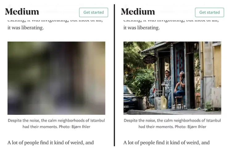
An example of image lazy loading in action. A placeholder image is loaded at page load (left), and when scrolled into the viewport, the final image loads at the time of need.
Why lazy-load images instead of just loading them?
Because it’s possible you are loading stuff the user may never see. This is problematic for a couple reasons:
- It wastes data.
- It wastes processing time, battery, and other system resources.
Lazy loading images and video reduces initial page load time, initial page weight, and system resource usage, all of which have positive impacts on performance.
Implementing Lazy Loading (HTML Way)
The concept of lazy loading is really helpful if you want your websites to load quickly. In HTML, we can use the attribute loading and set its value to lazy. This will automatically load images in a lazy fashion.
<html>
 <head>
 </head>
 <body>
   <div>
    <img src="photo.jpg"
         alt="img"
         loading="lazy" />
   </div>
 </body>
</html>
Picture element and lazy loading
Images that are defined using the <picture> element can also be lazy-loaded:
<picture>
  <source media="(min-width: 800px)" srcset="large.jpg 1x, larger.jpg 2x">
  <img src="photo.jpg" loading="lazy">
</picture>
Although a browser will decide which image to load from any of the <source> elements, the loading attribute only needs to be included to the fallback <img> element.
Avoid lazy loading images that are in the first visible viewport
You should avoid setting loading=lazy for any images that are in the first visible viewport. This is particularly relevant for LCP images.
Generally, any images within the viewport should be loaded eagerly using the browser’s defaults. You do not need to specify loading=eager for this to be the case for in-viewport images.
<!-- visible in the viewport -->
<img src="product-1.jpg" alt="..." width="200" height="200">
<img src="product-2.jpg" alt="..." width="200" height="200">
<img src="product-3.jpg" alt="..." width="200" height="200">

<!-- offscreen images -->
<img src="product-4.jpg" loading="lazy" alt="..." width="200" height="200">
<img src="product-5.jpg" loading="lazy" alt="..." width="200" height="200">
<img src="product-6.jpg" loading="lazy" alt="..." width="200" height="200">
Lazy loading CSS background images
While <img> tags are the most common way of using images on web pages, images can also be invoked via the CSS background-image property. Browser-level lazy loading does not apply to CSS background images, so we need to consider other methods if we have background images to lazy-load.
Unlike <img> elements which load regardless of their visibility, image loading behavior in CSS is done with more speculation.
This speculative behavior can be used to defer the loading of images in CSS by using JavaScript to determine when an element is within the viewport, and subsequently applying a class to that element that applies styling invoking a background image.
This causes the image to be downloaded at the time of need instead of at initial load. For example, let’s take an element that contains a large hero background image.
<div class="lazy-background">
  <h1>Here's a hero heading to get your attention!</h1>
  <p>Here's hero copy to convince you to buy a thing!</p>
  <a href="/buy-a-thing">Buy a thing!</a>
</div>
The div.lazy-background element would normally contain the hero background image invoked by some CSS.
In this lazy loading example, however, you can isolate the div.lazy-background element’s background-image property via a visible class added to the element when it’s in the viewport:
.lazy-background {
  background-image: url("hero-placeholder.jpg"); /* Placeholder image */
}

.lazy-background.visible {
  background-image: url("hero.jpg"); /* The final image */
}
From here, use JavaScript to check if the element is in the viewport (with Intersection Observer API), and add the visible class to the div.lazy-background element at that time, which loads the image:
document.addEventListener("DOMContentLoaded", function() {
  var lazyBackgrounds = [].slice.call(document.querySelectorAll(".lazy-background"));

  if ("IntersectionObserver" in window) {
    let lazyBackgroundObserver = new IntersectionObserver(function(entries, observer) {
      entries.forEach(function(entry) {
        if (entry.isIntersecting) {
          entry.target.classList.add("visible");
          lazyBackgroundObserver.unobserve(entry.target);
        }
      });
    });

    lazyBackgrounds.forEach(function(lazyBackground) {
      lazyBackgroundObserver.observe(lazyBackground);
    });
  }
});
Example:
See the Pen Lazy Loading CSS Background Images by Sunil Pradhan (@Sunil_Pradhan) on CodePen.
Best Practices
The best practice of setting dimensions applies to <img> tags regardless of whether or not they are being loaded lazily. With lazy loading, this can become more relevant.
Setting width and height on images in modern browsers also allows browsers to infer their intrinsic size.
In most scenarios images still lazy-load if dimensions are not included, but there are a few edge cases you should be aware of. Without width and height specified, image dimensions are 0×0 pixels at first.
If you have a gallery of such images, the browser may conclude that all of them fit inside the viewport at the start, as each takes up practically no space and no image is pushed offscreen.
In this case the browser determines that all of them are visible to the user and decides to load everything.
Hence, when using lazy-loading, you should specify the dimensions (width and height) because the browser does not know the dimension on lazy load initially. Without dimension, it is possible to have layout shifts in your site.
Lazy Loading for Video
As with image elements, you can also lazy-load video. How to lazy-load <video> depends on the use case, though. Let’s discuss a couple of scenarios that each require a different solution.
For video that doesn’t autoplay
For videos where playback is initiated by the user, specifying the preload attribute on the <video> element may be desirable:
<video controls preload="none" poster="one-does-not-simply-placeholder.jpg">
  <source src="one-does-not-simply.webm" type="video/webm">
  <source src="one-does-not-simply.mp4" type="video/mp4">
</video>
📣 Note
A video poster image can qualify as an LCP candidates. If your poster image is an LCP candidate, you should preload it with a fetchpriority attribute value of “high” so the user sees it as soon as possible.
The example above uses a preload attribute with a value of none to prevent browsers from preloading any video data. The poster attribute gives the <video> element a placeholder that will occupy the space while the video loads.
Unfortunately, it doesn’t prove useful when you want to use video in place of animated GIFs, which is covered next.
For video acting as an animated GIF replacement
Using the <video> element as a replacement for animated GIF is not as straightforward as the <img> element. Animated GIFs have three characteristics:
- They play automatically when loaded.
- They loop continuously.
- They don’t have an audio track.
Achieving this with the <video> element looks something like this:
<video autoplay muted loop playsinline>
  <source src="one-does-not-simply.webm" type="video/webm">
  <source src="one-does-not-simply.mp4" type="video/mp4">
</video>
The autoplay, muted, and loop attributes are self-explanatory. playsinline is necessary for autoplaying to occur in iOS. Now you have a serviceable video-as-GIF replacement that works across platforms. But how to go about lazy loading it? To start, modify your <video> markup accordingly:
<video class="lazy" autoplay muted loop playsinline width="610" height="254" poster="one-does-not-simply.jpg">
  <source data-src="one-does-not-simply.webm" type="video/webm">
  <source data-src="one-does-not-simply.mp4" type="video/mp4">
</video>
You will notice the addition of the poster attribute, which lets you specify a placeholder to occupy the <video> element’s space until the video is lazy-loaded.
You’ll notice the addition of the poster attribute, which lets you specify a placeholder to occupy the <video> element’s space until the video is lazy-loaded. As with the <img> lazy-loading the video URL in the data-src attribute on each <source> element.
From there, use JavaScript code similar to the Intersection Observer-based image lazy loading examples:
document.addEventListener("DOMContentLoaded", function() {
  var lazyVideos = [].slice.call(document.querySelectorAll("video.lazy"));

  if ("IntersectionObserver" in window) {
    var lazyVideoObserver = new IntersectionObserver(function(entries, observer) {
      entries.forEach(function(video) {
        if (video.isIntersecting) {
          for (var source in video.target.children) {
            var videoSource = video.target.children[source];
            if (typeof videoSource.tagName === "string" && videoSource.tagName === "SOURCE") {
              videoSource.src = videoSource.dataset.src;
            }
          }

          video.target.load();
          video.target.classList.remove("lazy");
          lazyVideoObserver.unobserve(video.target);
        }
      });
    });

    lazyVideos.forEach(function(lazyVideo) {
      lazyVideoObserver.observe(lazyVideo);
    });
  }
});
When you lazy-load a <video> element, you need to iterate through all of the child <source> elements and flip their data-src attributes to src attributes.
Once you have done that, you need to trigger loading of the video by calling the element’s load method, after which the media will begin playing automatically per the autoplay attribute.
Using this method, you have a video solution that emulates animated GIF behavior, but doesn’t incur the same intensive data usage as animated GIFs do, and you can lazy-load that content.
Lazy loading for iframes
Standardized lazy-loading of iframes defers offscreen iframes from being loaded until the user scrolls near them. This saves data, speeds up the loading of other parts of the page, and reduces memory usage.
<iframe src=https://example.com loading="lazy" width="600" height="400"></iframe>
If you need to dynamically create iframes via JavaScript, setting iframe.loading = 'lazy' on the element is recommended:
var iframe = document.createElement('iframe');
iframe.src = 'https://example.com';
iframe.loading = 'lazy';
document.body.appendChild(iframe);
Lazy-loading YouTube video embeds (Example)
<iframe src="https://www.youtube.com/embed/YJGCZCaIZkQ"
        loading="lazy"
        width="560"
        height="315"
        frameborder="0"
        allow="accelerometer; autoplay;
        encrypted-media; gyroscope;
        picture-in-picture"
        allowfullscreen>
</iframe>
Implementing lazy loading (JavaScript Way)
There are a lot of snippets and scripts out there that enable lazy-loading via JavaScript. In almost all cases a data attribute is used to prevent upfront image loading.
But how is the image loaded at all? To achieve this, one of the following two techniques is usually used.
Event listeners
This technique uses event listeners on the scroll, resize and orientationChange events in the browser.
If one of the mentioned events is fired and assuming the image enters the viewport the data-src attribute is replaced with the src attribute to trigger the loading call.
Example:
See the Pen Lazy loading images using event handlers – example code by ImageKit.io (@imagekit_io) on CodePen.
Intersection Observer API
Unlike the first method, the image is observed (asynchronously) by using the IntersectionObserver API. The image is then loaded by changing the data-src to src attribute as soon as it enters the viewport.
See the Pen Lazy loading images using IntersectionObserver – example code by ImageKit.io (@imagekit_io) on CodePen.
FAQs
Lazy Loading Library
Further Reading
- Browser-level image lazy loading for the web
- It’s time to lazy-load offscreen iframes!
- The Complete Guide to Lazy Loading Images
- Native lazy-loading (loading=lazy) not working even with flags enabled


Excellent guide on lazy loading images and videos! Implementing these tips can really boost website performance and improve user experience. Thanks for the updated info!