
Discover the magic of styled-components in React – where CSS meets JavaScript seamlessly.
Learn how to effortlessly style your components with this popular CSS-in-JS library, revolutionizing the way you approach styling in your React applications.
Join us as we explore the basics and unlock the full potential of styled-components for your projects.
What is styled-components
Styled-components is a library that lets you create components and style them using simple JavaScript code. It’s popular because it offers features like automatic vendor prefixing, unique class names, and the removal of unused styles.
This means you don’t have to worry about browser compatibility, global styling conflicts, or cluttered code. With styled-components, styling becomes easier and more efficient, making it a favorite among frontend developers.
Prerequisites
Before we go ahead with styled components, you should be familiar with React and CSS.
How to Create a Basic React App
Let’s start by creating a React app using Vite.
Also Read: Using Vite to create a new React app
Once your app is running successfully then install styled-components:
npm install styled-componentsLet’s Style Our First Component
Let’s start by setting up a simple project to get you familiar with styled components. Begin by opening your App.jsx file and creating a heading with the <h1> tag, a paragraph with the <p> tag, and a button using the <button> tag.
Don’t forget, we need to import styled-components into our App.jsx file before we can start styling our components.
This step is key because it lets us use styled-components to improve how our components look and behave.
App.jsx
import styled from 'styled-components';

function App() {
  return (
    <>
      <h1>Styled Components</h1>
      <p>
        Lorem ipsum dolor sit amet consectetur adipisicing elit. Similique enim
        rem fugit nam saepe vitae neque cumque quis natus veritatis eaque, ad
        ullam totam explicabo quos, adipisci hic ex! Similique.
      </p>
      <button>Click ME!</button>
    </>
  );
}

export default App;
Next, let’s create our own custom component, which we’ll call H1, and use it instead of the <h1> tag with our desired styling.
To do this, we start by choosing a custom name. Then, we use styled.<HTML Tag Name> and enclose the styling within backticks. Once we’ve defined this custom component, we can use it just like any other HTML tag, and it will automatically apply the specified styling.
App.jsx
import styled from 'styled-components';

const H1 = styled.h1`
color: #26ea54;
font-size: 40px;
`

function App() {
  return (
    <>
      <H1>Styled Components</H1>
      <p>
        Lorem ipsum dolor sit amet consectetur adipisicing elit. Similique enim
        rem fugit nam saepe vitae neque cumque quis natus veritatis eaque, ad
        ullam totam explicabo quos, adipisci hic ex! Similique.
      </p>
      <button>Click ME!</button>
    </>
  );
}

export default App;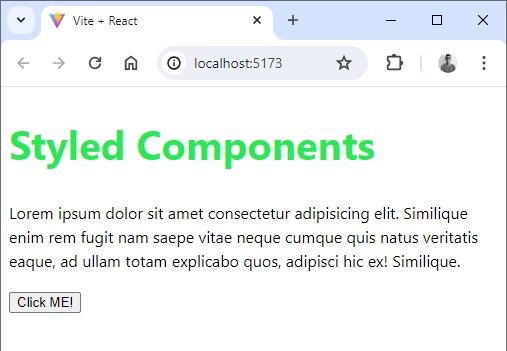
And there you have it! Our first custom styled component.
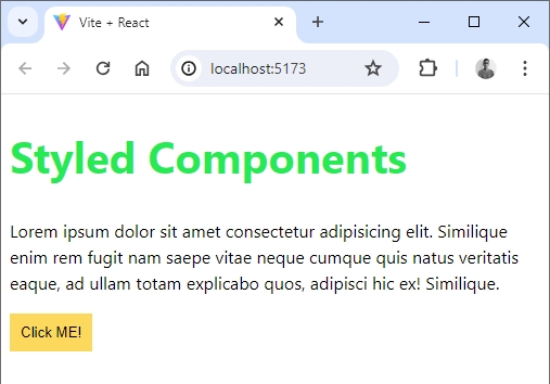
Now let’s style our button component:
const DefaultButton = styled.button`
background-color: #fcd95c;
border: none;
padding: 10px;
color: #000000;
`
We’ve named our custom component DefaultButton. Once we’ve applied styling to it, we can assign it any HTML tag we want.
So, when we use DefaultButton in our React code, it will actually render as a button tag in HTML, thanks to the styling we’ve applied using styled components.
App.jsx
import styled from 'styled-components';

const H1 = styled.h1`
  color: #26ea54;
  font-size: 40px;
`;

const DefaultButton = styled.button`
  background-color: #fcd95c;
  border: none;
  padding: 10px;
  color: #000000;
`;

function App() {
  return (
    <>
      <H1>Styled Components</H1>
      <p>
        Lorem ipsum dolor sit amet consectetur adipisicing elit. Similique enim
        rem fugit nam saepe vitae neque cumque quis natus veritatis eaque, ad
        ullam totam explicabo quos, adipisci hic ex! Similique.
      </p>
      <DefaultButton>Click ME!</DefaultButton>
    </>
  );
}

export default App;
Output:
Indeed, to maintain a tidy project structure, we’ll create a “components” folder within the “src” directory. Within this folder, we’ll craft two new files: “Title.jsx” and “Buttons.jsx”.
The styling for the title will reside in “Title.jsx”, while the button styles will be housed in “Buttons.jsx”.
Title.jsx
import styled from 'styled-components';

const H1 = styled.h1`
  color: #26ea54;
  font-size: 40px;
`;

export default H1;
Button.jsx
import styled from 'styled-components';

export const DefaultButton = styled.button`
  background-color: #fcd95c;
  border: none;
  padding: 10px;
  color: #000000;
`;
When we are exporting a component as default, then its import is a regular import as shown below:
import H1 from './components/Title';
When exporting a named component (like in Button.jsx), remember to use curly braces ({}) when importing it elsewhere in your code. This syntax ensures that you’re correctly referencing the named export.
import { DefaultButton } from './components/Button';Now our App.jsx looks like this:
import { DefaultButton } from './components/Button';
import H1 from './components/Title';


function App() {
  return (
    <>
      <H1>Styled Components</H1>
      <p>
        Lorem ipsum dolor sit amet consectetur adipisicing elit. Similique enim
        rem fugit nam saepe vitae neque cumque quis natus veritatis eaque, ad
        ullam totam explicabo quos, adipisci hic ex! Similique.
      </p>
      <DefaultButton>Click ME!</DefaultButton>
    </>
  );
}

export default App;
How to Nest Styles in Styled Components
You can style child elements within a styled component in a straightforward way. You don’t need to create a styled component for each child element. Instead, you can define styles for the child elements directly within the parent component’s styled definition.
Here’s an example to illustrate this:
App.jsx
import styled from 'styled-components';

const Card = styled.div`
  border: 1px solid #ccc;
  border-radius: 8px;
  padding: 16px;
  box-shadow: 0 4px 8px rgba(0, 0, 0, 0.1);
  background: #fff;
  width: 300px;
  margin: 16px;

  h3 {
    margin-top: 0;
    font-size: 1.5rem;
    color: #333;
  }

  p {
    font-size: 1rem;
    color: #666;
  }
`;

function App() {
  return (
    <>
      <Card>
        <h3>Card Title</h3>
        <p>
          This is a description inside the card. It is styled as a child element
          of the Card component.
        </p>
      </Card>
    </>
  );
}

export default App;
In this example, we’re making a Card component styled with a border, padding, rounded corners, shadow, and white background.
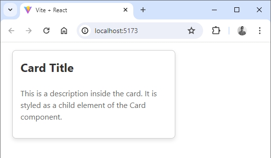
Inside, the h3 title is big, dark, and has no top space, suitable for titles. The p description is smaller, light, for additional info.
When used, Card styles only apply to its h3 and p, keeping styling contained and preventing conflicts. Using styled-components, we create reusable, customizable components, making code cleaner and easier to manage.
Applying Pseudo-classes and Pseudo-elements
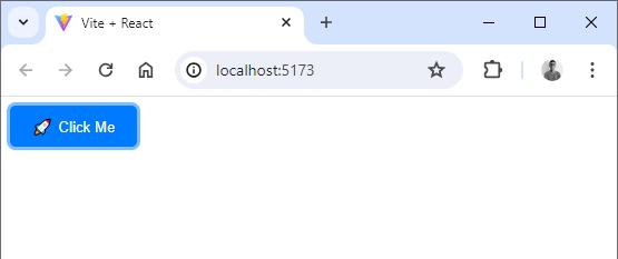
Yes, you can use pseudo-classes and pseudo-elements with styled components. For instance, imagine creating a styled button.
It has a blue background, white text, padding, rounded corners, and no border. When hovered over, it smoothly transitions to a darker shade. Plus, when focused, it gains a blue outline, making it easier to see and use for those relying on keyboard navigation.
App.jsx
import styled from 'styled-components';

const Button = styled.button`
  background-color: #007bff;
  color: #fff;
  padding: 10px 20px;
  border: none;
  border-radius: 5px;
  cursor: pointer;
  transition: background-color 0.3s ease;

  &:hover {
    background-color: #0056b3;
  }

  &:focus {
    outline: none;
    box-shadow: 0 0 0 3px rgba(0, 123, 255, 0.5);
  }

  &::before {
    content: "🚀";
    margin-right: 5px;
  }
`;

function App() {
  return (
    <>
      <Button>Click Me</Button>
    </>
  );
}

export default App;
To enhance the button’s appearance, we use pseudo-classes like :hover and :focus. When hovered over, the button’s background color changes to provide visual feedback.
When focused, it gains an outline to indicate keyboard accessibility. Furthermore, we utilize a pseudo-element (::before) to insert a rocket emoji before the button text, adding a decorative element to the button.
This example demonstrates how styled-components can be used to create visually appealing and interactive UI components by leveraging pseudo-classes and pseudo-elements for dynamic styling and decorative effects.
CSS Combinators and Styled Components
CSS combinators allow you to style elements based on their relationship with other elements in the DOM. This demonstrates how to use styled-components to create a card component with CSS combinators to style child elements.
import styled from 'styled-components';
const Card = styled.div`
background-color: #ffffff;
border: 1px solid #e0e0e0;
border-radius: 8px;
padding: 20px;
box-shadow: 0 4px 6px rgba(0, 0, 0, 0.1);
width: 300px;
/* CSS combinators */
> h2 {
font-size: 1.5rem;
margin-bottom: 10px;
}
> p {
font-size: 1rem;
color: #333333;
}
`;
function App() {
return (
<>
<Card>
<h2>Title</h2>
<p>This is the content of the card.</p>
</Card>
</>
);
}
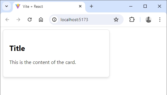
export default App;Here we’re using CSS combinators (>) to directly style the h2 and p elements inside the Card component. This ensures that the styles we define only apply to these specific child elements of the Card.
This approach provides more control and specificity over the styling of child elements within the Card, allowing for a more organized and maintainable codebase.
Applying Media Queries
Applying media queries in styled-components allows you to conditionally apply styles based on the screen size or device characteristics.
Here’s a simple example demonstrating how to use media queries in a styled component:
App.jsx
import styled from 'styled-components';
const Container = styled.div`
width: 100%;
padding: 20px;
background-color: #ffffff;
/* Media query for screens smaller than 768px */
@media screen and (max-width: 768px) {
background-color: lightblue;
}
`;
function App() {
return (
<>
<Container>
<h2>Hello, World!</h2>
<p>
This is a simple example of using media queries in styled-components.
</p>
</Container>
</>
);
}
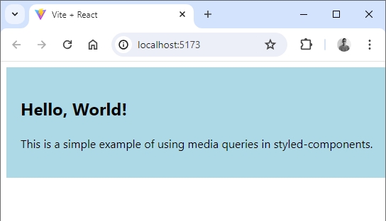
export default App;In styled-components, you can create responsive designs by using media queries. First, you define styles for your component that apply to all screen sizes.
Then, you can add media queries to target specific screen sizes or device characteristics.
For example, @media screen and (max-width: 768px) targets screens smaller than 768 pixels wide. Inside the media query, you specify different styles, such as changing background colors or adjusting layout, to ensure your design looks good across different devices.
This allows for a more adaptable and user-friendly experience.
Output:
Props in Styled Components
If you know how props work in React, great! Props in styled components are similar. If you’re not familiar with props, don’t worry – we will explain them here.
Custom components in styled components can have attributes, called props. We can use these props to change the styles of our components. This might sound confusing, but let’s look at some code to make it clear.
App.jsx
import './App.css';

import { StyledButton } from './components/Button';

function App() {
  return (
    <>
      <h2>Styled Components</h2>
      <p>Styled components make it easy to style your React components.</p>
      <StyledButton>Click ME!</StyledButton>
      <StyledButton primary>Click ME!</StyledButton>
    </>
  );
}

export default App;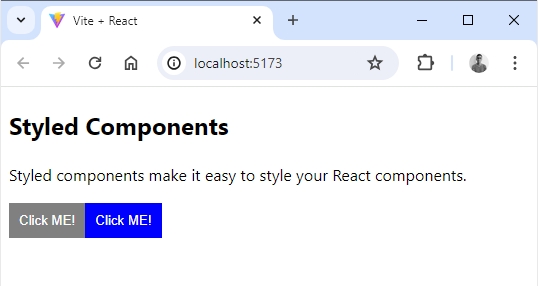
In the above code, we have two StyledButton components. The second button has an attribute primary. This attribute is a prop.
We can use this prop to change the button’s style. Here’s how we can do it:
Button.jsx
import styled from 'styled-components';

export const StyledButton = styled.button`
  background-color: ${(props) => (props.primary ? 'blue' : 'gray')};
  border: none;
  padding: 10px;
  color: white;
`;
In this code, we’re using template literals (backticks) to write CSS and JavaScript together.
We use ${} to add JavaScript inside the CSS. The arrow function takes props as an argument, allowing us to access the button’s attributes.
The function checks if the primary prop is present. If it is, the button’s background color will be blue; if not, it will be gray.
We can also make our code cleaner by destructuring props. Instead of using props.primary, we can write it like this:
Button.jsx
import styled from 'styled-components';

export const StyledButton = styled.button`
  background-color: ${({ primary }) => (primary ? 'blue' : 'gray')};
  border: none;
  padding: 10px;
  color: white;
`;
By destructuring the prop directly, we can access primary without needing props.primary.
How to Extend Styles in Styled Components
Styled components allow you to extend the styles of an existing component. This is useful when you want to create a new component that has similar styles to an existing one, but with some modifications. Let’s see how to do this with an example.
First, let’s create a basic styled component:
Button.jsx
import styled from 'styled-components';

export const Button = styled.button`
  background-color: gray;
  border: none;
  padding: 10px;
  color: white;
  cursor: pointer;
  font-size: 16px;
`;
This Button component has some basic styles.
Now, let’s create a new button component that extends the styles of the original Button component but changes the background color and font size:
Button.jsx
import styled from 'styled-components';

export const Button = styled.button`
  background-color: gray;
  border: none;
  padding: 10px;
  color: white;
  cursor: pointer;
  font-size: 16px;
`;


export const PrimaryButton = styled(Button)`
  background-color: blue;
  font-size: 24px;
`;
Here, PrimaryButton extends Button and overrides the styles we want to change.
Now, let’s use both Button and PrimaryButton in our app:
App.jsx
import { Button, PrimaryButton } from './components/Button';

function App() {
  return (
    <>
      <Button>Default Button</Button>
      <PrimaryButton>Primary Button</PrimaryButton>
    </>
  );
}

export default App;
Output:
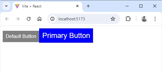
In this example, PrimaryButton looks similar to Button but with a different background color and font size.
Extending with Additional Props
You can also pass additional props to extended components. For instance, let’s create another button that also accepts a large prop to change its size:
Button.jsx
import styled from 'styled-components';

export const Button = styled.button`
  background-color: gray;
  border: none;
  padding: 10px;
  color: white;
  cursor: pointer;
  font-size: 16px;
`;


export const PrimaryButton = styled(Button)`
  background-color: blue;
  font-size: 24px;
`;


export const LargeButton = styled(Button)`
  padding: ${(props) => (props.large ? '20px' : '10px')};
  font-size: ${(props) => (props.large ? '20px' : '16px')};
`;
Here, LargeButton extends Button and changes the padding and font size based on the large prop.
Use LargeButton in your app, passing the large prop to it:
App.jsx
import { Button, PrimaryButton, LargeButton  } from './components/Button';

function App() {
  return (
    <>
      <Button>Default Button</Button>
      <PrimaryButton>Primary Button</PrimaryButton>
	  <LargeButton large>Large Button</LargeButton>
    </>
  );
}

export default App;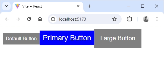
In this example, the LargeButton will have larger padding and font size when the large prop is passed.
Animation in Styled Components
Styled components make it easy to add animations to your components using keyframes from the styled-components library. Let’s go through an example step by step.
First, import styled-components and keyframes. Next, define the keyframes for your animation. In this example, we’ll create a simple scale and color change animation.
Now, create the styled component and apply the animation using the animation property:
Button.jsx
import styled, { keyframes } from 'styled-components';


const pulse = keyframes`
  0% {
    transform: scale(1);
    background-color: gray;
  }
  50% {
    transform: scale(1.1);
    background-color: lightgray;
  }
  100% {
    transform: scale(1);
    background-color: gray;
  }
`;

const Button = styled.button`
  background-color: gray;
  border: none;
  padding: 10px 20px;
  color: white;
  cursor: pointer;
  font-size: 16px;
  border-radius: 5px;
  animation: ${pulse} 2s infinite;

  &:hover {
    animation-play-state: paused;
  }
`;

export default Button;
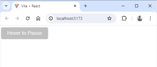
In this example, the button will pulse (scale and change color) continuously every 2 seconds. The animation will pause when the button is hovered over.
Finally, let’s use this animated button component in our app:
App.jsx
import Button from './components/Button';

function App() {
  return (
    <>
      <Button>Hover to Pause</Button>
    </>
  );
}

export default App;
Output:
CSS Variables and Styled Components
CSS variables are a powerful way to manage and reuse values throughout your styles. In styled components, you can easily use and manage CSS variables.
Let’s go through an example to see how to set and use CSS variables in styled components.
You can define CSS variables at a global level or within a specific styled component. Here’s how to do it:
First define global CSS variables by using the createGlobalStyle helper from styled-components and applying them to the :root selector:
GlobalStyles.jsx
import { createGlobalStyle } from 'styled-components';

const GlobalStyles = createGlobalStyle`
  :root {
    --primary-color: #3498db;
    --secondary-color: #2ecc71;
    --font-size: 16px;
    --padding: 10px;
  }

  body {
    font-size: var(--font-size);
  }
`;

export default GlobalStyles;
Now, let’s create a styled component that uses these global CSS variables:
Button.jsx
import styled from 'styled-components';

const Button = styled.button`
  background-color: var(--primary-color);
  color: white;
  padding: var(--padding);
  border: none;
  border-radius: 5px;
  cursor: pointer;
  font-size: var(--font-size);

  &:hover {
    background-color: var(--secondary-color);
  }
`;

export default Button;
Finally, make sure to apply the global styles in your main app component.
App.jsx
import GlobalStyles from './components/GlobalStyles';
import Button from './components/Button';
function App() {
return (
<>
<GlobalStyles />
<div>
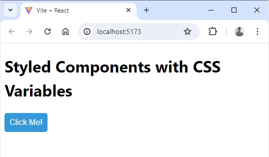
<h1>Styled Components with CSS Variables</h1>
<Button>Click Me!</Button>
</div>
</>
);
}
export default App;Output:
The “as” Polymorphic Prop in Styled Components
The as prop in styled components allows you to change the rendered HTML element of a styled component dynamically. This can be useful when you want to reuse the same styled component with different HTML elements without repeating the styles.
Let’s go through an easy example to understand how to use the as prop in styled components.
Let’s create a basic styled component for a box:
StyledBox.jsx
import styled from 'styled-components';

const StyledBox = styled.div`
  background-color: #f0f0f0;
  padding: 20px;
  border: 1px solid #ccc;
  border-radius: 10px;
  margin: 10px 0;
`;

export default StyledBox;
Now, let’s use the as prop to render the StyledBox component as different HTML elements. For example, we might want to render it as a section <section>, , an article <article>, , or a header <header>.
App.jsx
import StyledBox from './components/StyledBox';
function App() {
return (
<>
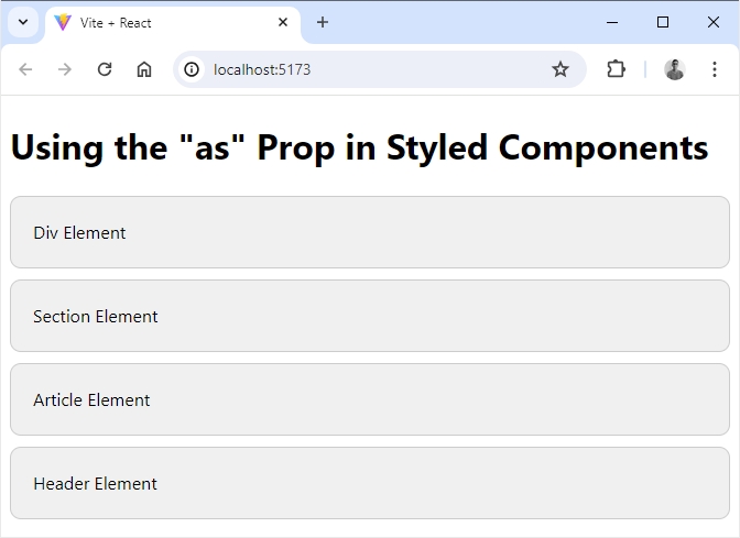
<h1>Using the "as" Prop in Styled Components</h1>
<StyledBox>Div Element</StyledBox>
<StyledBox as="section">Section Element</StyledBox>
<StyledBox as="article">Article Element</StyledBox>
<StyledBox as="header">Header Element</StyledBox>
</>
);
}
export default App;
Output:
Adding a Theme in Styled Components
Styled components support theming, which allows you to define a set of style values (like colors, fonts, and sizes) that can be accessed throughout your styled components.
This is particularly useful for maintaining a consistent look and feel across your application and for supporting multiple themes (like light and dark modes).
Here’s how to add a theme in styled components:
First create a theme object that contains your theme values. You can define multiple themes if needed.
theme.js
const theme = {
  colors: {
    primary: '#3498db',
    secondary: '#2ecc71',
    background: '#f0f0f0',
    text: '#333',
  },
  fonts: {
    main: 'Arial, sans-serif',
    code: 'Courier, monospace',
  },
  sizes: {
    padding: '10px',
    margin: '10px',
  },
};

export default theme;
Wrap your application with the ThemeProvider from styled-components and pass your theme object to it.
App.jsx
import './App.css';

import { ThemeProvider } from 'styled-components';
import theme from './components/theme';
import GlobalStyles from './components/GlobalStyles'; // Assuming you have global styles
import Button from './components/Button';

function App() {
  return (
    <>
      <ThemeProvider theme={theme}>
      <GlobalStyles />
      <div>
        <h1>Themed Styled Components</h1>
        <Button>Primary Button</Button>
      </div>
    </ThemeProvider>
    </>
  );
}

export default App;
Now, you can create styled components that access the theme values using the props parameter.
Button.jsx
import styled from 'styled-components';

const Button = styled.button`
  background-color: ${(props) => props.theme.colors.primary};
  color: ${(props) => props.theme.colors.text};
  padding: ${(props) => props.theme.sizes.padding};
  border: none;
  border-radius: 5px;
  cursor: pointer;
  font-family: ${(props) => props.theme.fonts.main};

  &:hover {
    background-color: ${(props) => props.theme.colors.secondary};
  }
`;

export default Button;
You can also define global styles that use the theme values. This is completely optional.
GlobalStyles.jsx
import { createGlobalStyle } from 'styled-components';

const GlobalStyles = createGlobalStyle`
  body {
    background-color: ${(props) => props.theme.colors.background};
    color: ${(props) => props.theme.colors.text};
    font-family: ${(props) => props.theme.fonts.main};
    margin: 0;
    padding: 0;
  }
`;

export default GlobalStyles;
Output:
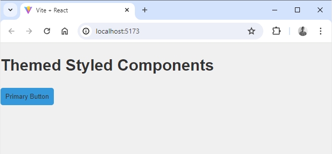
By using the ThemeProvider and a theme object, you can easily manage and apply consistent styles across your application.
This approach makes it straightforward to support multiple themes and ensures that your styles remain consistent and easy to maintain.
So, let’s extend the example to include both a base theme and a dark theme. We’ll provide a way to switch between the themes dynamically.
First, we’ll define two themes: a base theme and a dark theme.
themes.js
export const baseTheme = {
  colors: {
    primary: '#3498db',
    secondary: '#2ecc71',
    background: '#f0f0f0',
    text: '#333',
  },
  fonts: {
    main: 'Arial, sans-serif',
    code: 'Courier, monospace',
  },
  sizes: {
    padding: '10px',
    margin: '10px',
  },
};

export const darkTheme = {
  colors: {
    primary: '#2980b9',
    secondary: '#27ae60',
    background: '#2c3e50',
    text: '#ecf0f1',
  },
  fonts: {
    main: 'Arial, sans-serif',
    code: 'Courier, monospace',
  },
  sizes: {
    padding: '10px',
    margin: '10px',
  },
};
We’ll add functionality to toggle between the base theme and the dark theme.
App.jsx
import React, { useState } from 'react';
import { ThemeProvider } from 'styled-components';
import { baseTheme, darkTheme } from './components/theme';
import GlobalStyles from './components/GlobalStyles'; // Assuming you have global styles
import Button from './components/Button';
function App() {
const [isDarkTheme, setIsDarkTheme] = useState(false);
const toggleTheme = () => {
setIsDarkTheme(!isDarkTheme);
};
return (
<>
<ThemeProvider theme={isDarkTheme ? darkTheme : baseTheme}>
<GlobalStyles />
<div>
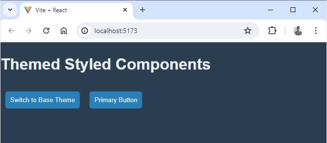
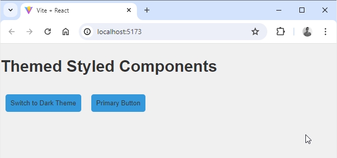
<h1>Themed Styled Components</h1>
<Button onClick={toggleTheme}>
Switch to {isDarkTheme ? 'Base' : 'Dark'} Theme
</Button>
<Button>Primary Button</Button>
</div>
</ThemeProvider>
</>
);
}
export default App;
Make sure your global styles use the theme values.
GlobalStyles.jsx
import { createGlobalStyle } from 'styled-components';

const GlobalStyles = createGlobalStyle`
  body {
    background-color: ${(props) => props.theme.colors.background};
    color: ${(props) => props.theme.colors.text};
    font-family: ${(props) => props.theme.fonts.main};
    margin: 0;
    padding: 0;
  }
`;

export default GlobalStyles;
Ensure your styled components use the theme values.
Button.jsx
import styled from 'styled-components';

const Button = styled.button`
  background-color: ${(props) => props.theme.colors.primary};
  color: ${(props) => props.theme.colors.text};
  padding: ${(props) => props.theme.sizes.padding};
  border: none;
  border-radius: 5px;
  cursor: pointer;
  font-family: ${(props) => props.theme.fonts.main};
  margin: ${(props) => props.theme.sizes.margin};

  &:hover {
    background-color: ${(props) => props.theme.colors.secondary};
  }
`;

export default Button;
Output:
CSS Helper Functions in Styled Components
In styled-components, CSS helper functions can be used to create reusable style blocks that can be shared across multiple components. This can help keep your styles DRY (Don’t Repeat Yourself) and more maintainable.
Here’s an example demonstrating how to create primary and secondary buttons using CSS helper functions with styled-components.
First create a Helpers.jsx file where you define your CSS helper functions. For instance:
Helpers.jsx
import { css } from 'styled-components';

export const primaryButtonStyles = css`
  background-color: #007bff;
  color: white;
  border: none;

  &:hover {
    background-color: #0056b3;
  }
`;

export const secondaryButtonStyles = css`
  background-color: #6c757d;
  color: white;
  border: none;

  &:hover {
    background-color: #5a6268;
  }
`;
Next, you can create your button components and use these helper functions to style them:
Button.jsx
import styled from 'styled-components';

import { primaryButtonStyles, secondaryButtonStyles } from './Helpers';

const Button = styled.button`
  padding: 10px 20px;
  font-size: 16px;
  border-radius: 5px;
  cursor: pointer;
  transition: background-color 0.3s;
  ${({ variant }) => variant === 'primary' && primaryButtonStyles}
  ${({ variant }) => variant === 'secondary' && secondaryButtonStyles}
`;

export default Button;
Finally, you can use these button components in your application like this:
App.jsx
import Button from './components/Button';
function App() {
return (
<>
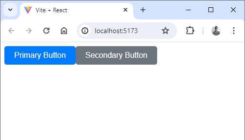
<Button variant="primary">Primary Button</Button>
<Button variant="secondary">Secondary Button</Button>
</>
);
}
export default App;Output:
Now let’s extend the previous example by adding styles for normal and large buttons. We’ll create additional CSS helper functions to handle the size variations.
Add to your existing Helpers.jsx file with the styles for normal and large buttons:
Helpers.jsx
import { css } from 'styled-components';

export const primaryButtonStyles = css`
  background-color: #007bff;
  color: white;
  border: none;

  &:hover {
    background-color: #0056b3;
  }
`;

export const secondaryButtonStyles = css`
  background-color: #6c757d;
  color: white;
  border: none;

  &:hover {
    background-color: #5a6268;
  }
`;


export const normalButtonStyles = css`
  padding: 10px 20px;
  font-size: 16px;
`;

export const largeButtonStyles = css`
  padding: 15px 30px;
  font-size: 20px;
`;
Update your Button.jsx to include the new size styles:
Button.jsx
import styled from 'styled-components';

import { primaryButtonStyles, secondaryButtonStyles, normalButtonStyles, largeButtonStyles  } from './Helpers';

const Button = styled.button`
  padding: 10px 20px;
  font-size: 16px;
  border-radius: 5px;
  cursor: pointer;
  transition: background-color 0.3s;
  ${({ variant }) => variant === 'primary' && primaryButtonStyles}
  ${({ variant }) => variant === 'secondary' && secondaryButtonStyles}
  ${({ size }) => size === 'normal' && normalButtonStyles}
  ${({ size }) => size === 'large' && largeButtonStyles}
`;

export default Button;
In your App.jsx, you can now specify both the variant and size props to create buttons of different styles and sizes:
App.jsx
import './App.css';
import Button from './components/Button';
function App() {
return (
<>
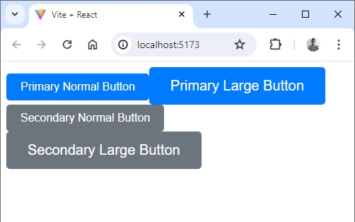
<Button variant="primary" size="normal">Primary Normal Button</Button>
<Button variant="primary" size="large">Primary Large Button</Button>
<Button variant="secondary" size="normal">Secondary Normal Button</Button>
<Button variant="secondary" size="large">Secondary Large Button</Button>
</>
);
}
export default App;Output:
We can also use a ternary operator directly within the styled component to apply different styles based on props. Let’s adapt the previous example to fit this pattern.
Button.jsx
import styled, { css } from 'styled-components';


export const DefaultButton = styled.button`
  background-color: ${({ red }) => (red ? 'red' : '#645cfc')};
  border: none;
  color: white;
  display: block;
  margin: 10px;
  border-radius: 5px;
  cursor: pointer;
  transition: background-color 0.3s;

  ${({ large }) =>
    large
      ? css`
          padding: 15px;
          font-weight: 800;
          font-size: 20px;
        `
      : css`
          padding: 10px;
          font-weight: 400;
          font-size: 16px;
        `}

  ${({ variant }) =>
    variant === 'primary' &&
    css`
      background-color: #007bff;

      &:hover {
        background-color: #0056b3;
      }
    `}

  ${({ variant }) =>
    variant === 'secondary' &&
    css`
      background-color: #6c757d;

      &:hover {
        background-color: #5a6268;
      }
    `}
`;
Here we are using a ternary operator to apply styles based on the large and variant props.
Now, use the DefaultButton component and pass the appropriate props to apply the styles.
App.jsx
import { DefaultButton } from './components/Button';
function App() {
return (
<>
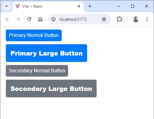
<DefaultButton variant="primary">Primary Normal Button</DefaultButton>
<DefaultButton variant="primary" large>
Primary Large Button
</DefaultButton>
<DefaultButton variant="secondary">Secondary Normal Button</DefaultButton>
<DefaultButton variant="secondary" large>
Secondary Large Button
</DefaultButton>
</>
);
}
export default App;
Output:
Attributes (attrs) in Styled Components
The attrs method in Styled Components helps you set default values or attributes (like HTML attributes) for a component.
Here’s a simple guide on how to use it:
Basic Usage
- Static Attributes: Set fixed values.
- Dynamic Attributes: Set values based on the component’s props.
Here are examples demonstrating both static and dynamic attributes:
Static Attributes
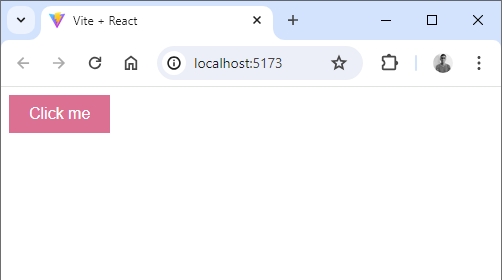
Button.jsx
import styled from 'styled-components';

const Button = styled.button.attrs({
  type: 'button', // Always sets the type attribute to 'button'
  className: 'my-button-class', // Always sets this class name
})`
  background: palevioletred;
  border: none;
  color: white;
  padding: 10px 20px;
  font-size: 1em;
`;

export default Button
App.jsx
import Button from './components/Button';

function App() {


  return (
    <>
     <Button>Click me</Button>
    </>
  );
}

export default App;
Output:
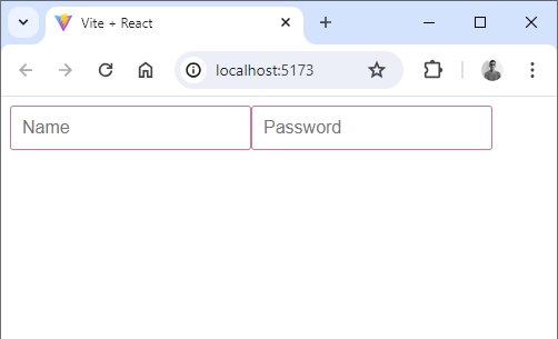
Dynamic Attributes
Input.jsx
import styled from 'styled-components';

const Input = styled.input.attrs((props) => ({
  type: props.type || 'text', // Sets type based on props, default is 'text'
  placeholder: props.placeholder || 'Enter text...', // Sets placeholder based on props
}))`
  padding: 10px;
  font-size: 1em;
  border: 1px solid palevioletred;
  border-radius: 3px;
`;

export default Input;
App.jsx
import Input from './components/Input';

function App() {
  return (
    <>
      <Input placeholder="Name" />
      <Input type="password" placeholder="Password" />
    </>
  );
}

export default App;
Output:
Combining with Styling Props
You can use attrs together with other props to style your components:
Box.jsx
import styled from 'styled-components';

const Box = styled.div.attrs(props => ({
  role: 'alert', // Sets role attribute to 'alert'
  tabIndex: 0, // Sets tabIndex attribute to 0
}))`
  background: ${props => props.bgColor || 'palevioletred'}; // Uses props to set background color
  padding: 20px;
  color: white;
  border-radius: 5px;
`;

export default Box
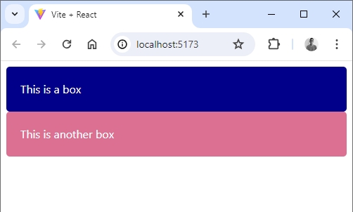
App.jsx
import Box from './components/Box';

function App() {
  return (
    <>
      <Box bgColor="darkblue">This is a box</Box>
      <Box>This is another box</Box>
    </>
  );
}

export default App;
Output:
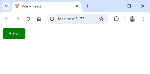
Advanced Usage with State or Context
You can use attrs to set attributes based on the component’s state or context:
ThemeButton.jsx
import React, { useContext } from 'react';
import { ThemeContext } from '../App';
import styled from 'styled-components';

const ThemedButton = styled.button.attrs((props) => ({
  type: 'button',
  'aria-pressed': props.active, // Sets aria-pressed attribute based on props
}))`
  background: ${(props) => (props.active ? 'green' : 'grey')};
  color: white;
  padding: 10px 20px;
  border: none;
  border-radius: 5px;
  cursor: pointer;
`;

function ThemeButton() {
  const { active, toggleActive } = useContext(ThemeContext);

  return (
    <ThemedButton active={active} onClick={toggleActive}>
      {active ? 'Active' : 'Inactive'}
    </ThemedButton>
  );
}

export default ThemeButton;
App.jsx
import React, { useState, createContext } from 'react';
import ThemeButton from './components/ThemeButton';

const ThemeContext = createContext();


function App() {
	const [active, setActive] = useState(false);
  const toggleActive = () => setActive(!active);
  return (
    <>
      <ThemeContext.Provider value={{ active, toggleActive }}>
      <ThemeButton />
    </ThemeContext.Provider>
    </>
  );
}

export { ThemeContext };
export default App;
Output:
Conclusion
Styled-components make styling in React easy and efficient by ensuring browser compatibility with automatic prefixing and associating styles directly with components to avoid untraceable class names.
To enhance your workflow in VS Code, use these two plugins:
- Styled Components Snippets for helpful code snippets.
- vscode-styled-components for syntax highlighting and IntelliSense.


Add comment