
One of the things you will use every day in css are units. They are used to set padding, margin, align elements and so on. Also, these css length units are very important when creating a responsive website and you might wonder which one to use considering we have several css length units (one example could be pixels – px).
🔥 Must Read: Best VS Code Shortcuts for Faster Programming
I had the same issue while working on a project, so I did some research on it. In this article, I will show you the most suitable css length units to use for a responsive design.
There are four types of css length units which are as follows:
- Absolute unit
- Relative unit
- Viewport unit
- Fraction unit
What is a CSS length unit
A css length unit determines the size of a property you are setting for an element or its content. For example, if you wanted to set the property margin of a paragraph (p), you would give it a specific value. This value includes the css length unit.
Let’s look at a small example:
p {
margin: 20px;
}
In this case, margin is the property, 20px; is the value, and px (or “pixel”) is the css length unit.
💡 Note
We cannot apply the whitespace between the number and the unit. The unit can be omitted for the value 0. Some properties of CSS allow the negative values of length too.
Even though it’s common to see units like px used, the big question is often, “What’s the best css length unit for a responsive design?”
Here is a brief overview of some of the available css length units –
| Unit | Type |
px | Absolute unit |
pt | Absolute unit |
pc | Absolute unit |
% | Relative unit |
em | Relative unit |
rem | Relative unit |
ch | Relative unit |
ex | Relative unit |
vw | Viewport unit |
vh | Viewport unit |
vmin | Viewport unit |
vmax | Viewport unit |
fr | Fraction unit |
You got an overview of available css length units, right? let’s now jump straight into all css length units in details.
What is an Absolute unit in CSS
Absolute units are fixed and (mostly) relate to some physical measurement. Once they are declared, their size cannot be altered. These units should not be used for a responsive website layout where the screen size varies.
Absolute units are much more useful in printing books, documents, and defining print stylesheets.
Let’s now discuss one of the most used css absolute unit, Yay! pixels (px).
Pixel (px) in CSS 🎯
Pixels (px) are typically the most popular absolute unit for screens (i.e. to be read on the computer screen). In other words, it is a fixed unit measurement but don’t confuse this with the pixel that defines screen resolution. The Pixel in css has nothing to do with the screen resolution.
When we try viewing a web page fixed at 1024px width suppose on a tablet with 1024px x 480px screen resolution, the web page will not fit in the screen.
Basically, the pixel in css measures the length of the display area instead of the screen resolution, so the 1024px screen resolution does not mean that the screen is also 1024px of the length.
One problem with the pixel unit is that it does not scale upward for visually-impaired readers or downward to fit mobile devices.
Hence,Using px can be problematic for responsive design, but they are useful for maintaining consistent sizing for some elements. If you have elements that should not be resized, then using px is a good choice
Example of Pixel (px) in CSS:
<body>
    <h1>This is heading 1</h1>
    <h2>This is heading 2</h2>
    <p>This is a paragraph.</p>
    <p>This is another paragraph.</p>
</body>
h1 {
font-size: 50px;
}
h2 {
font-size: 30px;
}
p {
font-size: 15px;
line-height: 20px;
}
💡 When to use absolute units?
As we have seen you should avoid css absolute units, whenever we aim to create a responsive website. However css absolute units are useful wherever we don’t want to stretch the elements. Eg. Logo
Absolute units summary
Absolute units or physical units (e.g. cm, mm, in, pc, and pt) should only be used for print style sheets, while pixels (px) should only be used for the screen.
CSS length units can actually mean different things depending on the device. For example, while 1cm in css should print as one physical centimeter, there’s no guarantee that 1cm in css results in one physical centimeter on the screen.
Below is a tabular demonstration for quick overview:
| Unit | Description | cm | mm | in | pc | pt | px |
cm | centimeter | 1cm | 10mm | ||||
mm | millimeter | 1/10cm | 1mm | ||||
in | inch | 2.54cm | 25.4mm | 1in | 6pc | 72pt | 96px |
pc | pica | 1/6in | 1pc | 12pt | 16px | ||
pt | point | 1/72in | 1/12pc | 1pt | 4/3px | ||
px | pixel | 2.54cm | 1/96in | 1/16pc | 3/4pt | 1px |
What is a Relative unit in CSS
Relative units does not have fixed sizes as in the case of absolute units in css. These are considered relative because they change/scale depending on the length of other elements.
💡 Note
Using relative values in CSS means that things can scale up and down according to some other value.
The benefit of using relative units is that we can make the font size, padding or other elements scale relative to everything else on the page. I prefer these units since they adjust to different screen sizes and best for responsive design.
🤔 What is the difference – Absolute vs. Relative
An absolute unit of measurement means that the value may be interpreted by the browser, but not recalculated. On the other hand, a relative unit of measurement means that the value may be interpreted, and possibly also recalculated by the browser.
Here are the most useful css relative units used in responsive design:
💡 When to use relative units?
You can set everything in pixels, but if you want to make something responsive, you usually need to overwrite more values. And another, maybe more important, reason: some people will have their browser font size set to something else than the default 16px, for example people who are visually impaired.
If you set a higher default font size, you wouldn’t have to zoom in the browser to be able to read a website, because the content of a website with relative units would increase with your preferred font size.
em in CSS 🎯
The em is a scalable relative unit that is used in a responsive design. An em is equal to the current font-size, for instance, if the font-size of the document is 16px, 1em is equal to 16px.
Ems are scalable in nature, so 2em would equal 32px, .5em would equal 8px, etc. Ems are becoming increasingly popular in a responsive design due to scalability and their mobile-device-friendly nature.
When to use em relative unit in css?
In an ideal situation, em basically allows setting the font-size of an element relative to the font-size of its parent.
Let’s take this simple example:
.parent {
  font-size: 18px;
}
.child {
  font-size: 1.5em;
}
Here the child would have a font-size of 27px (1.5 * 18px = 27px). Simple math right?
If the parent element doesn’t specify a value for font-size, a value will be looked for higher up in the DOM tree. If no font-size is specified all the way up to the root <html> element, then the browser default of 16px is used.
Pretty simple and straight-forward right?
em units can be used for much more than just setting font-size however, and they can be used pretty much everywhere units are expected (padding, margin, width, height, max-width and many more).
When em units are used on other properties than font-size, the value is relative to the element’s own font-size.
Let’s see this example:
.parent {
  font-size: 18px;
}
.child {
  font-size: 1.5em;
  padding: 2em 1em;
}
Here, the padding top and bottom on .child will be 54px (1.5 * 18px = 27px -> 27px * 2 = 54px). That’s 2 times the font-size of our current element’s font size (2 * 27px).
And the padding left and right on .child will be of 27px. That’s 1 time the font-size of our element.
💡 Note
When em units are used on font-size, the size is relative to the font-size of the parent. When used on other properties, it’s relative to the font-size of the element itself.
Compounding effect of em
So far everything is well and good with using the em unit, but a problem can come about from the fact that the unit can compound from one level to the other.
Let’s take a similar basic example:
.parent {
  font-size: 15px;
}
.child {
  font-size: 2em;
}
But let’s use it in our markup like this:
<body>
    <div class="parent">
      I'm 15px
      <div class="child">
      I'm 30px, as expected
        <div class="child">
        I'm 60px, trouble starts!
          <div class="child">
          I'm 120px, now we're really in trouble!
          </div>
        </div>
      </div>
    </div>
</body>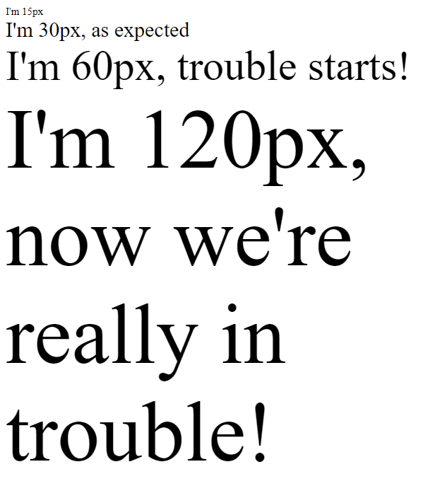
So, as you can see, the effect of em units can be compounding when multiple em-font-sized elements are within one another. This can become a problem and can lead to unintended consequences in your responsive design.
This problem is the reason why the rem unit was created.
rem in CSS 🎯
The rem unit, short for root em is a relative unit that will always be based upon the font-size value of the root element, which is the <html> element. And if the <html> element doesn’t have a specified font-size, the browser default of 16px is used.
So that means, by using the rem unit, the values of parent elements are ignored, and only the value of the root is taken into consideration.
🤔 What is the difference – em vs. rem
The difference lies in the inheritance. The rem value is based on the root element i.e html. Every child element uses the html font size as their calculation basis.
em on the other hand, is based on the font size of the parent element.
rem makes the calculation of the font size much easier. With nested elements or even multiple nested elements (e.g. lists), the font size no longer has to be calculated in relation to the font size of the parent element. rem always calculates the font size in relation to the html tag.
With a similar example, but this time in rem:
.html {
  font-size: 16px;
}
.parent {
  font-size: 15px;
}
.child-rem {
  font-size: 2rem;
}
<body>
<div class="parent">
I'm 15px
<div class="child-rem">
I'm 32px, as expected
<div class="child-rem">
I'm 32px, yep!
<div class="child-rem">I'm 32px, like clockwork!</div>
</div>
</div>
</div>
</body>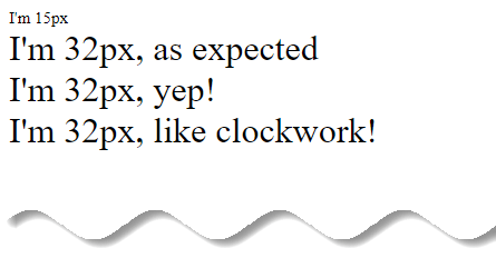
As you can see, using rem units allow you to avoid the compounding effect of em units. With rem things are always and consistently based on the font-size of the root element, so there are no surprises.
The same goes for other values than font-size (margin, padding etc.) Using rem units on those will still be relative to the font-size of the root element.
🤔 em vs rem, Which is better for responsive design?
There is no better unit really, and it all depends on your personal preferences. Some people like to design everything in rem units for consistency and predictability, while others like to also use em units in places where the influence of nearby parent elements would make sense.
In other words, em is best used at the lowest level of a DOM hierarchy.
Percent (%) in CSS 🎯
The percent(%) unit is quite similar to the em unit, because it is always relative to another value. As you might imagine, a valid percentage value is between 0% and 100% and is in most cases relative to the parent.
The value set for a length using percent
(%), is relative to a property of either the same element, a parent element or that of the containing block. However, most often the percentage value is relative to the element’s font size.
Percent(%) is also scalable like em. However, 100% is equal to the current font size. Think of it this way: 1.5em is 1.5 times larger, and 150% is 150 percent of the font size.
💡 Note
Percent(%) is simply a percentage of the parent element. If you have a <div> that is set to width:50%, it will be half the width of its parent.
For fonts, setting font-size: 100% will make your text 100% of the base font size set in the browser. Most browsers default to a 16px base font size, so 100% of that would be 16px, and 50% would be 8px.
Percent(%) is also good for responsive design and for accessibility because of their scalability. However, similar to em, percentages can also cause the same compounding issues.
✨ Interesting facts
It is good to know that the behavior of percentages change in combination with position: absolute; and position: relative;.
In most cases percent(%) when used on height doesn’t work unless there is an appropriate positioning used on the elements.
Also, the percent(%) unit is often used for height and width properties of a containers and divisions (div). But can be used anywhere where css length units are allowed.
For example, Here the second <div> will be 50% of its parent, which comes down to 30% of the page width. That is because the parent of the second <div>, the first <div>, is 60% of the page width.
<body>
    <div>
      First div
      <div>Second div</div>
    </div>
</body>
div {
width: 60%;
background-color: #a6d9dc;
}
div div {
width: 50%;
background-color: #e63c49;
color: #ffffff;
}Must Read (stackoverflow): When to use em and percent(%) for responsive design?
Since we used percent(%) it is going to be responsive pretty nicely, by default. Try resizing your browser’s width to see in effect. What is nice about the usage of percent(%), is that when you change the parent’s width the children will still behave in the same way.
💡 Note
Percent(%) unit is more useful for creating structure and layout of UI components.
Relative units summary
Relative units play nicely with both screen and print media types and should be the most frequently used css length units.
| Unit | Description |
% | relative to the parent element |
em | relative to font size of the element |
rem | relative to font size of the root element |
ch | relative to width of the “0” (ZERO, U+0030) glyph in the element’s font |
ex | relative to x-height of the font |
What is a Viewport unit in CSS
It’s been a few years since viewport units were first introduced in CSS. They are truly responsive length units in the sense that their value changes every time the browser resizes.
Responsive web design techniques rely heavily on percentage(%) rules. However, css percentage isn’t always the best solution for every problem. CSS width is relative to the nearest containing parent element.
What if you wanted to use the width or height of the viewport instead of the width of the parent element? That’s exactly what viewport unit provide.
💡 What is Viewport?
The viewport is the user’s visible area of a web page (not screen or device display size). Also, viewport is defined by the size of a browser window.
viewport == browser window size
🤔 What is the difference – Percent (%) vs. Viewport unit
Viewport unit represent a percentage of the current browser viewport. Hence, the difference to percentage unit is, that viewport unit always being calculated as the percentage of the browser’s viewport size. Whereas percentage units inherit the size of their parent element.
Let’s consider an example of a mobile screen viewport that is 480px x 800px.
1 vw = 1% of the viewport’s width (or 4.8px)50 vw = 50% of the viewport’s width (or 240px)1 vh = 1% of the viewport’s height (or 8px)50 vh = 50% of the viewport’s height (or 400px)
There are four viewport-based units in css. These are vh, vw, vmin and vmax.
| Unit | Description |
vw | relative to 1% of viewport’s width |
vh | relative to 1% of viewport’s height |
vmin | relative to 1% of viewport’s smaller dimension (height or width) |
vmax | relative to 1% of viewport’s larger dimension (height or width) |
Viewport width(vw) and viewport height(vh) in CSS 🎯
Sometimes, it is helpful to know the height or width of the viewport (the browser screen size). This is most often the case when you are creating immersive layouts that expand to fill portions of the screen.
CSS gives us two simple measures, the viewport width (vw) and its height (vh). These units are ideal for responsive design because they are completely independent of the base font size.
✨ Interesting facts
In a lot of cases, the viewport units (vh and vw) and percentage(%) unit overlap in terms of what they can achieve. However, they each have their clear strengths and weaknesses. To sum up:-
When dealing with widths, the % unit is more suitable. With heights, the vh unit is better.
Hence, setting an element to a width value of 50vw means that the element will have a width that’s 50% of the viewport size, and this stays true when the viewport is resized.
There are seemingly endless uses for these rules. For example, a very simple way of doing full-height or near full-height slides can be achieved with a single line of css:
Imagine you want a headline that is set to fill the width of the screen. To accomplish this, you would set a font-size in vw. That size will scale with the browser’s width. Let’s see in action.
<body>
    <h2>
      You can not always control circumstances. But you can control your own
      thoughts.
    </h2>
    <p><em>- Charles Popplestone </em></p>
</body>
body {
background: #e63c49;
padding: 1em 0;
color: #ffffff;
}
h2 {
font-size: 6vw;
margin-bottom: 0.2em;
}
vmax and vmin in CSS 🎯
As we discussed earlier, 1vh is equal to 1% of the current viewport height (i.e. the open browser window), while 1vw is 1% of the current viewport width. vmin and vmax use those same units, but in response to particular rules:
vminuses the ratio of the smallest side. That means, if the height of the browser window is less than its width,1vminwill be equivalent to1vh. If the width of the browser is less than it’s height,1vminis equivalent to1vw.vmaxis the opposite: it uses the largest side. So1vmaxis equivalent to1vwif the viewport is wider than it is tall; if the browser is taller than it is wide,1vmaxwill be equivalent to1vh.

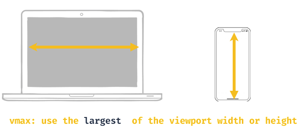
💡 Note
1vmin = 1vw or 1vh, whichever is smaller1vmax = 1vw or 1vh, whichever is larger
Say, for example, that your viewport is 1440px wide and 800px tall, if you set element to have a width of 50vmin, it will be 50% of the height (400px), and if instead you set the element to have a width of 50vmax, it will be 50% of the width (720px).
If the viewport was instead 800px width and 1440px tall, you would get the exact opposite result.
So, when might you use these values?
vmin and vmax is an excellent substitute for, or addition to, CSS orientation media queries (@media screen and (orientation : portrait or @media screen and (orientation : landscape)), since they respond immediately to the aspect ratio of the screen.
💡 Note
While px, em, and rem are primarily used for font sizing, %, vw, and vh are mostly used for margins, padding, spacing, and widths/heights.
What is a fraction unit in CSS
With CSS Grid layout, we get a new flexible length unit (here’s the spec): the fr unit.
💡 Note
fr are fraction units, and they are used in CSS Grid to divide space into fractions.
As straightforward as it can be, fr is the abbreviation of the word “fraction”. The new unit makes it possible to quickly slice the grid up into proportional columns or rows. As a result, the creation of fully responsive and flexible grids becomes almost a breeze.
fraction(fr) in CSS 🎯
As we discussed about percent(%) and, specifically, how in reality they are a bit of a pain in the arse to use.
Say we want to create a layout, based on an 8 column grid. There are two panels; the main content area that fills 5 of the 8 columns and a side panel that fills the remaining 3. To use percent(%), we must manually calculate 5/8 and 3/8.
.main-area { width: 62.5% }
.sidebar { width: 37.5% }
But here we have a catch! every time we add a new panel, we must go back and recalculate each of these values to redistribute the space available. Ridiculous right?
// Using Percentages
.main-area { width: 50% }
.sidebar { width: 25% }
.new-panel { width: 25% }
Fractional units, here, are our saviour. Let’s take one more example to better understand this concept.
Here we have defined a grid of three columns.
<body>
    <div class="grid">
      <div>Div one</div>
      <div>Div two</div>
      <div>Div three</div>
    </div>
</body>
.grid {
display: grid;
grid-template-columns: 1fr 2fr 2fr;
background-color: rgb(248, 8, 8);
}
.grid div {
background-color: rgb(5, 7, 5);
}
The column sizes get defined by the grid-template-columns property. There is a total of 5fr, which means that 1fr will come down to 20%.
This means that the column widths will be 20%, 40%, and 40% respectively. fr is a really nice css length unit for responsive design to use because it takes a lot of the math out of the way.
You can change the amount of fr’s in the grid and the size of 1fr will automatically get figured out for you. This is why you could, and maybe should, prefer them over percent(%) when defining a grid.
🤔 When should you use one unit over another?
Ultimately, there isn’t a perfect answer for this question. In general, it is often best to choose one of the relative, viewport or fractional css length units over px so that your web page has the best chance of rendering a beautifully responsive design.
Choose px however, if you need to ensure that an element never resizes at any breakpoint and remains the same regardless of whether a user has chosen a different default size. px units ensure consistent results even if that’s not ideal.
em is relative to the parent element’s font size, so if you wish to scale the element’s size based on its parent’s size, use em.
rem is relative to the root (html) font size, so if you wish to scale the element’s size based on the root size, no matter what the parent size is, use rem. If you have used em and are finding sizing issues due to lots of nested elements, rem will probably be the better choice.
vw is useful for creating full width elements (100%) that fill up the entire viewport’s width. Of course, you can use any percentage of the viewport’s width to achieve other goals, such as 50% for half the width, etc.
vh is useful for creating full height elements (100%) that fill up the entire viewport’s height. Of course, you can use any percentage of the viewport’s height to achieve other goals, such as 50% for half the height, etc.
% is similar to vw and vh but it is not a length that is relative to viewport’s width or height. Instead, it is a percentage of the parent element’s width or height. Percentage units are often useful to set the width of margins, as an example.
fr are fraction units, and they are used in CSS Grid to divide space into fractions. This unit is pretty new but much helpful while creating responsive design for Grid layout.
Conclusion
There are many discussions on the best practices of using css length units in front-end development. But ideally the px unit should be used when the properties generally need to be precise e.g. the border-radius and box-shadow horizontal or vertical offset, whilst for the em unit is better used for font sizing. Percentage(%), em, fr are the ideal css length unit to use on responsive design.
On the other hand, rem unit is better used for font sizing and em for margins and paddings. Notably, fr unit is new but has great use cases in responsive grid layout design. Hence, %, em, rem and fr are the ideal css length unit to use on responsive design.
So which unit do you prefer for responsive design? Let us know in the comment section.
Similar articles you may like
- What is CSS Specificity and How Does it Work?
- CSS Styles : Inline, External and Internal (Definitive Guide)
- Essential Git commands : Basic to advance with examples
- React Learning Path in 2020 – A Roadmap from Beginner to Advanced
.


Add comment