
Q1. What is CSS?
CSS stands for Cascading Style Sheets and it describes the style or an appearance of the web pages.
Q2. What is an external stylesheet?
It is a document containing the style information which is linked to a number of HTML files. With an external stylesheet file, you can change the look of an entire website by changing just one file.
<link rel="stylesheet" href="main.css">
Q3. Explain the difference between display: none and visibility: hidden?
These both are style properties.
display: none
This doesn’t allocate any space and removes the element entirely from the page which means it does not appear at all even though it remains in the source code.
visibility: hidden
The tag is not visible (hidden) on the page but the space is allocated unlike display: none.
Q4. List out the five values for “position”?
Static, relative, absolute, fixed and sticky are the five possible values for “position”.
Q5. Is CSS case sensitive?
No, CSS is not case-sensitive.
Q6. How to fix the image in the background?
To do so, we need to use background-attachment property in our CSS.
body {
  background-image: url('img_tree.gif');
  background-repeat: no-repeat;
  background-attachment: fixed;
}
Q7. Tell me why do we recommend external CSS versus Inline?
- Inline CSS has a bad impact on site performance, whereas external CSS reduce file size which helps fast rendering of a webpage.
- It is hard to maintain Inline CSS code.
Q8. How do browsers read CSS?
From right to left.
Q9. How many ways can you define CSS in a page?
There are three ways:
- Inline styles
- Internal styles
- External Styles
Q10.Tell me few advantages & disadvantages of Inline CSS?
Advantages:
– You can easily and quickly insert CSS rules to an HTML page. That’s why this method is useful for testing or previewing the changes, and performing quick-fixes to your website.
– You don’t need to create and upload a separate document as in the external style.
Disadvantages:
– Adding CSS rules to every HTML element is time-consuming and makes your HTML structure messy.
– Styling multiple elements can affect your page’s size and download time.
Q11.Tell me few advantages & disadvantages of Internal CSS?
Advantages:
– We can use class and id selectors.
– Since we will only add the code within the same HTML file, we don’t need to upload multiple files.
Disadvantages:
– Adding the code to the HTML document can increase the page’s size and loading time.
Q12.How many ways external CSS can be attached to an HTML document?
You can attach external style sheets in two ways — linking and importing.
Q13.Tell me few advantages & disadvantages of External CSS?
Advantages:
– Since the CSS code is in a separate document, your HTML files will have a cleaner structure and are smaller in size.
– You can use the same .css file for multiple pages.
Disadvantages:
– Your pages may not be rendered correctly until the external CSS is loaded.
– Linking to multiple CSS files can increase your site’s download time.
Q14.How to create rounded borders in CSS?
The border-radius property is used to add rounded borders to an element.
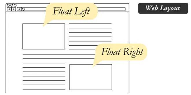
Q15.Can you tell us when you would utilize CSS float?
float is utilized when we need to make an element of our web page push to the right or left and make other elements cover around it.
Example:
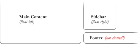
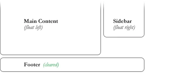
Q16.Can you tell us when you would utilize CSS clear?
A clear is utilized when we don’t need an element to wrap around another element, such as a float.
Example – Uncleared Footer
Example – Cleared Footer
Q17.Tell me how you clear a float element?
To clear it, we would need to do a clear:both or try overflow:auto on the containing div element.
Q18.Explain the difference between class and id?
id and class both are hooks in CSS.
- IDs are unique
- Class is NOT unique
Q19.What is the @charset CSS rule?
We can use the CSS @charset rule to specify the character encoding used in a stylesheet.
@charset "UTF-8";
Q20.What do you mean by Responsive Web Design (RWD)?
Responsive web design is about creating web sites which automatically adjust themselves to look good on all devices, from small phones to large desktops.
Q21.What is the difference between CSS Grid and CSS Flexbox?
CSS Grid and Flexbox are complimentary web layout technique but the major differences are:
- Flexbox is made for one dimensional layouts and Grid is made for two dimensional layouts.
- The approach of CSS Grid is the layout first, while the Flexbox approach is primarily the content.
- The Flexbox layout is best suited to small-scale layouts, while the Grid layout is designed for larger-scale layouts that are not linear in design.
Q22.What is the difference between absolute vs relative position?
Relative position
- Element will be positioned relative to its original position.
- Element will remain in normal document flow.
Absolute position
- Element will be positioned relative to the closest positioned ancestor.
- Element will be removed from normal document flow.
Q23.What is the use of CSS content property?
The content property in CSS is used to generate the content dynamically (during run time) or modify the text inside an HTML tag.
This property is combined with the ::after and ::before pseudo-elements that are used to append or prepend a value.
Q24.What is the difference between em, rem, %, vw, vh and px in CSS?
emand rem are used mainly when working with responsive design and they are relative units.emis relative to the parent element.remis relative to the root element (HTML tag).%is relative to the parent elementvwis relative to the viewport’s widthvhis relative to the viewport’s height- On the other hand, Pixels (
px) are considered absolute units that means thepxunit is fixed and does not change based on any other element.
Q25.What do you mean by z-index?
Z-index is a simple way to tell which element is in front of another one, similar to layers in Adobe Photoshop.
Q26.What is the difference between min-height and height property?
Height:
The height property blocks the height of an element to the given value:
div.mydiv {
  height: 100px;
}
Here, the div will have 100px height no matter what. Even if the content spans more than 100px;
Min-height:
div.mydiv {
  min-height: 100px;
}
This means the div will start at 100px, if the content pushes the div beyond 100px it will continue growing. However, if you have content that takes less than 100px it will still take 100px in space.
Q27.What do you mean by CSS Selectors?
Selectors are what allows you to target specific HTML elements and apply style to them.
Q28.How many types of CSS Selectors available and what are they?
Five types:
- Simple selectors
- Combinator selectors
- Pseudo-class selectors
- Pseudo-elements selectors
- Attribute selectors
Q29.What do you mean by type selector in CSS?
Type Selector is also known as Element selector or Tag selector. This selector must match one or more HTML elements of the same name.
Thus, a selector of nav would match all HTML nav elements, and a selector of p would match all p elements in our HTML document.
Example:
p {
  background-color: lightblue;
}
Q30.How do you define id selector in CSS?
By using #
Example: #demo
Q31.How do you define class selector in CSS?
By using(.) period.
Example: .demo
Q32.What do you mean by universal selector in CSS?
CSS Universal selector is used as a wildcard character which is denoted by (*) star symbol. By universal selector you can select all the elements on the HTML page.
Q33.What do you mean by grouping selector in CSS?
The grouping selector is used to select all the elements with the same style definitions. Front-end developers usually use grouping selector to minimize the code.
Example:
h1, h2, h3 {
  font-weight: normal;
}
Q34.Why do we need CSS Combinators?
Overuse of classes and IDs can create more presentational markup in our HTML, creating more work for us and anyone else working with the code.
By CSS combinators, we can reduce the strain of overly specific selectors and heavier markup by efficiently associating elements on our page.
Q35.What do you mean by CSS combinator?
A combinator is something that explains the relationship between the selectors in CSS. By combinators we can target children, grandchildren, great-grandchildren, or later of a given element in the document tree.
Q36.How many types of CSS combinator present and what are they?
There are four different combinators in CSS and they are as follows:
- Descendant selector (space)
- Child selector (
>) - Adjacent sibling selector (
+) - General sibling selector (
~)
Q37.What do you mean by descendant selector in CSS?
Descendant selector lets you mix simple selectors with a specified logic and is denoted with an empty space.
The pattern of this combinator is simply two tags side by side with a space in between them. It selects elements that are descendants of the first element.
article p {
  background-color: yellow;
}
Q38.What do you mean by child selector in CSS?
The child selector uses the greater than (>) symbol to denote and targets elements that are immediate children of the parent.
We can use this selector, for instance, to select the first level of list elements inside a nested list that has more than one level.
ul > li {

  list-style: square;

}
Q39.What is the difference between descendant & child selector?
The difference between descendant and child selectors is that the child selector is more specific. It only selects direct children’s elements of the first tag.
The descendant selector however is more liberal. Not only it selects children of the first tag, it will also select grandchildren, great grandchildren, and so on.
Q40.What do you mean by adjacent sibling selector?
Adjacent means “immediately following” and in CSS it is represented with the plus (+) operator.
Adjacent sibling combinator targets elements that are next to each other in the document tree which have the same parent. In other words, the second tag directly follows the first, and they share the same parent element.
This selector has the syntax like: E1 + E2, where E2 is the target of the selector.
Example:
The selector h1 + p in the following example will select the p elements only if both the h1 and p elements share the same parent in the document tree and h1 is immediately precedes the p element.
That means only those paragraphs that come immediately after each h1 heading will have the associated style rules.
h1 + p {

  color: blue;

  font-size: 18px;

}
Q41.What do you mean by general sibling selector?
Sibling means elements on the same level, so none of them are their parent or children.
The general sibling selector is similar to the adjacent sibling selector, but it is less strict. A general sibling selector is made up of two simple selectors separated by the tilde (~) character. It can be written like: E1 ~ E2, where E2 is the target of the selector.
Example:
The selector h1 ~ p in the example below will select all the p elements that preceded by the h1 element, where all the elements share the same parent in the document tree.
h1 ~ p {

  color: blue;

  font-size: 18px;

}
So, if you need to target elements on the same level of a specified element in a document tree then it is good to use the general sibling selector.
Q42.What do you mean by attribute selector in CSS?
Attribute selectors are a special kind of selector that will match elements based on their attributes and attribute values.
You can create an attribute selector by putting the attribute—optionally with a value—in a pair of square brackets [ ].
Example:
[title] {
  color: blue;

}
Q43.How many types of attribute selector are available in CSS?
There are two types:
- Presence and value selectors
- Substring matching selectors
Q44.What is presence and value selectors in CSS?
These selectors will select an element based on the presence of an attribute alone (e.g. href), or on various different matches against the value of the attribute.
Example:
[attr]– The attribute itself.[attr=”value”]– The attribute has this exact value.[attr~=”value”]The attribute has this value in a space-separated list.[attr|=”value”]The first attribute value in a dash-separated list.
Q45.What is substring matching selectors in CSS?
Substring selectors allow for more advanced matching inside the value of your attribute.
For example, if you have classes of message-warning and message-error and wanted to match everything that started with the string “message-“, you could use [class^=”message-“] to select them both!
[attr*=”value”]– The attribute value contains this value.[attr^=”value”]– The attribute starts with this value.[attr$=”value”]– The attribute ends with this value.
Q46.Explain simple [attribute] selector work?
This is the simplest form of an attribute selector that applies the style rules to an element if a given attribute exists.
Example:
[title] {
  color: blue;

}
Q47. How attribute has exact value selector works in CSS?
[attribute=”value”] – attribute has this exact value
Here we can use the = operator to make an attribute selector matches any element whose attribute value is exactly equal to the given value.
Example:
input[type='submit'] {

  border: 1px solid green;

}
Q48. How space-separated attribute selector works?
[attribute~=”value”] – attribute has this value in a space-separated list
We can use the ~= operator to make an attribute selector matches any element whose attribute value is a list of space-separated values (like class=”alert warning”), one of which is exactly equal to the specified value.
Example:
HTML
<body>
  <p class="warning">The style will apply to this paragraph. </p>
  <p class="warning highlight">The style will also apply to this paragraph. </p>
  <p class="highlight">The style will not apply to this paragraph. </p>
</body>
CSS
[class~='warning'] {
  color: #fff;

  background: red;

}
Q49.How attribute value in a dash-separated selector works?
[attribute|=”value”] – first attribute value in a dash-separated list
We can use the |= operator to make an attribute selector matches any element whose attribute has a hyphen-separated list of values beginning with the specified value.
HTML
<body>
  <p lang="en">The style will apply to this paragraph.</p>
  <p lang="en-us">The style will also apply to this paragraph.</p>
  <p lang="us">The style will not apply to this paragraph.</p>
</body>
CSS
p[lang|='en'] {

  color: #fff;

  background: blue;

}
The selector in the above example matches all elements that has a lang attribute containing a value start with en, whether or not that value is followed by a hyphen and more characters.
In other words, it matches the elements with lang attribute that has the values en, en-US, en-GB, and so on but not US-en, GB-en.
Q50.How attribute starts with a value selector work?
[attribute^=”value”] – attribute starts with this value
The [attribute^=value] has a caret (^) operator, which means “to start with”. This will target elements on the page where the given attribute starts with a specific value.
For example we may be able to select all links on the page that are external vs internal, and make the background color light blue.
Example:
a[href^="http://"]
{
  background-color: lightblue;
}
Q51.How attribute ends with a value selector work?
[attribute$=”value”] – attribute ends with this value
This attribute selector makes use of the dollar sign ($) which means “ends with”.
Example:
A use case for this might be to target links on the page which link to a PDF document.
CSS
a[href$='.pdf'] {
  background-color: lightblue;
}
Q52.How attribute contains selector work?
[attribute*=”value”] – attribute value contains this value
It uses asterisk (*) operator, which stands for “contains”. We can use [attribute*="value"] selector which matches all elements whose attribute value contains a specified value.
Example:
HTML
<body>

  <p class="warning">The style will apply to this paragraph.</p>
  <p class="alert warning">The style will also apply to this paragraph.</p>
  <p class="alert-warning">The style will also apply to this paragraph.</p>
  <p class="alert_warning">The style will also apply to this paragraph.</p>
  <p class="highlight">The style will not apply to this paragraph.</p>
</body>
CSS
[class*='warning'] {
  color: #fff;

  background: red;

}
It matches all HTML elements with a class attribute that values contain warning. For example, it matches the elements having class values warning, alert warning, alert-warning or alert_warning etc.
Q53.Explain cascading nature of CSS?
CSS stands for cascading stylesheets. “Cascading” means that the order in which CSS rules are applied to an element actually matters.
Ideally, if two rules are applied to the same element, the one that comes last is the one that will be used.
Q54.What is CSS specificity?
Specificity is the way which helps the browsers to decide which property value is most relevant for the element and, therefore, will be applied.
That means when more than one set of CSS rules apply to the same element, the browser will have to decide which specific set will be applied to the element. The rules the browser follows are collectively called Specificity.
Q55.What is hierarchy of CSS specificity?
There are four distinct categories which define the specificity level of a given selector and they are as follows:
- Inline styles
- ID selectors
- Classes, attributes and pseudo-classes
- Elements and pseudo-elements
Q56.How to calculate CSS specificity?
Calculating the specificity values of selectors is quite tricky. One way to calculate it is to use a weight system to rank different selectors to create a hierarchy.
We have 4 slots, and each one of them starts at 0: _ _ _ _. The slot at the left is the most important, and the rightmost one is the least important.
Like it works for numbers in the decimal system: 1 0 0 0 is higher than 0 1 0 0.
Here is a summary of the weights:
| CSS | weights |
| Inline Styles | 1000 |
| ID selectors | 100 |
| Classes, Attributes and Pseudo-classes | 10 |
| Elements and Pseudo-elements | 1 |
Q57.How do you override specificity in CSS?
!important overrides all other styles regardless of the specificity of the selector where it is used.
Q58.What is the role of universal selector and combinators in CSS specificity?
The universal selector (*) and combinators do not impact the weight of your selectors and have lower specificity, i.e., 0,0,0,0 .
Q59.What is an absolute unit in CSS?
Absolute units are fixed and (mostly) relate to some physical measurement. Once they are declared, their size cannot be altered. These units should not be used for a responsive website layout where the screen size varies.
Eg: px
Q60.Why you should not use px in your responsive design?
One problem with the pixel unit is that it does not scale upward for visually-impaired readers or downward to fit mobile devices.
Hence, using px can be problematic for responsive design, but they are useful for maintaining consistent sizing for some elements. If you have elements that should not be resized, then using px is a good choice
Q61.When to use absolute units?
Absolute units are useful wherever we don’t want to stretch the elements. Eg. Logo
Q62.What is a relative unit in CSS?
Relative units do not have fixed sizes as in the case of absolute units in CSS. These are considered relative because they change/scale depending on the length of other elements.
The benefit of using relative units is that we can make the font size, padding or other elements scale relative to everything else on the page. It is also a preferred units for responsive design since they adjust to different screen sizes automatically.
Q63.What is the difference between absolute vs. relative CSS length units?
An absolute unit of measurement means that the value may be interpreted by the browser, but not recalculated. On the other hand, a relative unit of measurement means that the value may be interpreted, and possibly also recalculated by the browser.
Q64.What is the difference between em vs rem?
The difference lies in the inheritance. The rem value is based on the root element i.e html. Every child element uses the html font size as their calculation basis.
em on the other hand, is based on the font size of the parent element.
Q65.Which is better for responsive design – em OR rem?
There is no better unit really, and it all depends on your personal preferences. Some people like to design everything in rem units for consistency and predictability, while others like to also use em units in places where the influence of nearby parent elements would make sense.
In other words, em is best used at the lowest level of a DOM hierarchy.
Q66.What is viewport?
The viewport is the user’s visible area of a web page (not screen or device display size). Also, viewport is defined by the size of a browser window.
viewport == browser window size
Q67.What is the difference – Percent (%) vs. Viewport unit?
Viewport unit represent a percentage of the current browser viewport. Hence, the difference to percentage unit is, that viewport unit always being calculated as the percentage of the browser’s viewport size. Whereas percentage units inherit the size of their parent element.
Let’s consider an example of a mobile screen viewport that is 480px x 800px.
1 vw=1%of the viewport’s width (or4.8px)50 vw=50%of the viewport’s width (or240px)1 vh=1%of the viewport’s height (or8px)50 vh=50%of the viewport’s height (or400px)
To sum up: –
When dealing with widths, the % unit is more suitable. With heights, the vh unit is better.
Q68.What is vh and vw units in css?
1vh is equal to 1% of the current viewport height (i.e. the open browser window), while 1vw is 1% of the current viewport width.
Q69.What is vmax and vmin units in css?
1vmin = 1vw or 1vh, whichever is smaller
1vmax = 1vw or 1vh, whichever is larger
Say, for example, that your viewport is 1440px wide and 800px tall, if you set element to have a width of 50vmin, it will be 50% of the height (400px), and if instead you set the element to have a width of 50vmax, it will be 50% of the width (720px).
vmin and vmax is an excellent substitute for, or addition to, CSS orientation media queries (portrait or landscape), since they respond immediately to the aspect ratio of the screen.
Q70.What is fr unit in css ?
fr are fraction units, and they are used in CSS Grid to divide space into fractions. This unit is pretty new but much helpful while creating responsive design for Grid layout.
Q71.Give use cases of px, em, rem, vw, vh, % units?
px, em, and rem are primarily used for font sizing on the other hand %, vw, and vh are mostly used for margins, padding, spacing, and widths/heights.
Q72.Which unit do you prefer for responsive design?
Ideally the px unit should be used when the properties generally need to be precise e.g. the border-radius and box-shadow horizontal or vertical offset.
On the other hand, rem unit is better used for font sizing and em for margins and paddings. Notably, fr unit is new but has great use cases in responsive grid layout design.
Hence, %, em, rem and fr are the ideal css length unit to use on responsive design.
Q73.What is the difference between HTML & CSS?
In short, HTML defines the structure of your web page, whereas CSS defines the visual presentation of the web page.
Q74.What can’t you do with HTML?
HTML isn’t a programming language hence we cannot do the following:
- Get data from a server database or other remote address
- Process data submitted through a form
- Handle user accounts, logins, and passwords
- Add, hide, or remove web page elements on-the-fly
Q75.What do you mean by Box model?
Every element that can be displayed on a web page is comprised of one or more rectangular boxes. CSS box model typically describes how these rectangular boxes are laid out on a web page.
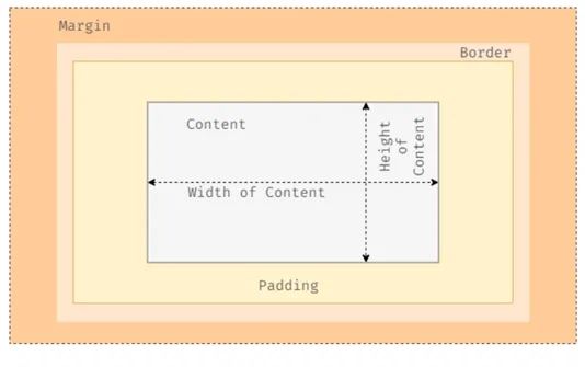
In a nutshell, when we say box it means that it has content, padding, border and margin. So, a box is made up of four properties. The image below illustrates it all:
Q76.What do you mean by padding?
Padding properties are used to generate space around an element’s content, inside of any defined borders.
Q76.When do you use padding?
Padding is ideal for cases where you want to extend the border away from the element or if you want to give space between the background colour of an element and the content inside.
Q77.When do you mean by border?
Border is the third area in the box model around the padding box. This creates a border around the element and its padding. You can set thickness, colour and style of the border.
Q78.What do you mean by margin?
margin properties are used to create space around elements, outside of any defined borders.
Q79.What is the difference between padding & margin?
The key differences between CSS margin and padding are:
- Margin is the space outside of the border area, whereas padding is the space inside the border area.
- Margin backgrounds are always transparent, whereas the background of the padding area of a box is specified by the background property of the element.
Q80.When do you use padding and margin?
Both allows us to adding space but if we find ourself saying – “we need more background”, then likely we need some padding. Padding allows the background colour through. If we feel… we need space between boxes, then that is when margin comes into play.
Margin is outside of the border, while padding is inside of the border.
Q81.What do you mean by collapsing margins?
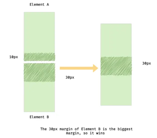
Top and bottom margins of elements are sometimes collapsed into a single margin that is equal to the largest of the two margins. This is called margins collapse or auto collapse of margins.
Q82.What is auto margin?
We often set margin property with value auto to block level element which helps to horizontally center the block level element (not text inside the element).
Q83.What is the relationship of colours with margin & padding?
The margin and padding properties are completely transparent and do not accept any colour values. Being transparent, though, they show the background colours of relative elements.
For margins, we see the background colour of the parent element, and for padding, we see the background colour of the element the padding is applied to.
Q84.What do you mean by box-sizing?
The box-sizing property defines how to calculate the total width and height of an element.
We can adjust box-sizing property using these two values:
- box-sizing: content-box;
- box-sizing: border-box;
Q85.How does content-box property works?
The way the content-box property works is, you specify the width and height for an element, any further additions to the box of any element will be added to its width and height.
Q86.How does border-box property works?
The border-box property takes the specified width and height as the total space an element will take up on the users screen, regardless of how much padding or border is added to the element.
In other words, when you set box-sizing: border-box; on an element, the padding and border of that element no longer increase its width, which is just opposite of content-box property.
Q87.Would you use content-box or border-box?
I prefer to use border-box, because it removes the uncertainties when sizing. It makes sure that if you set your element to have certain dimensions, it’ll stay as such.
Q88.What is the use of font-variant: small-caps; property?
In a small-caps font, all lowercase letters are converted to uppercase letters. However, the converted uppercase letters appear in a smaller font size than the original uppercase letters in the text.

Q89.What do you mean by Flexbox?
Flexbox is a way to describe how elements should be displayed inside another element. The outer element is called the flexbox container (the parent element – responsible for styling of full box), and the inner elements are known as flexbox items (the child elements – responsible for individual item in a box).
More, flexbox layout is an one-dimensional layout system, meaning that it handles either rows or columns, not both.
Q90.What are advantages of using Flexbox?
Flexbox is a great way to get more flexibility in your layouts and to simplify responsive layout design.
Q91.What are flexbox container properties available for us?
- display
- flex-direction
- flex-wrap
- flex-flow
- justify-content
- align-content
- align-items
Q92.What are flexbox items properties available for us?
- flex
- flex-basis
- flex-grow
- flex-shrink
- align-self
- order
Q93.How to create a flexbox container?
A flexbox container is created by setting the display property on the parent HTML element to either flex or inline-flex.
.flex-container {
  display: flex;
}
Q94.How to create a Row or Column in flexbox?
If we want to arrange the flexbox items to look like a row or a column then we can apply flex-direction property to the flexbox container.
.flex-container {
  display: flex;
  flex-direction: row;
  background-color: pink;
  border: 2px solid #000;
}
Q95.What is the use of flex-wrap property in flexbox?
The flex-wrap property allows us to choose whether our flexbox items should wrap or not.
.flex-container {
  display: flex;
  flex-wrap: nowrap;
  background-color: pink;
  border: 2px solid #000;
}
Q96.What is the use of flex-flow property in flexbox?
This property is a shorthand for setting the flex-direction and flex-wrap properties. The default value is flex-flow: row nowrap;.
Q97.How to align elements horizontally in flexbox?
To define the horizontal alignment of flexbox items, we can use the justify-content property. The available values for this property are flex-start, flex-end, center, space-between, space-around and space-evenly.
Q98.What is the difference between – space-around, space-between, space-evenly?
- We can use space-around to display flexbox items with space before, between, and after:
- With space-between flexbox items are displayed with equal spacing between them, first and last flexbox items are aligned to the edges of the flexbox container.
- space-evenly is similar to space-around, except all space is the same.
Q99.How to align elements vertically in flexbox?
To align flexbox items vertically, we can use the align-items, align-content or align-self properties.
Q100.What is the use of align-items property?
To define the vertical alignment of several flexbox items, we can apply the align-items property to the flexbox container. The available values for this property are stretch, flex-start, flex-end, center and baseline.
Q101.What is the use of align-content property?
To define the vertical alignment of several lines of flexbox items, we can use the align-content property. This property has no effect when there is only one line of flexbox items.
The available values for this property are stretch, flex-start, flex-end, center, space-between and space-around.
Q102.What is the use of align-self property?
The align-self property allows the default alignment (the one specified by align-items) to be overridden for individual flexbox items.
The available values for this property are auto, stretch, flex-start, flex-end, center and baseline.
Q103.How do you override the align-items value for a specific flexbox item?
By using align-self property.
Q104.How to achieve perfect centering in flexbox?
It’s quite simple in Flexbox! Just ensure both justify-content and align-items are set to center, and then flexbox items will be perfectly centered:
Q105.How to change the order of the elements in flexbox?
Several properties allow determining the order of the flexbox items and they are order, row-reverse, column-reverse and wrap-reverse.
Q106.What is the use of order property in flexbox?
The order property controls the order in which flexbox items appear in the flexbox container.
By default, all flexbox items have the order: 0; value. If you specify the value -1 for an element, it moves toward the start of the line, and the value 1 places it in the end.
Q107.What is the use of flex-grow property in flexbox?
The flex-grow property gives a flexbox item the ability to grow relative to the rest of the flexbox items in the flexbox container.
It accepts a unitless value that serves as a proportion. The default value is 0. Negative numbers are invalid.
For example, if all flexbox items have flex-grow set to 1, the remaining space in the flexbox container will be distributed equally to each flexbox item.
If one of the children has a value of 2, the remaining space would (attempt to) take up double the space of the others.
Q108.What is the use of flex-shrink property in flexbox?
The flex-shrink property applies to the flexbox items and indicates how much each element will be reduced if there is not enough available space.
It accepts a unitless value that serves as a proportion. The default value is 1. The value 0 allows keeping the item’s original size. Negative numbers are invalid.
But when flex-shrink property won’t work if the flexbox container has the flex-wrap: wrap; property.
Q109.What is the use of flex-basis property in flexbox?
The flex-basis property defines the default size of the flexbox item before the available space is distributed. You can set an absolute/relative value (e. g. 200px or 10em), a percentage value (e. g. 50%) or a keyword (auto, content).
Q110.What is the use of flex property in flexbox?
The flex property is shorthand for flex-grow, flex-shrink, and flex-basis combined. The second and third parameters (flex-shrink and flex-basis) are optional, with the default being 0 1 auto.
Q111.What do you mean by Media Queries in CSS?
Literally speaking the word “media” means the device(s) and “queries” in this context refer to the code that will be used to target these devices. So, a media query is a CSS3 feature that makes a webpage adapt its layout to different screen sizes and media types.
Q112.How many types of media types available in media queries for use?
We have four types and they are:
screen: Apply to all the screens – Monitors, TV, smartphone, and tablet screensprint: For the printed media only – i.e. When the user prints your web pagespeech: For screen readers that “read” the page out loudall: For all media types
Q113.What are media features in media queries?
By media feature we tell the browser which condition must meet the output device specified for the condition to be true and apply the code contained in the media query.
For example, if we apply min-width:320px, it means that the specified CSS properties will only be applied if the devices have a minimum width of 320px. If the device width is less than 320px the CSS properties will not work.
@media screen and (max-width: 320px) {

  /* CSS */

}
That mean, min-width, max-width, orientation, height, width, and resolution of a display are media features with specific values. An expression is true if the feature is met, and false if it is not.
Q114.What is the use of breakpoints in media queries?
CSS breakpoints are a huge part of responsive designs. We use breakpoints with media queries to set points where websites adjust to the width of devices. Therefore, we can control the layout of websites and change them according to users’ devices.
@media (max-width: 480px) {
  .text {
    font-size: 16px;
  }

}
Here, the breakpoint is 480px. Now the media query knows when to set or overwrite the new class. Basically, if the width of a device is smaller than 480px, the text class will be applied, otherwise, it won’t.
Q115.What are pseudo elements?
A CSS pseudo element is used to style specified parts of an element.
Pseudo elements really helpful in the situations when you just want to style the first letter of a paragraph to create the drop cap effect or you want to insert some content before or after an element, etc. only through stylesheet.
Q116.Give an example of textual pseudo elements?
::first-line and ::first-letter
Q117.Give an example of generated content pseudo elements?
::before and ::after
Q118.Give an example of fragment pseudo elements?
::selection
Q119.What is the use of the ::marker pseudo elements?
::marker pseudo element is for styling the stylistic marker of a list element.
Q120.What is the use of ::placeholder pseudo elements?
::placeholder pseudo element allows you to style the placeholder text of a form element ( <input> or <textarea>).
Q121.What is the difference between Pseudo Elements & Pseudo Class?
| Pseudo Elements | Pseudo Class |
| Denoted by :: | Denoted by : |
| Specificity – 0 0 0 1 | Specificity – 0 0 1 0 |
Q122.What is the use of content property in pseudo element?
The content property is used with the ::before and ::after pseudo elements, to insert generated content.


Add comment