
In this blog, we’ll go through the process of creating a Prepend and an Append button in React using the styled-components library for styling and Vite for scaffolding the React project.
The Prepend button will have an icon before the button text, while the Append button will have an icon after the button text.
Setting Up the Project
First, let’s set up a new React project using Vite. If you don’t have Vite installed, you can install it globally via npm:
npm install -g create-viteNext, create a new React project:
create-vite my-react-app --template react
cd my-react-app
npm install
After setting up the project, install styled-components:
npm install styled-componentsCreating the Prepend Button
Create a new file named PrependBtn.jsx in the src/components directory. This button will have an SVG icon before the button text.
PrependBtn.jsx
// Library Imports
import styled from 'styled-components';

// CSS-in-JS
export const PrependBtn = styled.button`
  &::before {
    content: url('data:image/svg+xml;base64,PHN2ZyB3aWR0aD0iMTkiIGhlaWdodD0iMTkiIHZpZXdCb3g9IjAgMCAxOSAxOSIgZmlsbD0ibm9uZSIgeG1sbnM9Imh0dHA6Ly93d3cudzMub3JnLzIwMDAvc3ZnIj4KPHBhdGggZD0iTTQuNSAwTDUuMTc1MjkgMS44MjQ3MUw3IDIuNUw1LjE3NTI5IDMuMTc1MjlMNC41IDVMMy44MjQ3MSAzLjE3NTI5TDIgMi41TDMuODI0NzEgMS44MjQ3MUw0LjUgMFoiIGZpbGw9IndoaXRlIi8+CjxwYXRoIGQ9Ik0xNi41IDEzTDE3LjE3NTMgMTUuMTg5NkwxOSAxNkwxNy4xNzUzIDE2LjgxMDRMMTYuNSAxOUwxNS44MjQ3IDE2LjgxMDRMMTQgMTZMMTUuODI0NyAxNS4xODk2TDE2LjUgMTNaIiBmaWxsPSJ3aGl0ZSIvPgo8cGF0aCBkPSJNMTMuMDQ2OSAwLjI5MjQ3MUMxMy4yMjg4IC0wLjA5NzQ5MDIgMTMuNzcxMiAtMC4wOTc0OTAyIDEzLjk1MzEgMC4yOTI0NzFMMTUuNDg0OSAzLjU3NjM5QzE1LjUyOTYgMy42NzIxNyAxNS42MDIxIDMuNzUxNDYgMTUuNjkyNyAzLjgwMzMzTDE4Ljc0MzIgNS41NTE3NEMxOS4wODU2IDUuNzQ3OTMgMTkuMDg1NiA2LjI1MjAyIDE4Ljc0MzIgNi40NDgyMkwxNS42OTI3IDguMTk2NjVDMTUuNjAyMSA4LjI0ODU0IDE1LjUyOTYgOC4zMjc3NiAxNS40ODQ5IDguNDIzNTNMMTMuOTUzMSAxMS43MDc1QzEzLjc3MTIgMTIuMDk3NSAxMy4yMjg4IDEyLjA5NzUgMTMuMDQ2OSAxMS43MDc1TDExLjUxNTEgOC40MjM1M0MxMS40NzA0IDguMzI3NzYgMTEuMzk3OSA4LjI0ODU0IDExLjMwNzMgOC4xOTY2NUw4LjI1Njc1IDYuNDQ4MjJDNy45MTQ0MiA2LjI1MjAyIDcuOTE0NDIgNS43NDc5MyA4LjI1Njc1IDUuNTUxNzRMMTEuMzA3MyAzLjgwMzMzQzExLjM5NzkgMy43NTE0NiAxMS40NzA0IDMuNjcyMTcgMTEuNTE1MSAzLjU3NjM5TDEzLjA0NjkgMC4yOTI0NzFaIiBmaWxsPSJ3aGl0ZSIvPgo8cGF0aCBkPSJNMy41NDUyMiAxMC4yNjkzQzMuNzI0NDkgOS45MTAyMyA0LjI3NTU0IDkuOTEwMjMgNC40NTQ4MSAxMC4yNjkzTDUuNDYzMzggMTIuMjg5OEM1LjUwNzEyIDEyLjM3NzQgNS41NzkyNSAxMi40NTAyIDUuNjY5NzYgMTIuNDk4MUw3Ljc0NzM5IDEzLjU5NjlDOC4wODQyIDEzLjc3NTEgOC4wODQyIDE0LjIyNDkgNy43NDczOSAxNC40MDMxTDUuNjY5NzYgMTUuNTAxOUM1LjU3OTI1IDE1LjU0OTggNS41MDcxMiAxNS42MjI2IDUuNDYzMzggMTUuNzEwMkw0LjQ1NDgxIDE3LjczMDdDNC4yNzU1NCAxOC4wODk4IDMuNzI0NDkgMTguMDg5OCAzLjU0NTIyIDE3LjczMDdMMi41MzY2NSAxNS43MTAyQzIuNDkyOTEgMTUuNjIyNiAyLjQyMDc3IDE1LjU0OTggMi4zMzAyNyAxNS41MDE5TDAuMjUyNjUgMTQuNDAzMUMtMC4wODQyMTY3IDE0LjIyNDkgLTAuMDg0MjE2NyAxMy43NzUxIDAuMjUyNjUgMTMuNTk2OUwyLjMzMDI3IDEyLjQ5ODFDMi40MjA3NyAxMi40NTAyIDIuNDkyOTEgMTIuMzc3NCAyLjUzNjY1IDEyLjI4OThMMy41NDUyMiAxMC4yNjkzWiIgZmlsbD0id2hpdGUiLz4KPC9zdmc+Cg==');
    position: relative;
    top: 3px;
    left: -6px;
  }

  font-family: 'Rubik', sans-serif;
  width: ${({ width }) => width || '241px'};
  height: ${({ height }) => height || '56px'};
  border-radius: 100px;
  background-color: #242424;
  color: #ffffff;
  font-size: 20px;
  font-weight: 400;
  line-height: 23px;
  text-align: center;
  outline: none;
  padding-left: 10px;
  padding-right: 10px;
  cursor: pointer;
  border: 1px solid #242424;
  transition: background-color 0.3s ease, border 0.3s ease, color 0.3s ease;

  &:hover {
    background-color: #454545;
    border: 1px solid #595959;
    color: #ff7624;
  }
`;
Creating the Append Button
Create a new file named AppendBtn.jsx in the src/components directory. This button will have an SVG icon after the button text.
AppendBtn.jsx
// Library Imports
import styled from 'styled-components';

// CSS-in-JS
export const AppendBtn = styled.button`
  font-family: 'Rubik', sans-serif;
  width: fit-content;
  height: ${({ height }) => height || '56px'};
  border-radius: 100px;
  background-color: transparent;
  color: #171717;
  font-size: 20px;
  font-weight: 400;
  line-height: 23px;
  text-align: center;
  outline: none;
  cursor: pointer;
  border: none;

  &::after {
    content: url('data:image/svg+xml;base64,PHN2ZyB3aWR0aD0iMTkiIGhlaWdodD0iMjAiIHZpZXdCb3g9IjAgMCAxOSAyMCIgZmlsbD0ibm9uZSIgeG1sbnM9Imh0dHA6Ly93d3cudzMub3JnLzIwMDAvc3ZnIj4KPHBhdGggZD0iTTE3LjI0NTEgMS44NzAxMlYxMS4zOTc1SDE2LjE5MDRWMy42NjMwOUw1LjI1Njg0IDE0LjU5NjdMNC41MTg1NSAxMy44MjMyTDE1LjQxNyAyLjkyNDhINy42ODI2MlYxLjg3MDEySDE3LjI0NTFaIiBmaWxsPSIjMTcxNzE3Ii8+Cjwvc3ZnPgo=');
    position: relative;
    top: 5px;
    left: 5px;
  }

  &:hover {
    color: #ff7624;
  }
`;
We have used base64 Guru to convert SVG image into base64.
Integrating Buttons in the App
Now that we have our buttons ready, let’s integrate them into the main application. Update your App.jsx file to import and use these buttons.
import { AppendBtn } from './components/AppendBtn';
import { PrependBtn } from './components/PrependBtn';

function App() {
  return (
    <>
      <PrependBtn>Prepend Button</PrependBtn>
      <AppendBtn>Append Button</AppendBtn>
    </>
  );
}

export default App;
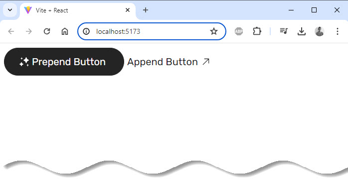
Output:
Conclusion
In this blog, we’ve created a Prepend button with an icon before the text and an Append button with an icon after the text using React and styled-components.
By leveraging the power of CSS-in-JS with styled-components and the fast build times of Vite, we can efficiently develop and style React components.
Happy coding!


Add comment