
Material-UI (MUI) is a React UI framework that follows the principles of Material design. Material design is a design system created by Google.
In this article we will cover the mysteries of MUI Theming.
We will explore what it is, why it’s useful, and how you can wield it to create stunning, consistent, and highly customizable user interfaces in your React applications.
So buckle up and get ready for an exciting journey into the heart of Material UI’s theming system!
💡 MUI Installation
Understanding the Basics of a Theme Object
Before we dive into the deep end, let’s take a moment to understand what a theme object is.
In the simplest terms, a theme object is a configuration object that determines the look and feel of your Material UI components.
The theme object comes with a set of default values, which are used by Material UI components. This means that even if you don’t explicitly define a theme, your Material UI components will still look good thanks to these default values.
But the real power of the theme object lies in its customizability. You can change the colors, the typography, the spacing, and much more to make Material UI truly your own.
This is where MUI Theming really shines, and we will explore this in more detail in the upcoming sections.
const theme = createTheme({
	palette: {
		primary: {
			main: '#ff5722',
		},
		secondary: {
			main: '#03a9f4',
		},
	},
});
In the code snippet above, we are creating a custom theme object using the createTheme function from Material UI.
We are defining our own primary and secondary colors, which will be used by Material UI components throughout our app.
This is just a simple example, but you can customize your theme object to your heart’s content.
To promote greater consistency between apps, Material UI provides two theme types to choose from: light and dark.
By default, components use the light theme type. However, you can easily switch to the dark theme or even define your own custom themes.
import React from 'react';
import { createTheme, ThemeProvider } from '@mui/material/styles';

const theme = createTheme({
  palette: {
    type: 'dark',
    primary: {
      main: '#90caf9',
    },
    secondary: {
      main: '#f48fb1',
    },
  },
});

function App() {
  return (
    <ThemeProvider theme={theme}>{/* Your component tree */}</ThemeProvider>
  );
}

export default App;
In the code snippet above, we are creating a dark theme with custom primary and secondary colors.
We then use the ThemeProvider component from Material UI to apply this theme to our entire app.
This is a simple example of how Material UI and its theming capabilities can be used to create a consistent and visually pleasing user interface.
Introduction to the Theme Provider
Now that we have created our custom theme, how do we apply it to our app? This is where the ThemeProvider comes into play.
The ThemeProvider is a React component provided by Material UI that makes the theme available to all components in the component tree.
It uses the context feature of React to pass the theme down to the components, ensuring that all components have access to the theme object.
📣 Also Read: React useContext Hook
To use the ThemeProvider, you simply wrap your component tree with it and pass your theme as a prop.
It’s important to note that the ThemeProvider should preferably be used at the root of your component tree to ensure that all components have access to the theme.
Let’s see an example:
main.jsx
import React from 'react';
import ReactDOM from 'react-dom/client';
import App from './App.jsx';
import './index.css';
import { ThemeProvider } from '@mui/material';
import { theme } from './theme.js';

ReactDOM.createRoot(document.getElementById('root')).render(
  <React.StrictMode>
    <ThemeProvider theme={theme}>
      <App />
    </ThemeProvider>
  </React.StrictMode>
);
theme.js
import { createTheme } from '@mui/material/styles';

export const theme = createTheme({
	palette: {
		primary: {
			main: '#FFBB5C',
		},
		secondary: {
			main: '#C63D2F',
		},
	},
});
App.jsx
import './App.css';
import { Button, Stack } from '@mui/material';
function App() {
return (
<>
<Stack direction="row" spacing={2}>
<Button variant="contained" color="primary">
Button
</Button>
<Button variant="contained" color="secondary">
Button
</Button>
</Stack>
</>
);
}
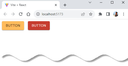
export default App;In the code snippet above, we are creating a custom theme and using the ThemeProvider to apply this theme to our app.
All Material UI components inside the ThemeProvider will now use the colors defined in our custom theme.
Output:
The ThemeProvider is a powerful tool in MUI theming. It allows you to define a theme once and have it automatically applied to all your components, ensuring a consistent look and feel across your app.
Whether you are using the default theme or a custom theme, the ThemeProvider makes it easy to manage and apply your theme.
Utilizing the Material Palette Generator
So, you want to create your own harmonious palettes?
Material UI has got you covered with the Material Palette Generator. This palette generation tool can be used to generate a palette for any color you input.
It’s a fantastic tool for creating a color scheme that matches your brand palette.
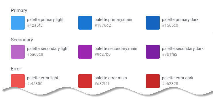
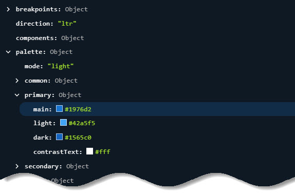
The Material Palette Generator creates a palette object that includes main, dark and light variants of the color you input, as well as a contrasting text (contrastText) color.
This makes it easy to create a consistent color scheme for your app.
We can append a new color to the palette object with a main and text color to create a new custom palette.
theme.js
import { createTheme } from '@mui/material/styles';

export const theme = createTheme({
	palette: {
		primary: {
			main: '#FFBB5C',
		},
		secondary: {
			main: '#C63D2F',
		},
		primaryLight: {
      main: "#dbece2",
      contrastText: "#616161"
    }
	},
});
“contrastText”, “dark” and “light” are optional, and if omitted, their values will be calculated automatically according to the “tonalOffset” and “contrastThreshold” of the “main” value.
More details on this are available on MUI Palette Documentation.
In the code snippet above, we are using hex code #dbece2 as main color. This color object includes light, main, and dark variants as well as a contrasting text color, all of which can be used in our theme.
App.jsx
import './App.css';
import { Button, Stack } from '@mui/material';
function App() {
return (
<>
<Stack direction="row" spacing={2}>
<Button variant="contained" color="primary">
Button
</Button>
<Button variant="contained" color="primaryLight">
Button
</Button>
</Stack>
</>
);
}
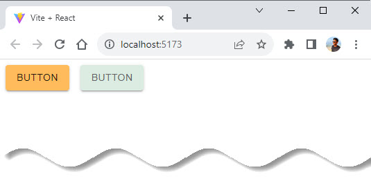
export default App;Creating your own color palettes can be a fun and creative process. But it can also be challenging to create a palette that looks good and meets accessibility standards.
The Material Palette Generator simplifies this process and ensures that your palette is both beautiful and accessible. So go ahead and give it a try! Who knows, you might discover your new favorite color combination.
Output:
MUI theme also provides a set of built-in colors that we can import and use anywhere in the application. Each set of colors comes with all shades from 0 to 100.
Let’s import the theme colors and replace the values we had earlier.
theme.js
import { createTheme } from '@mui/material/styles';
import { green, purple } from '@mui/material/colors';

export const theme = createTheme({
	palette: {
		primary: {
			main: green[500],
		},
		secondary: {
			main: purple[500],
		},
	},
});
App.jsx
import './App.css';
import { Button, Stack } from '@mui/material';
function App() {
return (
<>
<Stack direction="row" spacing={2}>
<Button variant="contained" color="primary">
Button
</Button>
<Button variant="contained" color="secondary">
Button
</Button>
</Stack>
</>
);
}
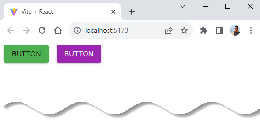
export default App;Output:
The Power of Custom Variables
When using Material UI’s theme with MUI System or any other styling solution, it can be convenient to add additional variables to the theme so you can use them everywhere.
This allows you to define your own custom properties and values that can be accessed throughout your application.
For instance, you might want to define a custom status color that indicates danger, like so:
theme.js
import { createTheme } from '@mui/material/styles';

export const theme = createTheme({
	palette: {
		primary: {
			main: '#FFBB5C',
		},
		secondary: {
			main: '#C63D2F',
		},
	},
	status: {
		danger: '#FFBB5C',
	},
});
In the code snippet above, we have added a new status field to our theme object with a danger property set to hex color value. We can now use this custom status color in our components.
However, it’s important to note that vars is a private field for CSS theme variables. It will throw an error if you try to pass a value to it:
createTheme({
          vars: {
            // ... (your variables)
          },
          // ❌ error
        });
So, remember to avoid using vars as a property name when adding custom variables to your theme.
Adding custom variables to your theme can be a powerful way to enhance the customization and flexibility of your theme.
It allows you to define your own design tokens and use them consistently across your app, making your theme even more powerful and adaptable.
Nesting Themes for More Control
Material UI allows you to nest multiple theme providers. This means you can have a ThemeProvider inside another ThemeProvider. The inner theme will override the outer theme, giving you more control over the theming of different parts of your app.
This can be useful in scenarios where you want to apply a global theme to your entire app, but also want to apply a different theme to a specific part of your app. By nesting theme providers, you can easily achieve this.
Here’s an example:
import React from 'react';
import { createTheme, ThemeProvider } from '@mui/material/styles';
import { purple, green } from '@mui/material/colors';

const outerTheme = createTheme({
  palette: {
    primary: {
      main: purple[500],
    },
  },
});

const innerTheme = createTheme({
  palette: {
    primary: {
      main: green[500],
    },
  },
});

function App() {
  return (
    <ThemeProvider theme={outerTheme}>
      <Checkbox defaultChecked />
      <ThemeProvider theme={innerTheme}>
        <Checkbox defaultChecked />
      </ThemeProvider>
    </ThemeProvider>
  );
}

export default App;
In the code snippet above, we have an outer theme with a primary color of purple and an inner theme with a primary color of green.
The first Checkbox component will use the outer theme (purple), while the second Checkbox component, which is inside the inner ThemeProvider, will use the inner theme (green).
Nesting themes can provide a lot of flexibility, but it can also make your code more complex. It’s a powerful tool, but like all powerful tools, it should be used with care.
Theme Configuration Variables
One of the most effective ways to match Material UI to your needs is by changing the theme configuration variables.
These variables allow you to control various aspects of your theme, such as the color palette, typography, spacing, breakpoints, and more.
Let’s take a closer look at some of the most important theme variables:
- palette: This variable allows you to customize the color scheme of your app.
- typography: This variable allows you to customize the typography of your app. You can define the font family, font size, font weight, line height, and more.
- spacing: This variable allows you to customize the spacing between elements in your app. Material UI uses an 8px square baseline grid for spacing.
- breakpoints: This variable allows you to define the breakpoints for different screen sizes. You can use these breakpoints to create responsive layouts.
- zIndex: This variable allows you to control the stack order of elements in your app. An element with a higher z-index will be displayed in front of an element with a lower z-index.
- transitions: This variable allows you to define transition durations, easing functions, and delay times for animating elements in your app.
- components: This variable allows you to customize the default styles of Material UI components.
Remember, you can check out the default theme section to view the default theme in full and understand how these variables are used.
import React from 'react';
import { createTheme, ThemeProvider } from '@mui/material/styles';
import { purple, green } from '@mui/material/colors';

const theme = createTheme({
  palette: {
    primary: {
      main: purple[500],
    },
    secondary: {
      main: green[500],
    },
  },
  typography: {
    fontFamily: 'Roboto, sans-serif',
    fontSize: 16,
  },
  spacing: 8,
});

function App() {
  return (
    <ThemeProvider theme={theme}>{/* Your component tree */}</ThemeProvider>
  );
}

export default App;
In the code snippet above, we are creating a custom theme with a purple primary color, a green secondary color, Roboto as the font family, a base font size of 16px, and a spacing factor of 8px.
With these theme configuration variables, you have full control over the look and feel of your app.
Accessing the Theme in a Component
Now that we have created our theme and applied it using ThemeProvider, how do we actually use the theme inside our components?
Material UI provides a handy hook called useTheme for this purpose.
The useTheme hook allows you to access the current theme object inside your functional React components. This means you can use the theme’s colors, typography, spacing, and other properties inside your components.
Here’s an example:
import React from 'react';
import { useTheme } from '@mui/material/styles';

function DeepChild() {
  const theme = useTheme();
  return <span>{`spacing ${theme.spacing}`}</span>;
}
In the code snippet above, we are using the useTheme hook to access the current theme inside a functional component. We are then using the theme’s spacing property to set the spacing of a span element.
The useTheme hook is a powerful tool for accessing your theme inside your components.
It allows you to use your theme’s properties in a dynamic and flexible way, making it easier to create consistent and customizable interfaces.
Remember, the useTheme hook can only be used inside functional components, and it requires the ThemeProvider to be in the component tree. So make sure to wrap your components with ThemeProvider before using useTheme.
Nesting the Theme
As we have seen before, Material UI allows us to nest multiple theme providers. This is a powerful feature that lets us apply different themes to different parts of our app.
But did you know that you can also extend the outer theme by providing a function to the inner theme? This allows you to inherit properties from the outer theme and override or add new properties in the inner theme.
Here’s an example:
import React from 'react';
import { createTheme, ThemeProvider } from '@mui/material/styles';
import { purple, green } from '@mui/material/colors';

const outerTheme = createTheme({
  palette: {
    primary: {
      main: purple[500],
    },
  },
});

const innerTheme = createTheme(outerTheme, {
  palette: {
    primary: {
      main: green[500],
    },
  },
});

function App() {
  return (
    <ThemeProvider theme={outerTheme}>
      <Checkbox defaultChecked />
      <ThemeProvider theme={innerTheme}>
        <Checkbox defaultChecked />
      </ThemeProvider>
    </ThemeProvider>
  );
}

export default App;
In the code snippet above, we are creating an outer theme with a primary color of purple and an inner theme that extends the outer theme but overrides the primary color with green.
The first Checkbox component will use the outer theme (purple), while the second Checkbox component, which is inside the inner ThemeProvider, will use the inner theme (green).
This is a powerful technique that allows you to create complex theme hierarchies and variations.
It gives you fine-grained control over the theming of your app, allowing you to create sophisticated and consistent user interfaces.
Conclusion
MUI Theming is a game-changer for frontend developers. It provides a robust and flexible system for defining and applying a consistent look and feel across an entire app.
With MUI Theming, you can control the colors, typography, spacing, and other design aspects of your app in a central place, ensuring a consistent and pleasing user experience.
Lastly, understanding MUI’s system is essential for maximizing usability and enhancing the developer’s experience.
We hope you enjoyed learning from this article and if you have any questions, please leave a comment below.
Bye for now 👋👋
Tools and Resources
Similar articles you may like
- Using Vite to create a new React app
- React Components – A Theoretical View
- JSX in React – For Absolute Beginners
- useState in React: A Complete Guide


Add comment