
In our last post, we went over CSS Attribute selectors which includes presence and value selectors, substring matching selectors. In this post we are going to discuss Pseudo-class selectors in CSS.
This is the fourth part of a five-parts article. You can find first four parts from the following link:
Part -1 Simple Selectors
Part -2 CSS Combinators
Part -3 CSS Attribute Selectors
Part -4 CSS Pseudo element selectors
So far, all the CSS selectors we have seen map directly to a piece of HTML markup that we wrote. However, there is more going on in a rendered web page than just our HTML content.
There is “stateful” information about what the user is doing (opposed to the content we have authored). One classic example would be LINK.
As a web developer, you create hyperlink <a> element. After the browser renders it, the user can interact with that link. They can hover over it, click it, and visit the URL.

CSS “pseudo-classes” provide a mechanism for hooking into this kind of temporary user information.
At any given time, hyperlink <a> element can be in a number of different states, and you can use pseudo-classes to style each one of them individually.
Think of them as class selectors that you don’t have to write on your own because they are built into the browser.
What are Pseudo-classes?
The CSS pseudo-classes allow you to style the dynamic states of an element.
For example, it can be used to:
- Style an element when a user mouses over it
- Style visited and unvisited links differently
- Style an element when it gets focus
💡 Note
CSS Pseudo Selectors are classified as Pseudo Class and Pseudo elements. CSS Pseudo Classes are called using colon (:). In CSS3, we use double colons (::) for pseudo elements, but single colon is also supported.
If you want to style an element based on the state of a specified element, you can use pseudo classes for that. A pseudo-class starts with a colon (:) and its syntax can be given with:
Syntax
selector : pseudo-class { property : value; }
Example:
a:hover {
  /* Yep, hover is a pseudo class */
}
The following section describes the most commonly used pseudo-classes with descriptive example of each of them. Let’s get started!
Link-related pseudo class selectors
Some of the basic pseudo-classes are related to links specifically.
There are two types of link pseudo-classes: link and user action ones. The link are :link and :visited, while the user action ones are :hover, :active and :focus.
The :link pseudo-class applies to links that haven’t been visited by the user, while the :visited pseudo-class applies to links that have been visited, so they are mutually exclusive.
💡 Note
:link – A link the user has never visited.:visited – A link the user has visited before.:hover – A link with the user’s mouse over it.:active – It applies when the element is activated or clicked.:focus – It applies when the element has keyboard focus.
The :hover pseudo-class applies when the user moves the cursor over the element, without having to activate or click on it.
The :active pseudo-class applies when the user actually clicks on the element.
And finally the :focus pseudo-class applies when that element is on focus — the most common application is on form elements.
Link-related pseudo class example:
<body>
    <p>Visit <a href="https://hello-sunil.in/" target="_blank">Hello Sunil</a></p>
</body>
a:link {
color: blue;
}
a:visited {
text-decoration: none;
}
a:hover {
color: red;
}
a:active {
color: gray;
}
a:focus {
color: yellow;
}To make these pseudo-classes work perfectly, you must define them in the exact order — :link, :visited, :hover, :active, :focus.
💡 Note
A cool way to remember the order of the five selectors, “LVHAF (link, visited, hover, active, focus)”
Just think ‘LOVE’ (LV) and ‘HATE’ (HA)….
You can also use more than one user action pseudo-class in your stylesheets, so you can have, for example, a different background color for an input field depending on whether the user’s cursor is only hovering over it or hovering over it while in focus:
input:focus {
  background: #D2D2D2;
  border: 1px solid #5E5E5E;
  }

input:focus:hover {
  background: #C7C7C7;
  }
Pseudo-classes can also be combined with CSS classes:
<body>
    <h2>Pseudo-classes and CSS Classes</h2>
    <p>When you hover over the first link below, it will change color:</p>

    <p><a class="highlight" href="css_syntax.html">CSS Syntax</a></p>
    <p><a href="default.html">CSS Tutorial</a></p>
</body>
a.highlight:hover {
color: #ff0000;
}When you hover over the link in the example, it will change color as shown on the image:

User interface state pseudo class selectors
As with the link pseudo classes there are also some pseudo classes generated around the user interface state of elements, particularly within form elements.
These user interface element state pseudo classes include :enabled, :disabled, :checked, and many more.
Lets discuss all of them one by one:
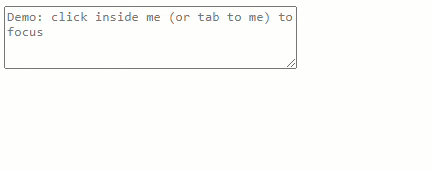
:focus
The :focus pseudo class in CSS is used for styling an element that is currently targeted by the keyboard, or activated by the mouse.
An element is focusable if you can tap it, click it or tab to select. Good examples of this are form inputs and links.
Here is an example:
<body>
    <form>
      <textarea
        name=""
        id=""
        cols=""
        rows=""
        placeholder="Demo: click inside me (or tab to me) to focus"
      ></textarea>
    </form>
 </body>
textarea:focus {
background: pink;
}
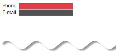
:enabled & :disabled
The :enabled pseudo-class enabled elements include ones in that you can select, that you can enter data into, or that you can focus on or click.
It is only associated with form elements of <input>, <select> and <textarea>.
On the other hand, :disabled pseudo class targets a form element in the disabled state. An element in a disabled state can’t be selected, checked or activated or gain focus.
It can used for, <button>, <input>, <textarea>, <optgroup>, <option> and <fieldset>.
  <body>
      <form>
        Phone: <input type="tel"><br>
        E-mail: <input type="email" disabled="disabled">
      </form>
  </body>
input:enabled {
background-color: #e63c49;
}
input:disabled {
background-color: #535252;
}
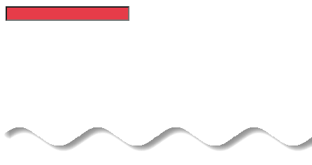
:required
The :required pseudo class selector in CSS allows us to select and style any matched element with the required attribute.
One use cases would be the forms can easily indicate which fields must have valid data before the form can be submitted.
Let’s say we have an input with an attribute of type="name" and make it a required input using the required boolean attribute.
  <body>
    <form>
      <input type="name" name="fname" required />
    </form>
  </body>
Now we can style that input using the :required pseudo class selector.
/* style all elements with a required attribute */
:required {
  background: #e63c49;
}
Example from Codepen:
See the Pen :required Styling by Chris Coyier (@chriscoyier) on CodePen.
:optional
The :optional pseudo class selects optional elements. Form elements that can be selected using :optional are <input>, <select> and <textarea> without a required attribute.
This pseudo class is useful for styling fields that are not required to submit a form.
 <body>
    <div class="example">
      <form action="#">
        <label> Name * <input type="name" required /></label>
        <label> Email * <input type="email" required /></label>
        <label> Phone (optional) <input type="phone" /></label>
        <label> Address (optional) <input type="url" /></label>
      </form>
    </div>
</body>
.example {
margin: 40px auto;
max-width: 400px;
}
label,
button {
display: block;
width: 100%;
margin-bottom: 1.5em;
}
input,
select,
button {
padding: 0.4em 1em;
}
input,
select {
border: 1px solid #666666;
}
input:optional,
select:optional {
background-color: #eeeeee;
color: #666666;
opacity: 0.5;
transition: 0.3s;
}
input:optional:hover,
select:optional:hover {
opacity: 1;
}
input:required,
textarea:required {
border-bottom: 3px solid #e63c49;
}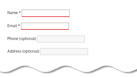
The :optional selector can also be linked with other selectors (e.g. :hover) and with pseudo elements (e.g. ::after).
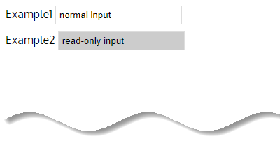
:read-only / :read-write
The :read-only pseudo class represents an element (such as <input> or <textarea>) that is not editable by the user.
Elements that fall into the editable category include:
<input>elements that are notread-onlyand that are notdisabled.<textarea>that is neitherread-onlynordisabled.- An element that is not an
<input>or a<textarea>, and that has thecontenteditableattribute set.
<body>
    <form>
      <div>
        <label for="normal">Example1</label>
        <input value="normal input" id="normal">
      </div>
      <div>
        <label for="read-only">Example2</label>
        <input readonly value="read-only input" id="read-only">
      </div>
    </form>
</body>
input {
margin-bottom: 10px;
border: 1px solid #ddd;
padding: 5px;
}
input:read-only {
background-color: #ccc;
}
The :read-write pseudo class represents an element (such as <input> or <textarea>) that is editable by the user.
According to the official CSS Specifications, a :read-write selector will match an element when:
- It is either an
<input>which hasreadonlynordisabledattributes. - It is a
<textarea>which has neitherreadonlynordisabled - It is any other editable element (thanks to the
contenteditableattribute)
<body>
    <form>
      <div>
        <label for="read-write">Example1</label>
        <input value="read-write input" id="read-write" />
      </div>
      <div>
        <label for="read-only">Example2</label>
        <input readonly value="read-only input" id="read-only" />
      </div>
    </form>
</body>
input {
margin-bottom: 10px;
border: 1px solid #ddd;
padding: 5px;
}
input:read-only {
background-color: #ccc;
}
#read-write:read-write {
background: lightgreen;
}
:checked
The :checked pseudo class selector represents any radio, checkbox, or option (<option> in a <select>) element that is checked or toggled to an on state.
It is only associated with input (<input>) elements of type radio and checkbox.
Remember, checkbox and radio elements can be toggled “on” and “off” by the user.
  <body>
    <form>
      <div>
        <input type="radio" name="my-input" id="yes" />
        <label for="yes">Yes</label>
        <input type="radio" name="my-input" id="no" />
        <label for="no">No</label>
      </div>
      <div>
        <input type="checkbox" name="my-checkbox" id="opt-in" />
        <label for="opt-in">Check!</label>
      </div>
    </form>
 </body>
div {
margin: 10px;
font-size: 20px;
}
input:checked + label {
color: #000;
}
input[type="radio"]:checked {
box-shadow: 0 0 0 4px #8ebf42;
}
/* Checkbox element, when checked */
input[type="checkbox"]:checked {
box-shadow: 0 0 0 3px #1c87c9;
}
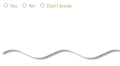
:indeterminate
The CSS :indeterminate pseudo class selects a user interface element that has an indeterminate state.
The :indeterminate pseudo class selects:
- Checkboxes (
<input type="checkbox">) with indeterminate attribute set to “true”. - Radio buttons (
<input type="radio">) when the radio button group does not contain checked radio button. - Progress element (
<progress>) with no value attribute.
  <body>
    <form>
      <input type="radio" name="option" value="yes" id="yes">
      <label for="yes">Yes</label>
      <input type="radio" name="option" value="no" id="no">
      <label for="no">No</label>
      <input type="radio" name="option" value="don't know" id="don't-know">
      <label for="don't-know">Don't know</label>
    </form>
  </body>
label {
margin-right: .5em;
position: relative;
top: 1px;
}
input[type="radio"]:indeterminate + label {
color: #8ebf42;
}
Example from Codepen:
See the Pen Indeterminate Checkboxes in jQuery by Chris Coyier (@chriscoyier) on CodePen.
Further read from css-tricks.
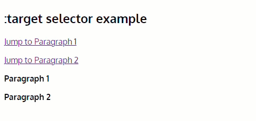
:target
The :target psuedo class represents an element that is the target of a referring URI.
For example, if you have a particularly long article broken up into sections, with each section having a unique ID, you can link to that particular section in the URL.
Using the :target selector, you can style whichever section is the current target.
Here is an example:
<body>
    <h2>:target selector example</h2>
    <p>
      <a href="#example1">Jump to Paragraph 1</a>
    </p>
    <p>
      <a href="#example2">Jump to Paragraph 2</a>
    </p>
    <p id="example1">
      <strong>Paragraph 1</strong>
    </p>
    <p id="example2">
      <strong>Paragraph 2</strong>
    </p>
 </body>
:target {
border: 2px solid #1c87c9;
background-color: #eeeeee;
}
More examples @css-tricks & Webdesignernotebook
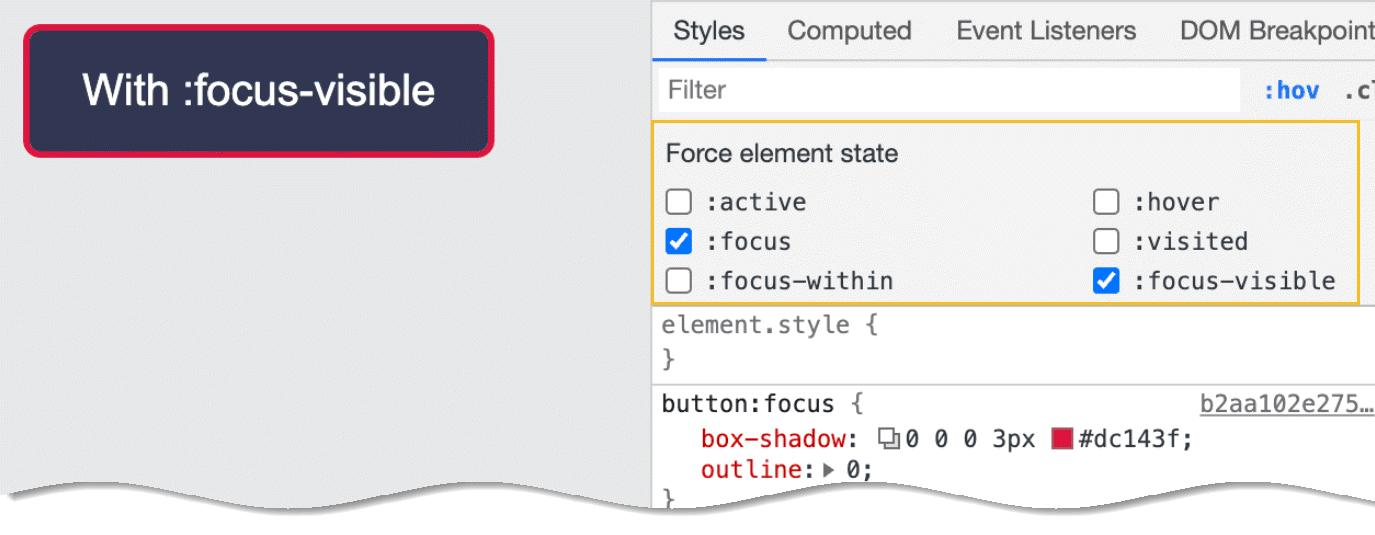
:focus-visible
The :focus-visible pseudo class is a native CSS way to style elements that:
- Are in focus
- Need a visible indicator to show focus
:focus-visible is used similarly to :focus to bring attention to the element that currently has the focus.
Why do we need :focus-visible?
When you create a simple form, the user agent (browser) will apply its own styles to the focus state of the form elements (like the text inputs, text areas and so on).
This is actually an important accessibility feature, and it allows users whose experience of the page is somehow impaired to navigate and use the form properly.
When an element is in focus, keyboard events will be applied to that element, but there’s a good chance it won’t work well with the rest of your design.
To remove this outline entirely we could use the following CSS to target all focus states:
:focus {
    outline: none;
}
That solves your problem from a stylistic angle, but in doing this you will remove the accessibility cue that visually tells users which element has focus. In other words, it’s not a good idea.
This problem is solved by :focus-visible pseudo class. Here is an example from Matthiasott to demonstrate:
See the Pen :focus-visible Demo by Matthias Ott (@matthiasott) on CodePen.
Note that :focus-visible always applies in combination with :focus. So if you inspect it in Chrome’s Developer Tools, for example, make sure to tick both boxes to see the appropriate focus styles.
:focus-within
:focus-within pseudo-class selects an element if that element contains any children that have :focus.
So,:focus-within is assigned to a parent element. The styling rules are applied when any child element receives focus. Selecting an input, clicking a link, etc.
<body>
    <ul>
      <li id="red">
        <input value="Red">
      </li>
      <li id="blue">
        <input value="Blue">
      </li>
      <li id="yellow">
        <input value="Yellow">
      </li>
    </ul>
  </body>
If we assume each input is the child then that makes li the parent. So let’s add focus-within to our li elements.
To do this, we need to add an id and then associate that with each li element.
#red:focus-within {
  background-color: #e63c49;
}

#blue:focus-within {
  background-color: #1c87c9;
}

#yellow:focus-within {
  background-color: #ecec10;
}
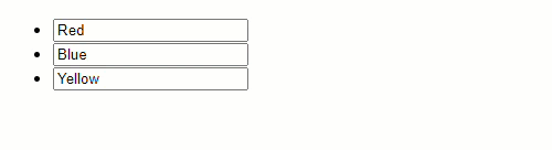
If we click on an input we see that the surrounding element receives color.
So what’s actually happening? The li element is looking at the input inside of it. When that input receives focus the styles are applied.
However, since the rule is on the li element, the style is applied to the li element, even though the state change occurs in the input.
Make sense? Lets take one more example:
Imagine that you have a login card, and you want that login card to change its appearance when any of its children has been focused.
You want the card to change when the user focus on any input (for example), or show some generic message, etc.
So, you don’t need JavaScript to achieve that behavior. CSS can do that! You just need the :focus-within pseudo-class.
See the Pen CSS Focus Within Example by Felippe Regazio (@felipperegazio) on CodePen.
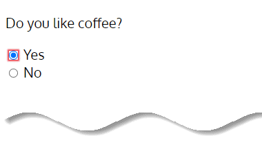
:default
The :default pseudo class matches the default element in a group of associated elements, such as the radio button in a group of buttons that are selected by default, even if the user has selected a different value.
This pseudo class can only be used on the button, input (when type=”checkbox” or type=”radio”) and option elements.
Examples include the default submit button in a group of buttons, the default option from a popup menu, the radio button that has the checked attribute set in the HTML, and the checkboxes that are by default checked.
  <body>
    <div class="example">
      <p>Do you like coffee?</p>
      <input type="radio" name="radios" id="ex1" checked />
      <label for="ex1">Yes</label>
      <br />
      <input type="radio" name="radios" id="ex2" />
      <label for="ex2">No</label>
    </div>
  </body>
input:default {
box-shadow: 0 0 2px 2px #e63c49;
}
.example {
margin: 20px auto;
font-size: 20px;
}
:fullscreen
The :fullscreen pseudo class allows you to select and style any element that is currently in fullscreen mode.
Seen an example:
See the Pen :fullscreen selector by Mojtaba Seyedi (@seyedi) on CodePen.
More info from css-tricks.
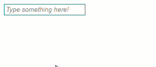
:placeholder-shown
The :placeholder-shown pseudo class represents any <input> or <textarea> or element that is currently displaying placeholder text.
  <body>
    <input placeholder="Type something here!" />
  </body>
input {
border: 1px solid black;
padding: 3px;
}
input:placeholder-shown {
border-color: teal;
color: purple;
font-style: italic;
}
Validity pseudo class selector
:valid & :invalid
The :valid pseudo class selector allows you to select <input> elements that contain valid content, as determined by its type attribute.
In the same way, the :invalid pseudo class selector allows you to select <input> elements that do not contain valid content, as determined by its type attribute.
<body>
    <form>
      <label>
        Enter ATM Pin :
        <input type="text" pattern="^[0-9]{4}$" required maxlength="4" />
      </label>
    </form>
  </body>
input[type='text']:valid {
box-shadow: 0px 0px 5px 1px green;
}
input[type='text']:invalid {
box-shadow: 0px 0px 5px 1px #e63c49;
}
:in-range & :out-of-range
The :in-range pseudo class selector in CSS matches input elements when their value is within the range specified as being acceptable.
In the same way, the :out-of-range pseudo class selector in CSS matches input elements when their value is outside the range specified as being acceptable.
<body>
    <input max="10" min="5" type="number">
</body>
input:in-range {
border: 5px solid green;
}
input:out-of-range {
border: 5px solid #e63c49;
}
Relational pseudo class selectors
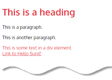
:not()
The :not() pseudo class represents elements that do not match a list of selectors.
It is also known as the negation pseudo class. It is a functional pseudo class selector that takes a simple selector as an argument and matches with one or more elements not being represented by the argument.
The :not() selector takes as an argument any of the following:
- Type selector
- Class selector
- ID selector
- Pseudo class selector
- Attribute selector
- The universal selector
For example, set a background color for all elements that are not a <p> element:
  <body>
    <h1>This is a heading</h1>

    <p>This is a paragraph.</p>
    <p>This is another paragraph.</p>

    <div>This is some text in a div element.</div>

    <a href="#" target="_blank">Link to Hello Sunil!</a>
  </body>
p {
color: #000000;
}
:not(p) {
color: #e63c49;
}
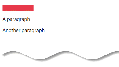
:empty
The CSS :empty pseudo class selects any element that does not contain children for a given selector.
For example, specify a background color for empty <p> elements:
  <body>
    <p></p>
    <p>A paragraph.</p>
    <p>Another paragraph.</p>
  </body>
p:empty {
width: 100px;
height: 20px;
background: #e63c49;
}
Text related pseudo class selectors
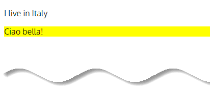
:lang
The :lang() pseudo class selector is used to select elements with a lang attribute with the specified value.
The lang attribute value is most often a two letter language code, like lang="fr" (for French), or two language codes combined, like lang="fr-ca" (for Canadian French).
  <body>
    <p>I live in Italy.</p>
    <p lang="it">Ciao bella!</p>
  </body>
p:lang(it) {
background: yellow;
}
Structural & Position based pseudo class selectors
A handful of pseudo-classes are structural and position based, in which they are determined based off where elements reside in the document tree.
These structural and position based pseudo-classes come in a few different shapes and sizes, each of which provides their own unique function.
Some pseudo-classes have been around longer than others, however CSS3 brought way of an entire new set of pseudo-classes to supplement the existing ones.
Lets discuss all of them one by one:
:first-child, :last-child, & :only-child
The first structural and position based pseudo-classes one is likely to come across are the :first-child, :last-child, and :only-child pseudo-classes.
:first-child
The :first-child selector allows you to target the first element immediately inside another element. Suppose we have an article and want to make the first paragraph larger – like a “lede”, or piece of introductory text:
<body>
    <article>
      <p>First paragraph...</p>
      <p>Lorem ipsum...</p>
      <p>Dolor sit amet...</p>
      <p>Consectetur adipisicing...</p>
    </article>
</body>
Instead of giving it a class (e.g. .first), we can use :first-child to select it:
p:first-child {
  font-size: 1.5em;
}
💡 Note
Using :first-child is very similar to :first-of-type but with one critical difference: it is less specific. :first-child will only try to match the immediate first child of a parent element, while :first-of-type will match the first occurrence of a specified element, even if it doesn’t come absolutely first in the HTML.
Let’s take another example: you want all your h2 tags in your sidebar to have a top margin, to separate them from whatever comes before them, but the first one doesn’t need a margin. You can use the following code:
#sidebar > h2 {
  margin-top: 10px;
  }

#sidebar > h2:first-child {
  margin-top: 0;
  }
:last-child
The :last-child selector allows you to target the last element directly inside its containing element.
Suppose we have an article and want to make the last paragraph smaller, to act as a conclusion to the content, then you can write:
<body>
    <article>
      <p>Lorem ipsum...</p>
      <p>Dolor sit amet...</p>
      <p>Consectetur adipisicing...</p>
      <p>Last paragraph...</p>
    </article>
</body>
Instead of using a class (e.g. .last), we can use :last-child to select it:
p:last-child {
  font-size: 0.75em;
}
Hence, these pseudo-classes are perfect for selecting the first or last items in a list and so forth.
:only-child
The :only-child pseudo-class selector property in CSS represents an element that has a parent element and whose parent element has no other element children.
This would be the same as :first-child:last-child or :nth-child(1):nth-last-child(1), but with a lower specificity.
Also Read: What is CSS Specificity and How Does it Work?
For example, if we nest paragraphs within a div like so…
<body>
    <div>
      <p>This paragraph is the only child of its parent</p>
    </div>

    <div>
      <p>This paragraph is the first child of its parent</p>
      <p>This paragraph is the second child of its parent</p>
    </div>
</body>
Now we can style the only p of our first child div. The subsequent div and it’s children will never be styled as the parent container holds more than one child (i.e. the p tags).
p:only-child {
  color:red;
}
Remember, :only-child won’t work as a selector if your parent element contains more than one child with an identical tag. For example:
<body>
    <div class="contain">
      <div>
        <h1>Div Child 1</h1>
        <p>paragraph1</p>
        <p>paragraph2</p>
      </div>

      <div>
        <h1>Div Child 2</h1>
        <p>paragraph1</p>
        <p>paragraph2</p>
      </div>

      <div>
        <h1>Div Child 3</h1>
        <p>paragraph1</p>
        <p>paragraph2</p>
      </div>
    </div>
</body>
div.contain div:only-child {
color: red;
}
This will result in no div inheriting the color red as the parent contains more than 1 child (the 3 unnamed divs).
:first-of-type, :last-of-type, & :only-of-type
Finding the first, last, and only children of a parent is pretty helpful, and often all that is needed. However sometimes you only want to select the first, last, or only child of a specific type of element.
For example, should you only want to select the first or last paragraph within an article, or perhaps the only image within an article. Fortunately this is where the :first-of-type, :last-of-type, and :only-of-type pseudo-selectors come into place.
:first-of-type
The :first-of-type selector in CSS allows you to target the first occurrence of an element within its container. That means, it is used to style content based on its relationship with parent and sibling content.
Suppose we have an article with a title and several paragraphs:
<body>
    <article>
      <h1>A Title</h1>
      <p>Paragraph 1.</p>
      <p>Paragraph 2.</p>
      <p>Paragraph 3.</p>
    </article>
</body>
We want to make the first paragraph larger, as a sort of “lede” or introductory paragraph. Instead of giving it a class, we can use :first-of-type to select it:
p:first-of-type {
  font-size: 1.25em;
}
This reveals the power of :first-of-type: it targets a particular type of element in a particular arrangement with relation to similar siblings, not all siblings.
:last-of-type
The :last-of-type selector allows you to target the last occurrence of an element within its container. That means, it is used to style content based on its relationship with parent and sibling content.
Suppose we have an article with a title, several paragraphs and an image:
<body>
    <article>
      <h1>A Title</h1>
      <p>Paragraph 1.</p>
      <p>Paragraph 2.</p>
      <p>Paragraph 3.</p>
      <img src="/img/signature.webp" width="250" height="100" />
    </article>
</body>
We want to make the last paragraph smaller, to act as a conclusion to the content (like an editor’s note). Instead of giving it a class, we can use :last-of-type to select it:
p:last-of-type {
  font-size: 0.75em;
}
:only-of-type
The :only-of-type selector targets elements where the parent elements do not have any other children of the same type.
Lets take an example, Specify a background color(lightblue) for every p element that is the only child of its type, of its parent:
<body>
    <div>
      Div 1
      <p>1 p tag</p>
      <p>2 p tags</p>
    </div>
    <div>
      Div 2
      <p>1 p tag</p>
    </div>
</body>
p:only-of-type {
background-color: lightblue;
}
💡 Note
You can achieve the same selection as :only-of-type with :first-of-type:last-of-type or :nth-of-type(1):nth-last-of-type(1).
Those use two chained selectors though, meaning the specificity is double that of :only-of-type.
There are also a few structural and position based pseudo-classes that select elements based on a number or an algebraic expression. These pseudo-classes include :nth-child(n), :nth-last-child(n), :nth-of-type(n), and :nth-last-of-type(n).
All of these unique pseudo-classes are prefixed with nth and accept a number or expression inside of the parenthesis, indicated by the character n argument.
The number or expression that falls within the parenthesis determines exactly what element, or elements, are to be selected.
Using a number outright will count individual elements from the beginning or end of the document tree and then select one element, while using an expression will count numerous elements from the beginning or end of the document tree and select them in groups or multiples.
💡 Pseudo-class Numbers & Expressions
using numbers outright within a pseudo-class will count from the beginning, or end, of the document tree and select one element accordingly. For example, the li:nth-child(4) selector will select the fourth list item within a list.
Counting begins with the first list item and increases by one for each list item, until finally locating and selecting the fourth item. When using a number outright it must be a positive number.
Expressions for pseudo-classes fall in the format of an, an+b, an-b, n+b, -n+b, and –an+b. The same expression may be translated and read as (a×n)±b.
The a variable stands for the multiplier in which elements will be counted in while the b variable stands for where the counting will begin or take place.
For example, the li:nth-child(3n) selector will identify every third list item within a list. Using the expression this equates to 3×0, 3×1, 3×2, and so forth. As you can see the results of this expression lead to the third, sixth, and every element a multiple of three being selected.
Additionally, the odd and even keyword values may be used. As expected, these will select odd or even elements respectively. Should keyword values not be appealing the expression of 2n+1 would select all odd elements while the expression of 2n would select all even elements.
Using the li:nth-child(4n+7) selector will identify every fourth list item starting with the seventh list item. Again, using the expression this equates to (4×0)+7, (4×1)+7, (4×2)+7, and so forth.
The results of this expression leading to the seventh, eleventh, fifteenth, and every element that is a multiple of four here on out being selected.
Using the n argument without being prefixed by a number results in the a variable being interpreted as 1. With the li:nth-child(n+5) selector every list item will be selected starting with the fifth list item, leaving the first four list items unselected. Within the expression this breaks down as (1×0)+5, (1×1)+5, (1×2)+5, and so forth.
To make things a bit more complicated negative numbers may also be used. For example, the li:nth-child(6n-4) selector will start counting every sixth list item starting at negative four, selecting the second, eighth, and fourteenth list items and so forth. The same selector, li:nth-child(6n-4), could also be written as li:nth-child(6n+2), without the use of a negative b variable.
A negative a variable, or a negative n argument, must be followed by a positive b variable. When preceded by a negative a variable or negative n argument the b variable identifies how high the counting will reach.
For example, the li:nth-child(-3n+12) selector will select every third list item within the first twelve list items. The selector li:nth-child(-n+9) will select the first nine list items within a list, as the n argument, without any stated a variable, is defaulted to -1.
:nth-child(n) & :nth-last-child(n)
With a general understanding of how the pseudo-class numbers and expressions work let’s take a look at the actual pseudo-classes in which these numbers and expressions may be used, the first of which being the :nth-child(n) and :nth-last-child(n) pseudo-classes.
:nth-child(n)
The :nth-child selector allows you to select one or more elements based on their source order, according to a formula.
/* Select the first list item */
li:nth-child(1) {
}

/* Select the 5th list item */
li:nth-child(5) {
}
Suppose we are building a CSS grid, and want to remove the margin on every fourth grid module. See here how the HTML will looks like:
 <body>
    <section class="grid">
      <article class="module">One</article>
      <article class="module">Two</article>
      <article class="module">Three</article>
      <article class="module">Four</article>
      <article class="module">Five</article>
    </section>
 </body>
Rather than adding a class to every fourth item (e.g. .last), we can use :nth-child:
.module:nth-child(4n) {
  margin-right: 0;
}
The :nth-child selector takes an argument: this can be a single integer, the keywords even, odd, or a formula.
If an integer is specified only one element is selected—but the keywords or a formula will iterate through all the children of the parent element and select matching elements — similar to navigating items in a JavaScript array.
Keywords “even” and “odd” are straightforward (2, 4, 6, etc. or 1, 3, 5 respectively). The formula is constructed using the syntax an+b, where:
- “a” is an integer value
- “n” is the literal letter “n”
- “+” is an operator and may be either “+” or “-”
- “b” is an integer and is required if an operator is included in the formula
It is important to note that this formula is an equation, and iterates through each sibling element, determining which will be selected. The “n” part of the formula, if included, represents a set of increasing positive integers (just like iterating through an array).
In our above example, we selected every fourth element with the formula 4n, which worked because every time an element was checked, “n” increased by one (4×0, 4×1, 4×2, 4×3, etc). If an element’s order matches the result of the equation, it gets selected (4, 8, 12, etc).
For a more in-depth explanation of the math involved, please read this article.
Luckily, you don’t always have to do the math yourself—there are several :nth-child testers and generators out there:
💡 Note
:nth-child iterates through elements starting from the top of the source order. The only difference between it and :nth-last-child is that the latter iterates through elements starting from the bottom of the source order.
The :nth-child selector is very similar to :nth-of-type but with one critical difference: it is less specific. In our example above they would produce the same result because we are iterating over only .module elements, but if we were iterating over a more complex group of siblings, :nth-child would try to match all siblings, not only siblings of the same element type.
This reveals the power of :nth-child—it can select any sibling element in an arrangement, not only elements that are specified before the colon.
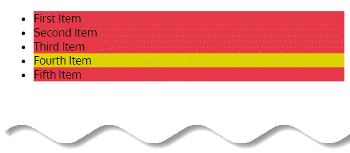
:nth-last-child(n)
The :nth-last-child selector allows you select one or more elements based on their source order, according to a formula. It functions the same as :nth-child except it selects items starting at the bottom of the source order, not the top.
Suppose we have a list with an unknown number of items, and we wish to highlight the second-to-last item (in our example, the “Fourth Item”):
<body>
    <ul>
      <li>First Item</li>
      <li>Second Item</li>
      <li>Third Item</li>
      <li>Fourth Item</li>
      <li>Fifth Item</li>
    </ul>
</body>
Rather than doing something like adding a class to the list item (e.g. .highlight) we can use :nth-last-child:
li {
  background: orange;
}
/* select the second-last item */
li:nth-last-child(2) {
  background: turquoise;
}
As you can see, :nth-last-child takes an argument: this can be a single integer, the keywords “even” or “odd”, or a formula.
In our example, we selected every second element with the formula 2n, which worked because every time an element was checked, “n” increased by one (2×0, 2×1, 2×2, 2×3, etc). If an element’s order matches the result of the equation, it gets selected (2, 4, 6, etc).
The :nth-last-child selector is very similar to :nth-last-of-type but with one critical difference: it is less specific.
In our example they would produce the same result because we are iterating over only li elements, but if we were iterating over a more complex group of siblings, :nth-last-child would try to match all siblings, not only siblings of the same element type.
This reveals the power of :nth-last-child—it can select any sibling element in an arrangement, not only elements that are specified before the colon.
:nth-of-type(n) & :nth-last-of-type(n)
The :nth-of-type(n) and :nth-last-of-type(n) pseudo classes are very similar to that of the :nth-child(n) and :nth-last-child(n) pseudo classes, however instead of counting every element within a parent the :nth-of-type(n) and :nth-last-of-type(n) pseudo classes only count elements of their own type.
The :nth-of-type selector allows you select one or more elements based on their source order, according to a formula, meaning it is used to style content based on its relationship with parent and sibling elements.
:nth-of-type(n)
Suppose we have an unordered list and wish to zebra-stripe alternating list items:
  <body>
    <ul>
      <li>First Item</li>
      <li>Second Item</li>
      <li>Third Item</li>
      <li>Fourth Item</li>
      <li>Fifth Item</li>
    </ul>
  </body>
Rather than adding classes to each list item (eg .even & .odd) we can use :nth-of-type:
li {
  background: #e63c49;
}

/* select alternating items
starting with the second item */

li:nth-of-type(2n) {
  background: #dfd106;
}
As you can see, :nth-of-type takes an argument: this can be a single integer, the keywords “even” or “odd”, or a formula as shown above.
If an integer is specified only one element is selected—but the keywords or a formula will iterate through all the children of the parent element and select matching elements—similar to navigating items in an array in JavaScript.
Keywords “even” and “odd” are straightforward, but the formula is constructed using the syntax an+b, where:
- “a” is an integer value
- “n” is the literal letter “n”
- “+” is an operator and may be either “+” or “-”
- “b” is an integer and is required if an operator is included in the formula
It is important to note that this formula is an equation, and iterates through each sibling element, determining which will be selected.
The “n” part of the formula, if included, represents a set of increasing positive integers (just like iterating through an array).
In the above example, we selected every second element with the formula 2n, which worked because every time an element was checked, “n” increased by one (2×0, 2×1, 2×2, 2×3, etc). If an element’s order matches the result of the equation, it gets selected (2, 4, 6, etc).
For a more in-depth explanation of the math involved, checkout css-tricks article.
Luckily, you don’t always have to do the math yourself—there are several :nth-of-type testers and generators out there:
:nth-last-of-type(n)
The :nth-last-of-type selector allows you select one or more elements based on their source order, according to a formula, meaning it is used to style content based on its relationship with parent and sibling elements.
It functions the same as :nth-of-type except it selects items starting at the bottom of the source order, not the top.
Suppose we have an unordered list and wish to highlight the second-to-last item (in this exact example, the “Fourth Item”):
  <body>
    <ul>
      <li>First Item</li>
      <li>Second Item</li>
      <li>Third Item</li>
      <li>Fourth Item</li>
      <li>Fifth Item</li>
    </ul>
</body>
Rather than doing something like adding a class to the list item (e.g. .highlight) we can use :nth-last-of-type:
li {
  background: #e63c49;
}

/* select the second-last item */

li:nth-last-of-type(2) {
  background: #dfd106;
}
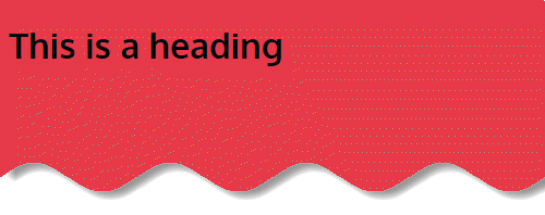
:root
:root pseudo class selector used to select the element that represents the root of the document.
In HTML5, this is always the <html> element, since it is the highest-level ancestor of all other elements on the page. So, :root is identical to using the html as a selector, except that it has a higher specificity.
This means that, in the following example, the styles specified using :root will override those specified using the html selector, even if the latter comes next in the style sheet.
:root {
    /* style the root element */
}

html {
    /* style the root element */
}
Also Read: What is CSS Specificity and How Does it Work?
Here is an example:
  <body>
    <h1>This is a heading</h1>
  </body>
:root {
background: #e63c49;
}
Since CSS is also designed for SVG and XML you can actually use :root and it will just correspond to a different element.
For example, in SVG the highest-level parent is the svg tag.
:root {
  fill: gold;
}

svg {
  fill: gold;
}
Similar to HTML, the :root and svg tags select the same element, however the :root selector will have higher specificity.
Functional pseudo class selectors
The syntax of a pseudo class consists of a “:” followed by the name of the pseudo class as a CSS identifier (example- :hover) , and, in the case of a functional pseudo class, a pair of parentheses containing its arguments (Example- is(), :where()).
is() & :where()
When writing CSS, you can sometimes end up with long selector lists to target multiple elements with the same style rules. For example, if you want to color adjust any <b> tags found inside a heading element, you could write:
h1 > b, h2 > b, h3 > b, h4 > b, h5 > b, h6 > b {
  color: hotpink;
}
Instead, you could use :is() and improve legibility while avoiding a long selector:
:is(h1,h2,h3,h4,h5,h6) > b {
  color: hotpink;
}
More info:
- :is pseudo class selector – css-tricks
- :is pseudo class selector – MDN docs
- New CSS functional pseudo-class selectors :is() and :where()
The :where() pseudo class selector is identical to the :is() pseudo selector in that it takes a comma-separated list of selectors to match against, except that where :is() takes the most specific among them as the specificity of that whole part, the specificity of :where() is always zero (0).
For example:
main :where(h1, h2, h3) {
  color: orange;
}
Matches as if you wrote that selector like this:
main h1, main h2, main h3 {
  color: orange;
}
Except the specificity of the first example above is (0, 0, 0, 1) for the single element selector (main) and doesn’t include the specificity of anything in the :where() part. Whereas, in the second example, the specificity is (0, 0, 0, 2) because there are two element selectors.
More info:
Read the difference between :is() and :where() from web.dev article.
Experimental pseudo class selectors
Experimental pseudo class are immature, and currently in the process of being added to the Web platform (or considered for addition).
:blank
The :blank pseudo-class builds upon the :empty pseudo-class. Like :empty, :blank will select elements that contain nothing at all, or contain only an HTML comment. But, :blank will also select elements that include whitespace, which :empty will not.
More read from freecodecamp article:
:current
The :current pseudo class selector is a time dimensional pseudo class that represents the element, or an ancestor of the element, that is currently being displayed.
For example in a video with captions which are being displayed by WebVTT.
:past & :future
These two are time dimensional pseudo classes and it apply when viewing something which has timing, such as a WebVTT caption track.
:user-invalid
It selects a form element based on whether the value as entered by a user – is valid when checked against the what is specified as an accepted value in the HTML markup after the end user has interacted with the form beyond that input.
:dir()
The :dir() CSS pseudo-class matches elements based on the directionality of the text contained in them.
Further Reading
- On :target – css-tricks
- On :target – css-tricks
- :focus-visible – css-tricks
- CSS selectors- MDN Web docs
- The :target Trick – Bitsofco
- Tutsplus – Better Focus Styles with CSS Pseudo-Class :focus-visible
Conclusion
Enough with the boring talk, now it’s time for you to grab the information on this post and go try it for yourself: start by creating an experimental page and test all of these selectors, come back here when in doubt.
And that’s basically it for CSS pseudo class Selectors. We hope you found this piece useful, especially for future reference.
Thank you for reading!


Add comment