
Here, in this article, we have included a list of the most popular interview questions and answers for cracking Bootstrap interviews.
This will help to crack the interview for both experienced and for fresher candidates.
Also Read: Top CSS Interview Questions Updated
Let’s go!!
1. What is Bootstrap?
Bootstrap is the most popular CSS Framework for developing responsive and mobile-first websites. Bootstrap 5 is the newest version of Bootstrap.
2. What are the advantages of Bootstrap?
The following are some advantages of Bootstrap:
- A mobile-first strategy and it is simple to use and anyone with a basic understanding of HTML and CSS can get started.
- Bootstrap 5 is compatible with all modern browsers, including Chrome, Firefox, Microsoft Edge, Safari, and Opera.
3. What is a Bootstrap Container, and how does it work?
A bootstrap container is a handy class that generates a central region on the page where we can put our site content.
There are three types of container class that we can use: .container, .container-fluid and responsive container.
4. What do you know about the Bootstrap Grid System?
The Bootstrap Grid System is a mobile-first, responsive grid system that scales up to 12 columns as the device or viewport size grows.
The available classes are:
.col-.col-sm-.col-md-.col-lg-.col-xl-.col-xxl-
5. What is the difference between Bootstrap 4 and Bootstrap 5
| Parameter | Bootstrap 4 | Bootstrap 5 |
| Grid System | 5 tier grid system (xs, sm, md, lg, xl). | 6 tier grid system (xs, sm, md, lg, xl, xxl). |
| jQuery | It has jQuery along with all the related plugins. | Jquery is removed and it has switched to vanilla JS with some working plugins. |
| Internet Explorer | Bootstrap 4 supports both IE 10 and 11. | Bootstrap 5 doesn’t support IE 10 and 11. |
| Form elements | Radio buttons and checkboxes look different in different OS and browsers. | The look of form elements does not change on different OS or browsers. |
| Utilities API | Utilities cannot be modified in Bootstrap 4. | Bootstrap 5 allows us to modify and also create our own utility. |
| Jumbotron | Bootstrap 4 supports the jumbotron. | Bootstrap 5 doesn’t support the jumbotron. |
6. What is the difference between Bootstrap 3 and Bootstrap 4
| Parameter | Bootstrap 3 | Bootstrap 4 |
| Grid System | 4 tier grid system (xs, sm, md, lg). | 5 tier grid system (xs, sm, md, lg, xl). |
| CSS File | LESS | SASS |
| Primary Unit | Primary unit is px. | Primary unit is rem |
| Condensed Tables | It supports .table-condensed. | It supports .table-sm. |
| Responsive Image | .img-responsive class is to be used. | .img-fluid class is to be used. |
| Glyphicons | Supported. | Not supported. |
| Flexbox | Not supported. | Supported. |
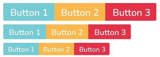
7. What is a Button Group, and what is the class for a basic Button Group?
Multiple buttons can be placed together on a single line using button groups. We can use this when we want to place items like alignment buttons together.
The .btn-group class is used for basic button groups. We can use the class .btn to wrap a set of buttons in .btn-group.
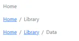
8. What is a breadcrumb in Bootstrap?
Breadcrumbs are a wonderful way to display a site’s hierarchy-based information. That means, it shows us where the current page is in the navigational hierarchy.
9. What is Image Thumbnail in Bootstrap? *(Removed in Bv4)
In Bootstrap the image thumbnail is a border surrounded by the image. To create this image thumbnail we can use the .img-thumbnail class.

10. In Bootstrap, how to display code?
In Bootstrap, there are two straightforward ways to display code:
- The
<code>element is used to showcase a piece of inline code. - We can also use the
<pre>tag to display a code that has multiple lines or even a block element.
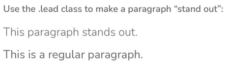
11. What is a lead?
Lead adds some emphasis to a paragraph. The .lead class is used to achieve this and it makes the font larger, taller, and lighter in weight.
<p class= "lead" > Paragraph </p>
12. In Bootstrap what is flexbox?
Flexbox is a layout module for flexible boxes. Without using float or positioning, we can quickly create a flexible layout design with flexbox.
13. How can one create an alert in Bootstrap?
Create a wrapper <div> and add a class of .alert and one of the contextual classes to create a basic alert (e.g., .alert-success, .alert-info, .alert-warning, .alert-danger, .alert-primary, .alert-secondary, .alert-light or .alert-dark).

14. What is a bootstrap card?
In Bootstrap, a card is a bordered box with padding surrounding its content. Cards support a wide variety of content, including images, text, links, and more.

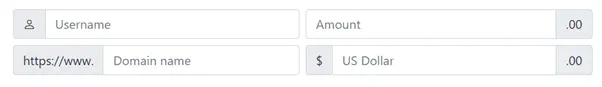
15. Explain input groups in Bootstrap.
input-group class is a container to enhance an input by adding an icon, text or a button in front or behind the input field as a “help text”.
Example: custom file selectors or custom inputs.
16. Give few examples of Bootstrap table classes.
.tableclass gives a table some basic styling..table-stripedclass gives zebra stripes to the table..table-borderedclass adds borders to the table and cells on all sides.
17. What is a toast and what are the main components of a toast?
It is like an alert box that appears for a small time. The main components of a toast are the toast header and the toast body.
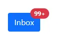
18. What are badges? Which class will you use to make your badge look more rounded?
In Bootstrap v5, Badges are simple and basic components that are used to display an indicator or count a number. This is quite useful for mail count and alerting purposes, among other things.
To make rectangular badges, we can use the .badge class with a contextual class (like .badge-secondary) within <span> elements.
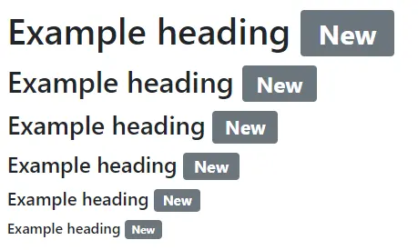
To make the badges more rounded, we can use .badge-pill class.

19. What are Bootstrap collapsing elements?
Bootstrap collapsing elements enable you to collapse any particular element without writing any JavaScript code or the accordion markup.
20. In Bootstrap, what is a scrollspy?
It’s an auto-updating nav component that allows you to grab sections of the page based on where you’re scrolling. Based on the scroll position, the .active class will update from one nav item to the next.
21. Why is Jumbotron used in Bootstrap? *(Removed Bv4)
In Bootstrap, Jumbotron is used to highlight the contents. In order to implement Jumbotron in Bootstrap, create a container div with the .jumbotron class.

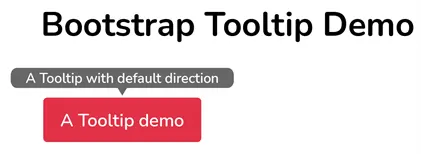
22. How is tooltip different from popover?
When the user moves the mouse pointer over an element, the Tooltip component appears as a little pop-up box.
The Popover component is a pop-up box that emerges when the user clicks on an element. The popover may hold a lot more information.
The popover will show on the right side of the element by default whereas the tooltip will show on the top of the element by default.

23. What classes can help you change the default settings of positioning a popover and closing a popover?
The popover will show on the right side of the element by default. To position the popover on the top, bottom, left, or right side of the element, use the data-bs-placement attribute.
When you click on the element again, the popover closes by default. However, the data-bs-trigger=" focus" attribute can be used to close the popover when the user clicks outside the element.
24. What are the important rules that you should follow while using Grids in Bootstrap?
The following three rules should be strictly kept in mind while using Grids in Bootstrap:-
- A row’s immediate child must be a Column.
- Rows are just used to contain Columns and are not utilized for anything else.
- Rows should be put within a container.
Q25. What will be the default Bootstrap look of the alert created with this following code:
<div class="alert" role="alert">Warning! I'm missing something.</div>
Alert messages are used to provide feedback messages and they usually require the attention of the user. Here it is important to note that Bootstrap Alerts don’t have a default class.
If a contextual class such as .alert-success, .alert-info, .alert-warning, or .alert-danger, is not provided, a default gray alert will be created.
Q26. Give me few examples of Contextual classes in Bootstrap?
.active, .success, .warning, .danger
Q27. How many types of layout are available in Bootstrap?
There are two major layouts for Bootstrap:
- Fluid Layout- This layout is necessary for creating an app that is 100 % wider and covers all the screen width.
- Fixed Layout- It is used only for a standard screen.
Both layouts can be used for creating a responsive design.
Q28. How do you make images responsive?
Bootstrap allows to make the images responsive by adding a class .img-fluid to the <img> tag. This class applies max-width: 100%; and height: auto; to the image so that it scales nicely to the parent element.
Q29. Explain types of lists supported by Bootstrap.
Bootstrap supports three types of lists such as:
- Ordered lists
- Unordered lists
- Definition lists
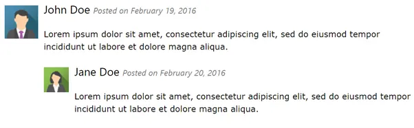
Q30. What is media object in Bootstrap? *(Removed in Bv4)
Bootstrap provides an easy way to align media objects (like images or videos) to the left or to the right of some content. This can be used to display blog comments, tweets and so on.
Q31. Explain the uses of carousel plugin in Bootstrap.
Carousel plugin in bootstrap is used to make sliders in the web pages.
Q32. What are glyphicons? *(Removed in Bv4)
Glyphicons are icon fonts which can be used in our web projects.
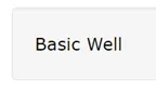
Q33. What do you mean by Bootstrap well? *(Removed in Bv4)
Bootstrap well class adds a rounded border around an element with a gray background color and some padding.
Q34. How to create thumbnails using Bootstrap? *(Removed in Bv4)
To create thumbnails using Bootstrap we need to do the following:
- Add an
<a>tag with the class of.thumbnailaround an image. - It will add four pixels of padding and a gray border.
- Now, on hover, an animated glow will outline the image.
Q35. What are bootstrap alerts?
Bootstrap Alerts provide a contextual feedback message for typical user actions. Also, we can add an optional close icon to alert.
Q36. What do you mean by column ordering in Bootstrap? *(Removed in Bv4)
Column ordering is one of the most interesting features found in bootstrap. In order to change or alter the order of the column easily, we can use classes .push and .pull classes (Bootstrap v3) and for newer version of bootstrap we can use class like .order:
Q37. What is Normalize in Bootstrap? *(Removed in Bv4)
Bootstrap used to use Normalize.css to establish cross-browser consistency.
In newer version of bootstrap (v5) they are currently using Reboot.
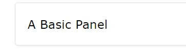
Q38. What are Bootstrap panels? *(Removed in Bv4)
A panel in bootstrap is a bordered box with some padding around its content.
Q39. Why do we use the affix plugin in Bootstrap? *(Removed in Bv4)
The Affix plugin allows an element to become affixed (locked) to an area on the page. This is often used with navigation menus or social icon buttons, to make them “stick” at a specific area while scrolling up and down the page.
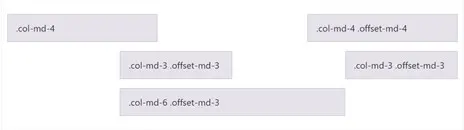
Q40. What are offset columns in Bootstrap?
An offset is used to push columns over for more spacing.
Q41. Explain what is Modal plugin used for in Bootstrap?
A modal is a child window that is layered over its parent window. Hence to enrich user experience and to add functionality to users.
Q42. How can you make an image round in Bootstrap?
We can use the .rounded class to make an image round.
Q43. What are the different button styles in Bootstrap?
In Bootstrap, there are lots of styles that we can use with the buttons.
Some of them are:
- Buttons with colours
- Buttons with a coloured outline
- Small buttons
- Large buttons
- Block-level buttons
- Button links
Q44. Is there any relationship between Bootstrap and JavaScript?
Yes, there is a relationship between the two technologies. Some Bootstrap components require JavaScript to work properly.
Example:
Carousels, Modals, Toasts and few other components.
Q45. Who Developed Bootstrap?
Mark Otto and Jacob Thornton at Twitter.
Q46. Name some alternatives to Bootstrap.
There are lots of alternatives. Some of them are shown in the below list.
- Foundation
- Bulma
Q47. What is the class used to give a Bootstrap table a dark colour?
We can use the .table-dark class to give a Bootstrap table a dark color.
Q48. What’s new in Bootstrap 5?
- Dropped jQuery
- No older browsers support (such as IE 10 and 11, Microsoft Edge legacy, and more)
- Form elements are now designed to have a consistent look, irrespective of browser or operating system
- Bootstrap now lets users modify, extend, or create their utility classes easily
- More recent version of Bootstrap also features an experimental option to enable a separate grid system that’s built on CSS Grid.
- Placeholder component
- For a while now, only vertical collapse is supported in Bootstrap, but in this latest version, the team has added support for horizontal collapse.
- A new offcanvas component has been added in Bootstrap 5 which can be used to create expanding sidebars for navigation or for shopping carts or offcanvas menu.
- SVG Icon Library
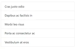
Q49. Explain what is list group in Bootstrap and what is the use of it?
The use of List-Groups is just to display a series or list of content in an organized way.
Q50. What are responsive utility classes in Bootstrap?
Bootstrap includes dozens of utilities—classes with a single purpose. They’re designed to reduce the frequency of highly repetitive declarations in your CSS while allowing for quick and easy development.


Add comment